abS object
I made this site for abS object as part of an exercise at the company "wix". Avi is a designer and maker, working and living in Tel Aviv. About a year ago he founded objects design brand abS_objects. All of abS objects are produced in a traditional artisan way and are hand made in Tel Aviv. Every object is slightly different, which makes every object one of a kind.
Web Design // 2019
Laura zajdner
More

Good Intentions
A collaborative project between Shenkar’s Fashion Design Department and the Sheba Medical Center’s Rehabilitation Department for war-injured soldiers.
Twelve fashion students worked closely with twelve wounded soldiers, each with unique physical challenges and personal stories, to co-design adaptive, fashionable garments that promote independence and dignity in everyday life.
The process was rooted in design thinking, with occupational therapists guiding the students to create solutions such as magnetic closures, garments compatible with medical braces, and custom features like pockets for white canes.
Beyond aesthetics, the project explored how fashion can be a tool for healing, empowerment, and inclusion.
Maia Arazi, Tamar Mani, Helen Sofrin // Shenkar; Esti Neuhar, occupational therapist// Sheba Medical Center; Dana dariel, Laura Zajdner // Wix.
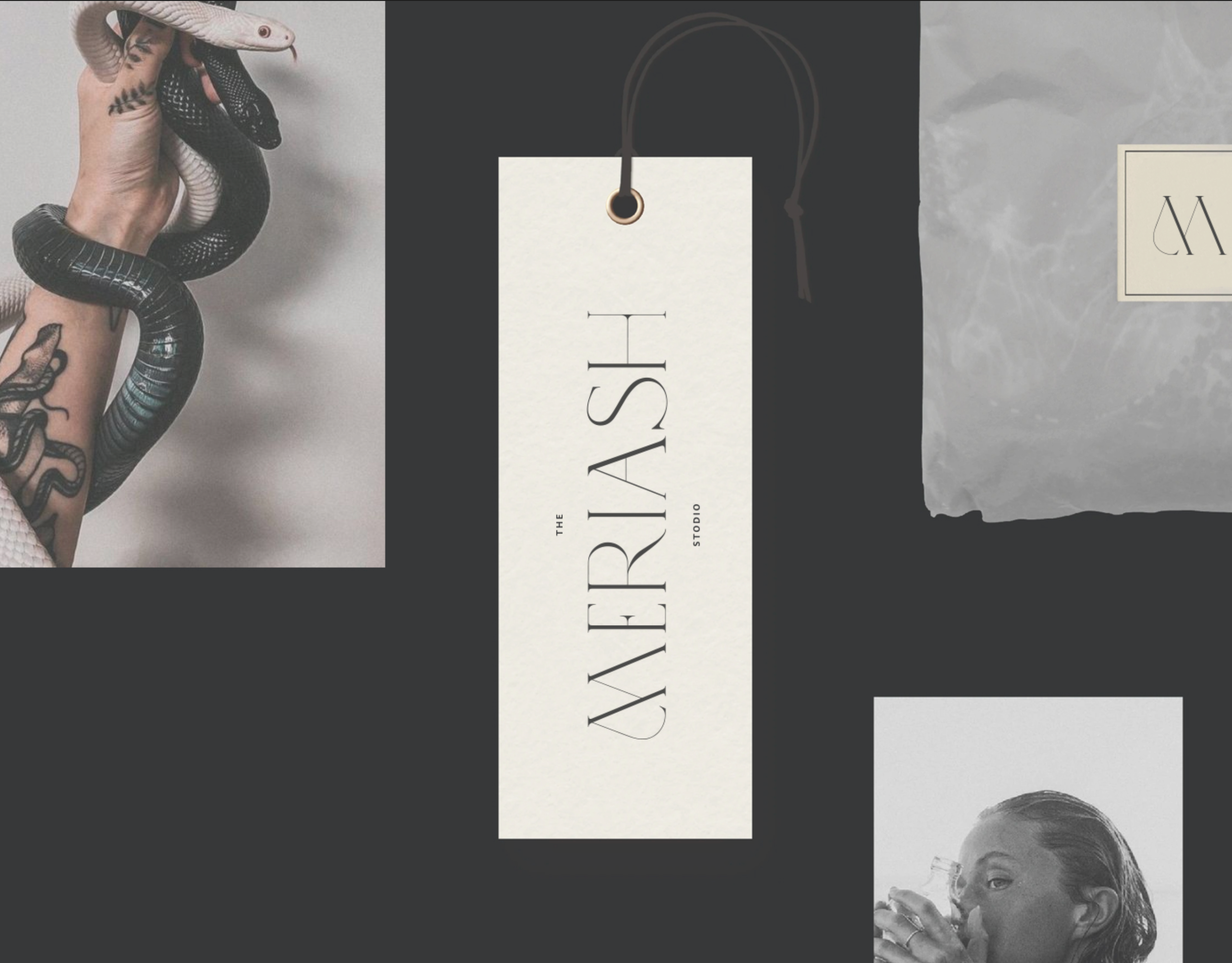
Meriash Logotype
Logotype for fashion designer
MERIASH is an intimate and small young brand that engraves on its banner creative, enchanted and mysterious worlds through which unique clothing items with a distinct design language are created. There is a range of complexity in the same breath - from the most commercial items to the highly invested items. The quantities are not significant.
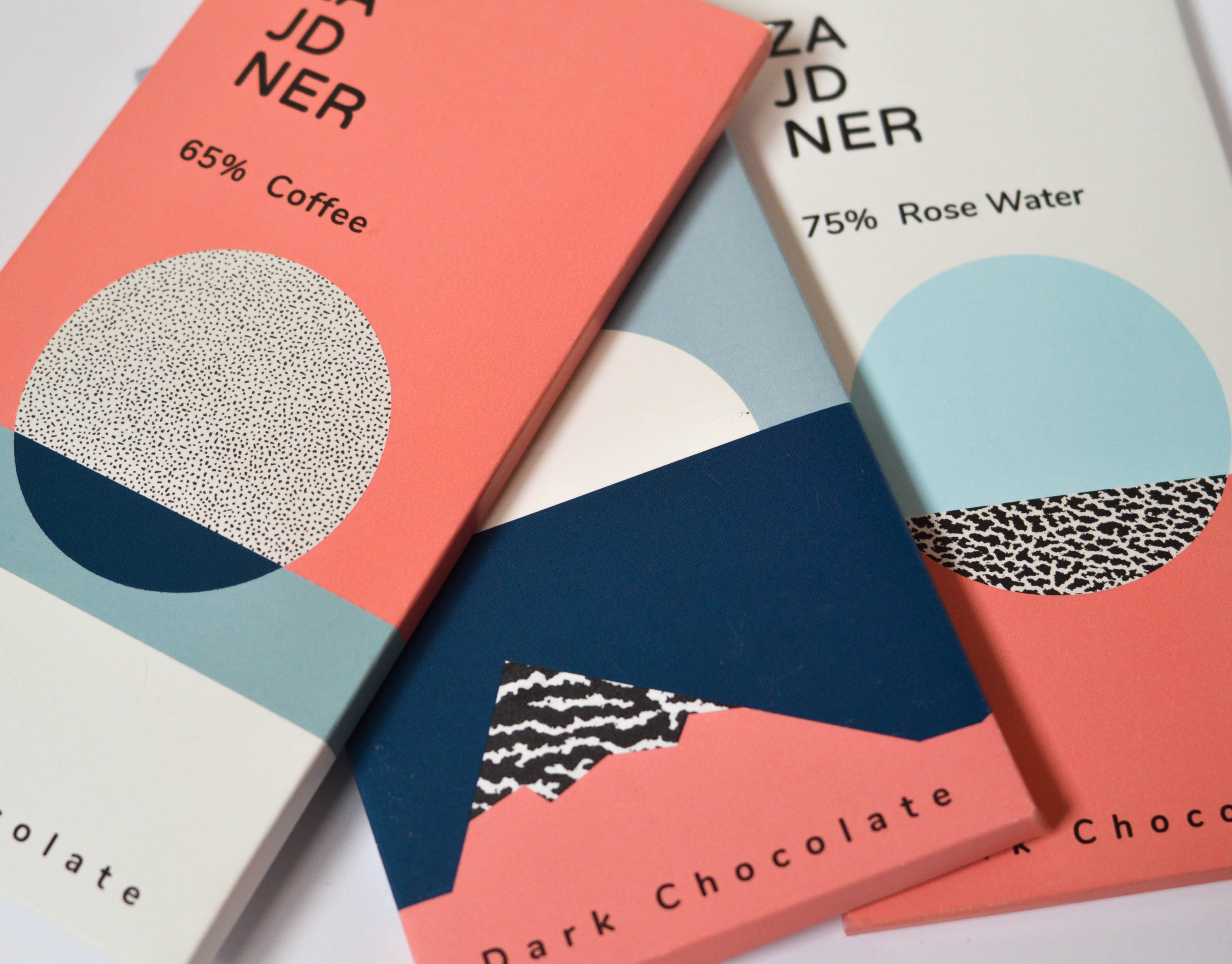
Diamonds chocolate
The journey of chocolate, from seed to finished product, reminded me of the way rocks are formed over time. Both begin as raw materials from nature and transform into something refined, rich, and full of character.
Inspired by this parallel, I designed a chocolate package that draws on geological textures and a desert-inspired color palette. The use of organic, abstract shapes reflects the wildness and unpredictability of natural formation processes.
To give the packaging a postcard-like feel, I incorporated rock textures and added information about various global mines on the back – creating a sensory and narrative-rich unboxing experience that connects the product to the earth it came from.
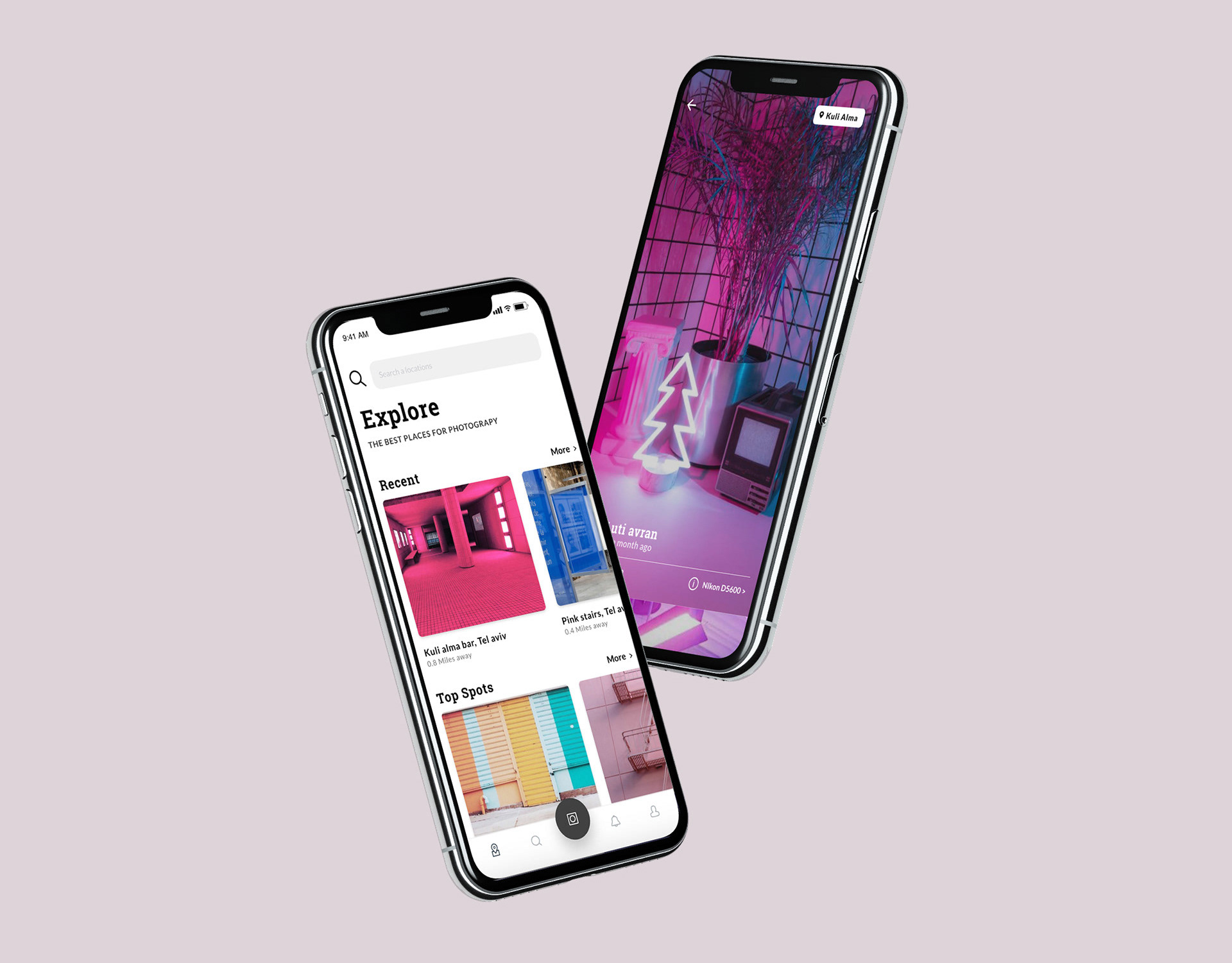
Spotip
SPOTIP is a platform designed for photographers seeking the perfect spot – near or far – to capture their next shot.
The app helps users discover beautiful, photogenic locations, tailored to their interests through a smart search engine with category filters.
Each location includes detailed info: recommended gear, time of day, and tips from other photographers who have already been there – along with sample photos for inspiration.
Once users explore a location, they’re invited to contribute: share new places, upload their photos, and become part of a global photography community.
A premium tier unlocks exclusive features: access to remote or restricted spots, offline saving, photography lectures, and advanced gear recommendations – all designed to help photographers capture the perfect moment, every time.
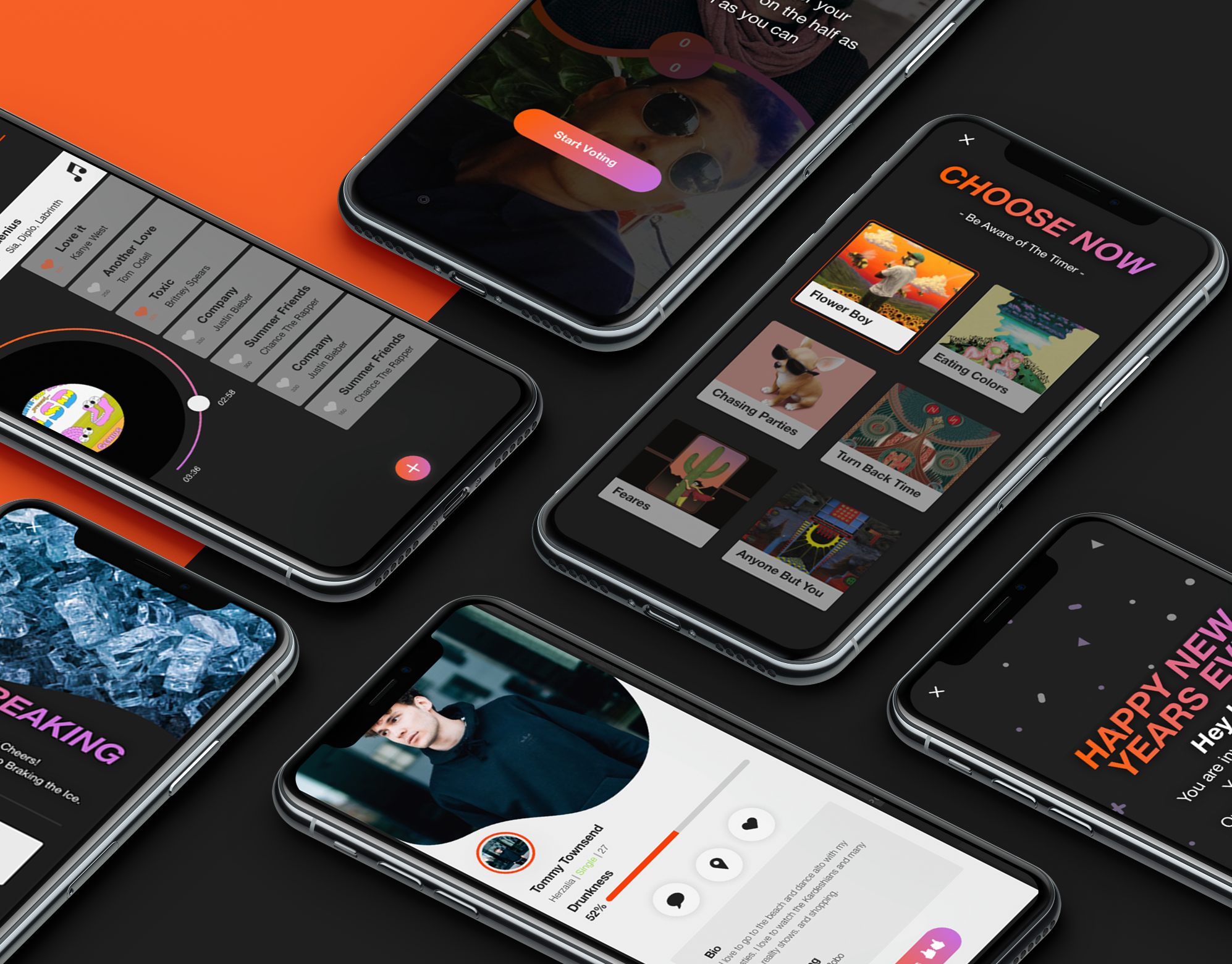
Screenshot
Screenshot is an interactive bar application, The app combines the experience of going out to a bar in synchronization between the smartphone and the visitor's activity in the bar. The bar is surrounded by screens that dynamically present what is going on in live broadcast. Through the application, the user stays up to date, constantly exposed to new experiences and acquaintances, can order food and drinks and be in the whole partner experience, in exchange for participation, the bar rewards the customers constantly.
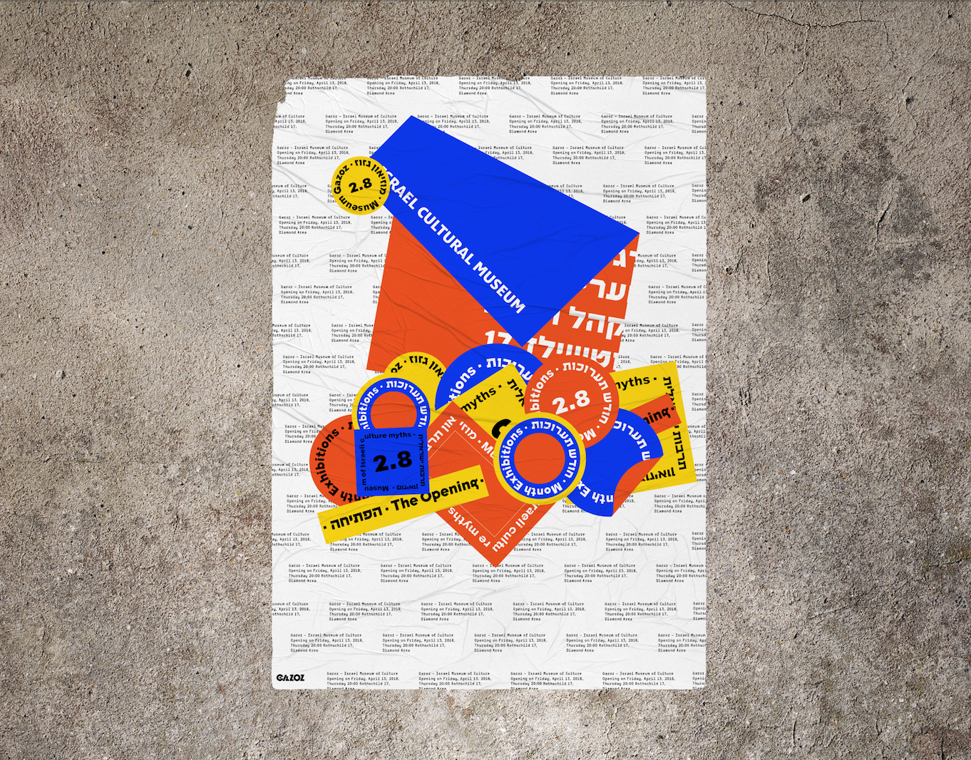
Gazoz israeli museum
Branding of "Gazoz Museum of Israeli culture"
The colors used are of the Mediterranean sands, sea, and sun.
I was inspired by the amount of stickers that vary, represent and express, the multitude of cultural connections in Israel.
My design is based on the informative, somewhat boring and mundane side of the Museum in contrast of the sassy, unpretentious Israeli side that's glued on layers and layers of different views and expressive ideas.
I chose a naked cement wall that in my view symbolizes true and hard israeliness.
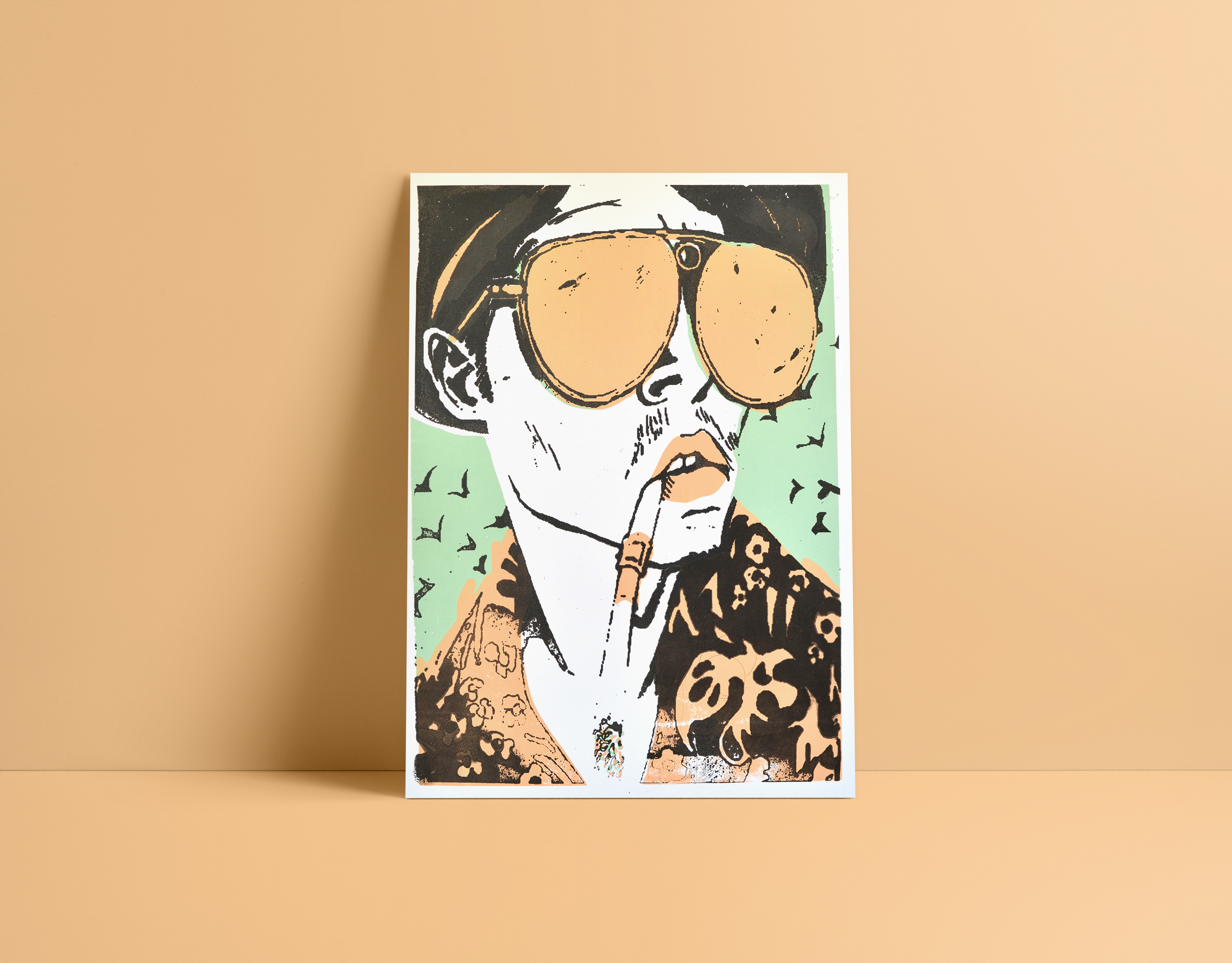
Silk print
Silk screen printing.
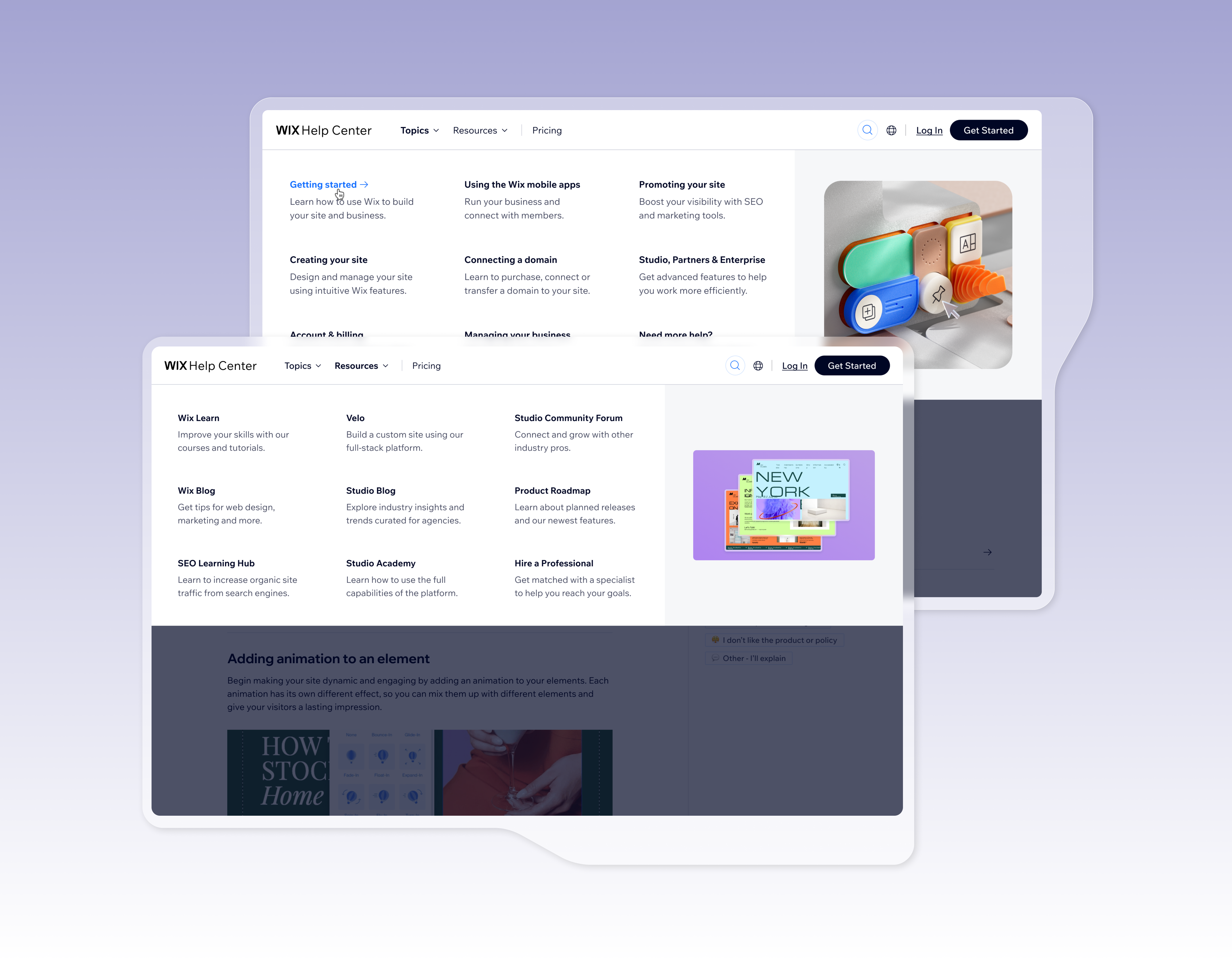
Help center header
The Wix Help Center used to inherit the global Wix.com header. This created several problems: it took up too much space, included irrelevant links, wasn’t aligned with support best practices, and we had no control over its content or data. The goal was to design a dedicated, independent header tailored for support, aligned with industry standards, and optimized for Help Center users.
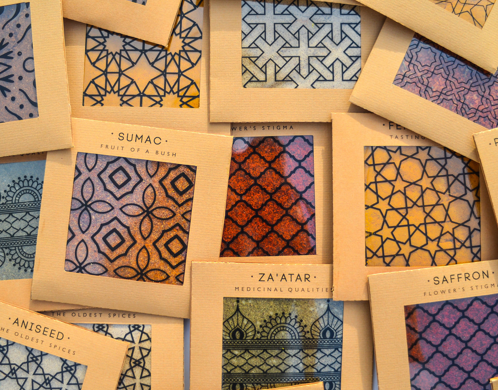
Spicy middle east
While working at a startup, I fell in love with sticky notes – their bold colors, versatility, and the creative energy they bring. Inspired by that spirit, I designed a spice packaging system that channels the startup vibe through color, shape, and tone.
The packaging mimics the square, lean format of sticky notes – compact and practical. A transparent window lets the natural colors of the spices shine through, acting as both a functional element and a vibrant design feature.
I explored Middle Eastern patterns, matching each spice with a mood and motif: the hotter the spice, the bolder the pattern.
Materials are compostable and eco-friendly, with a neutral brown base that emphasizes the natural beauty of the contents.
Just like sticky notes, these packages are made to stick anywhere in your kitchen – turning it into a colorful, expressive space inspired by the land they came from.
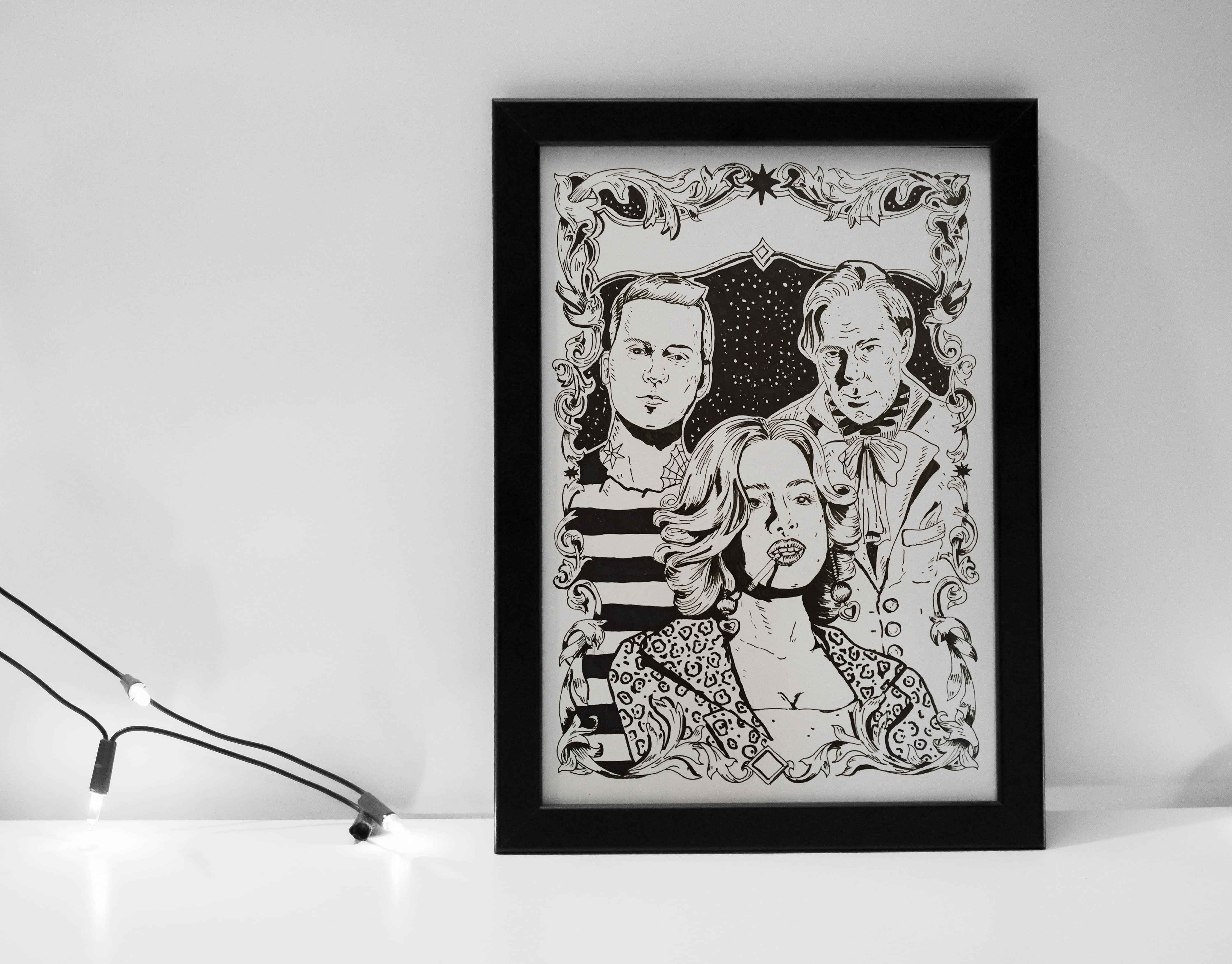
Drawing
poster story that i draw to a project.