Pablo escobar
Poster, postcard and cigar as an icon called ׳Pablo Escobar׳. The design plays with the colors of black and white, In all aspects and represents both sides of Escobar. On one hand, the evil personality, and on the other hand the one who supports the poor people. The guns are like the wings of angels.
Typography course, Shenkar College, first year / 2017.
guidance: Avner haberfeld
More
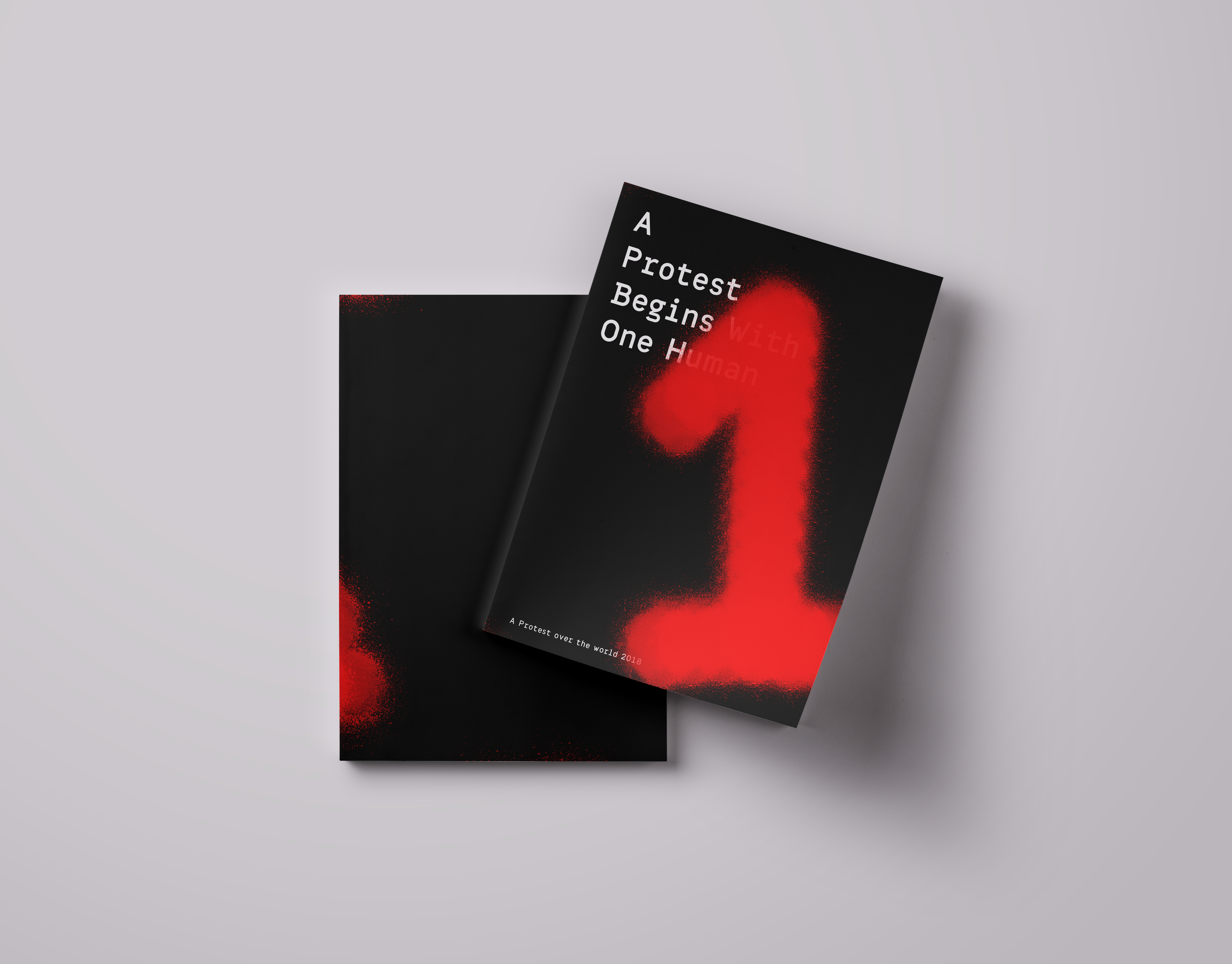
Protest catalog
A protest Begin with one human
this is a catalog dealing with protests.
the catalog is an introduction to the term "protest". The many different shades and layers this term contains.
The catalog engages in a trial to see the many shades and layers of the word from the visual point of view.
The colors that are bound together on the different billboards exposed in protests.
The end focuses on the contrast between the individual as to the masses in a composition.
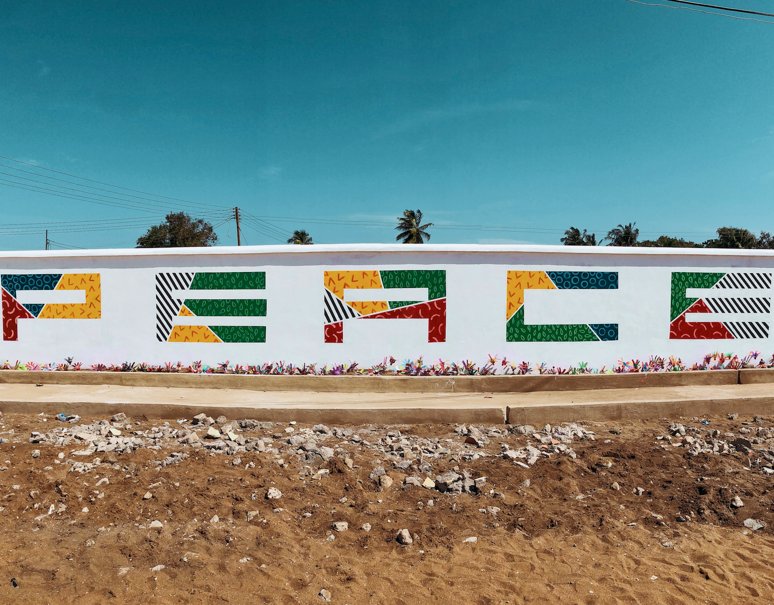
Africa
During a humanitarian expedition to Ghana, I took part in renovating a local school and orphanage.
As part of the project, I created a 30x3 meter mural on the school’s wall, reflecting the school’s core value: PEACE.
The artwork was developed in collaboration with the local community and aims to bring hope, color, and meaning to the everyday environment of the children.
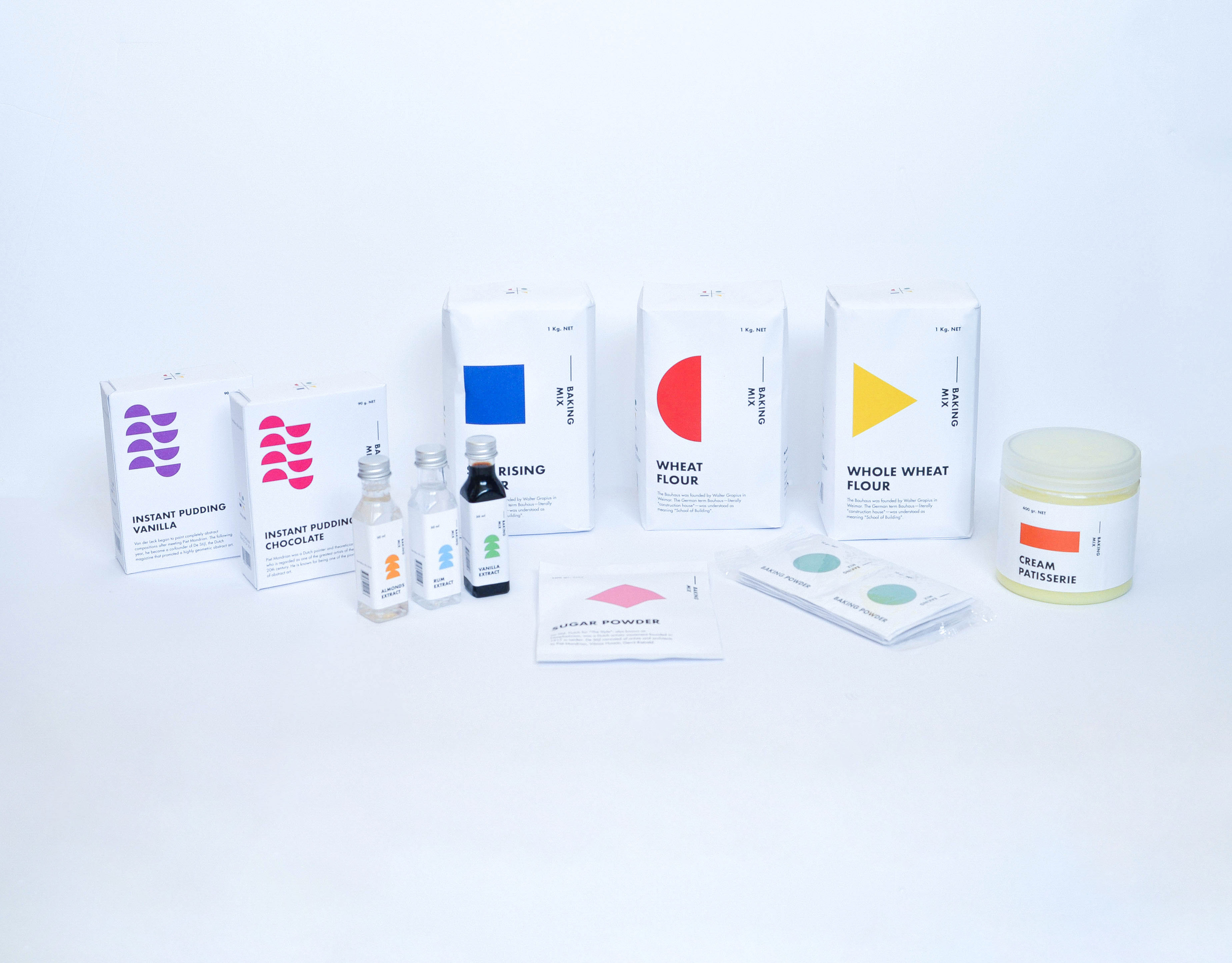
Baking packaging
Baking Products being a very basic substance. I compared it to Art. Any being can make art, as any being can create something as basic from baking products. I chose the Bauhaus era. A time that was identified with basic colors and shapes, including the font that was identified and used at that time. Various products have added printed informative knowledge at this time. Vertical and Horizontal graphic art was common use during those years. The topography was all designed and based on these shapes. Each color represents a product with a different flavor and Each shape represents a family group. The shape changes its form as the product becomes more complex. My starting point was the Wheat, flour group. I branched out from that starting point creating a language.
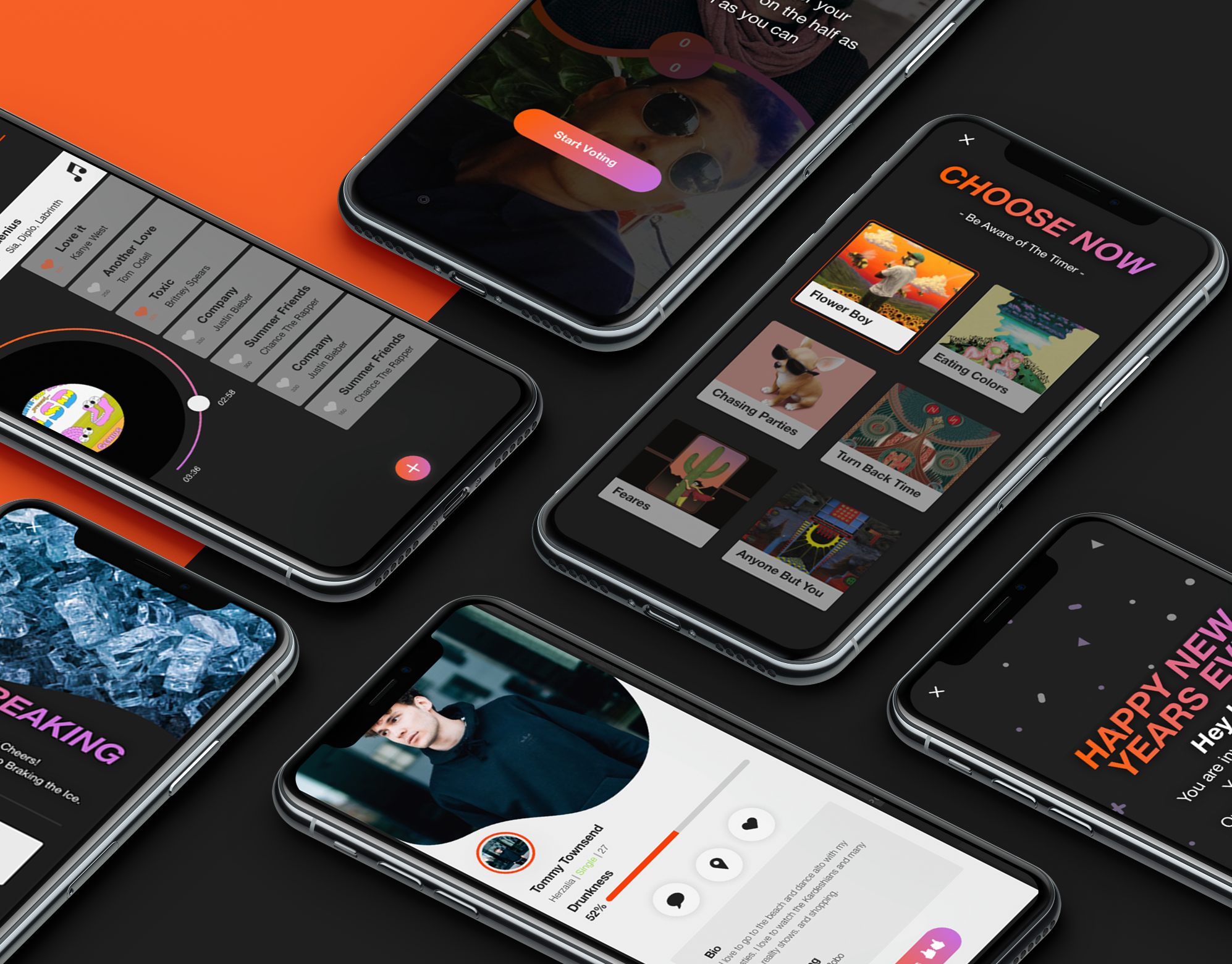
Screenshot
Screenshot is an interactive bar application, The app combines the experience of going out to a bar in synchronization between the smartphone and the visitor's activity in the bar. The bar is surrounded by screens that dynamically present what is going on in live broadcast. Through the application, the user stays up to date, constantly exposed to new experiences and acquaintances, can order food and drinks and be in the whole partner experience, in exchange for participation, the bar rewards the customers constantly.
Capsule
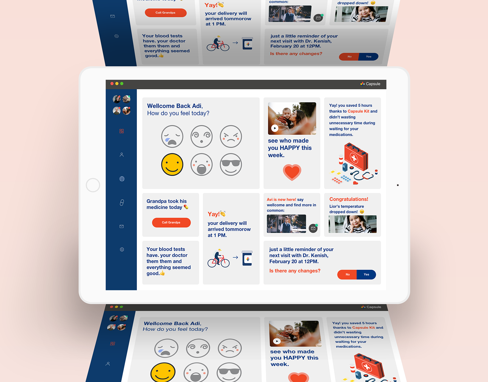
The brief was to make a particular site to a native application and refine it.
we chose the Capsule site - new kind of pharmacy, prescription delivery service, which is located in the United States, we create a simple system that summarizes all the medical events and advances that have taken place for you or your family this week, have added various features that are relevant in the world of innovative medicine. The app will recognize your health status up to the smallest details, take care of the relevant medications and also as a social community that helps you find more and more people with the same health issues and share between them treatments and medicine reviews.
Little steps
A garden in the heart of Tel Aviv with a rich, Montessori-inspired environment that fosters independence in children, hands-on learning, in a nurturing setting, tailored individually to each child's needs.

Good Intentions
A collaborative project between Shenkar’s Fashion Design Department and the Sheba Medical Center’s Rehabilitation Department for war-injured soldiers.
Twelve fashion students worked closely with twelve wounded soldiers, each with unique physical challenges and personal stories, to co-design adaptive, fashionable garments that promote independence and dignity in everyday life.
The process was rooted in design thinking, with occupational therapists guiding the students to create solutions such as magnetic closures, garments compatible with medical braces, and custom features like pockets for white canes.
Beyond aesthetics, the project explored how fashion can be a tool for healing, empowerment, and inclusion.
Maia Arazi, Tamar Mani, Helen Sofrin // Shenkar; Esti Neuhar, occupational therapist// Sheba Medical Center; Dana dariel, Laura Zajdner // Wix.
Music 3
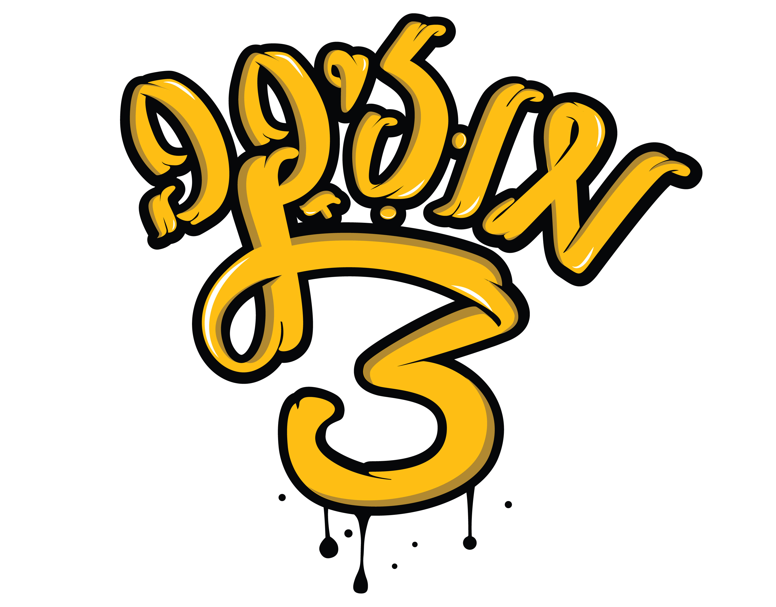
A visual identity for a music channel inspired by the evolution of rap culture and technology.
The icon set reflects three decades of sound, featuring a vinyl record (1980s), a boombox (1990s), and an iPod (2000s) – each representing how rap music was consumed and lived through the years.
The logotype and icons combine bold rhythm and nostalgic references to express the channel’s dynamic voice.
Cartel Font
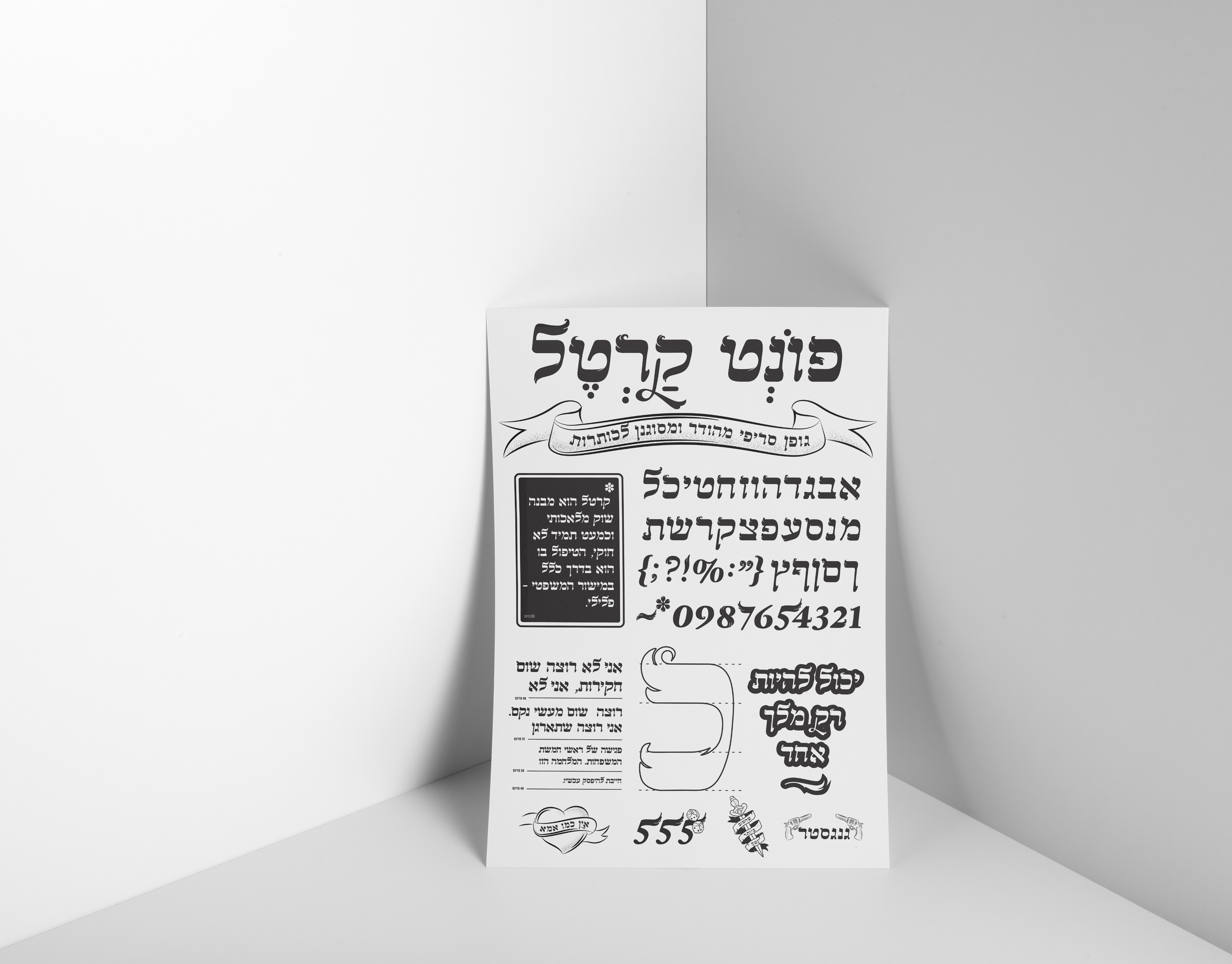
A Hebrew font course which includes all the symbols and numbers.
I inspired by a biblical old logo I saw, And from there the font developed.
clippy
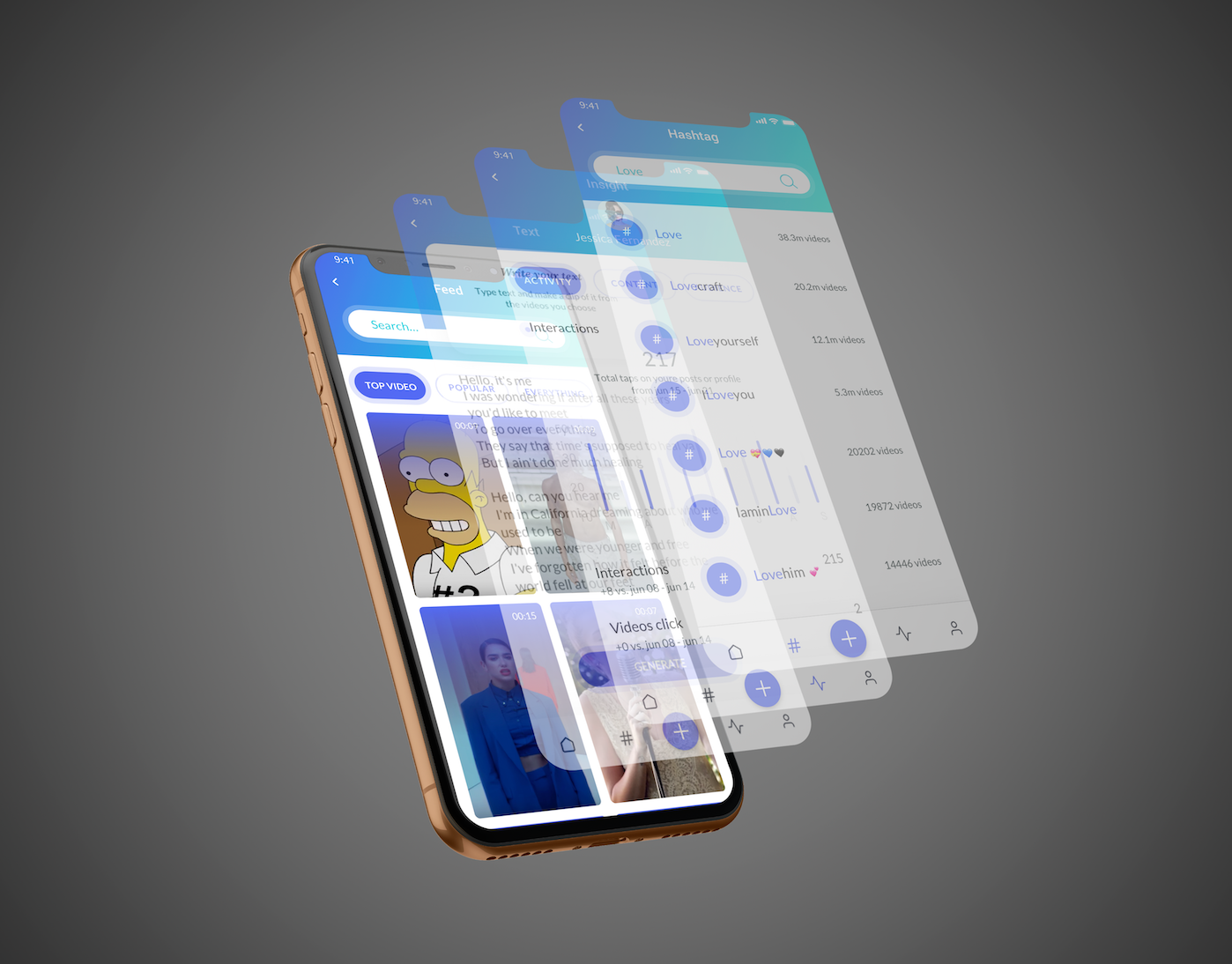
Clippy is a platform a social network that 's based on video realms and creates
clips that personally coordinate word connections to videos.