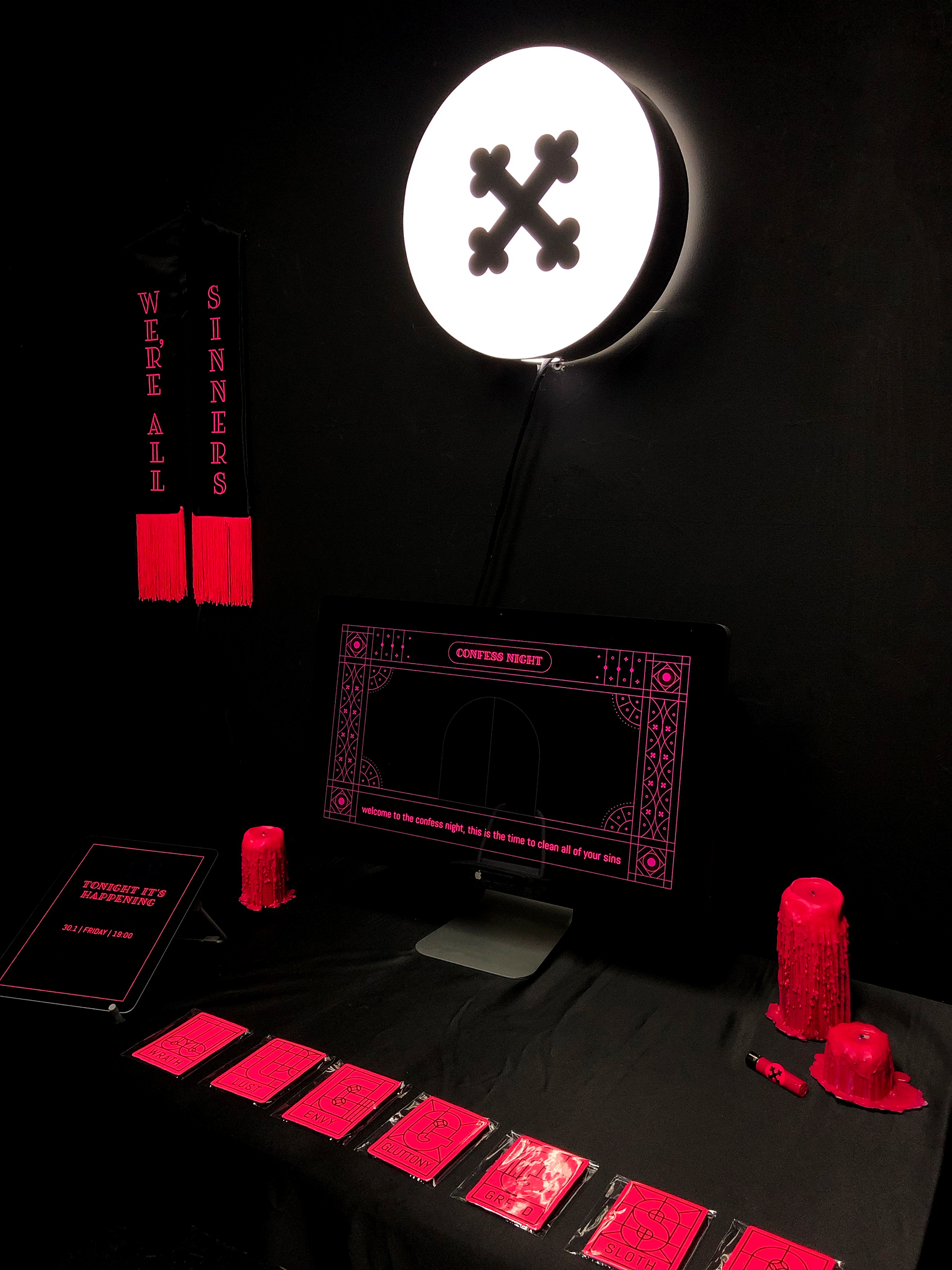
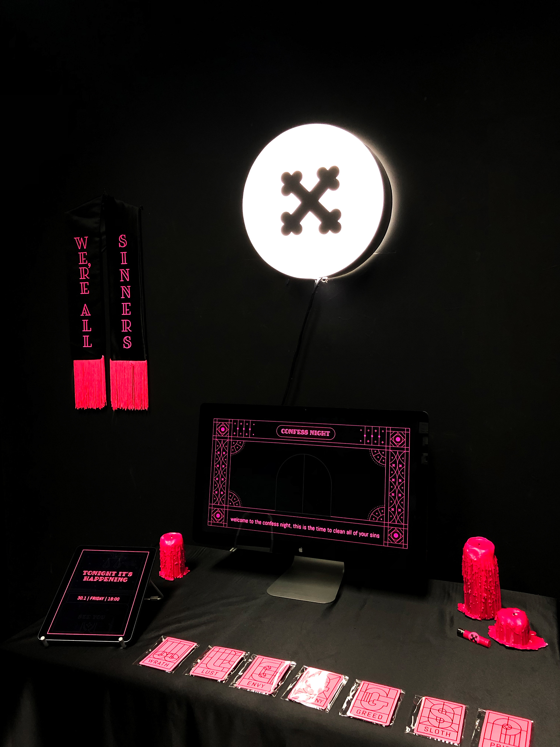
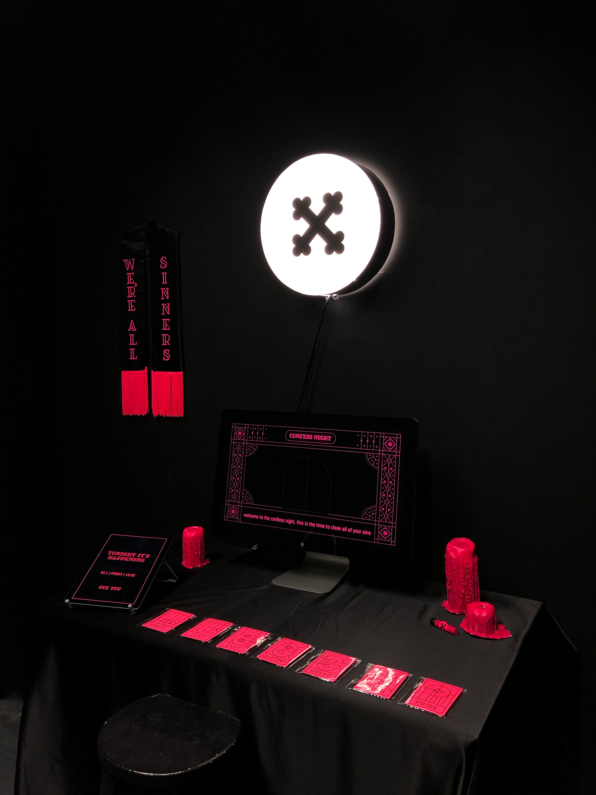
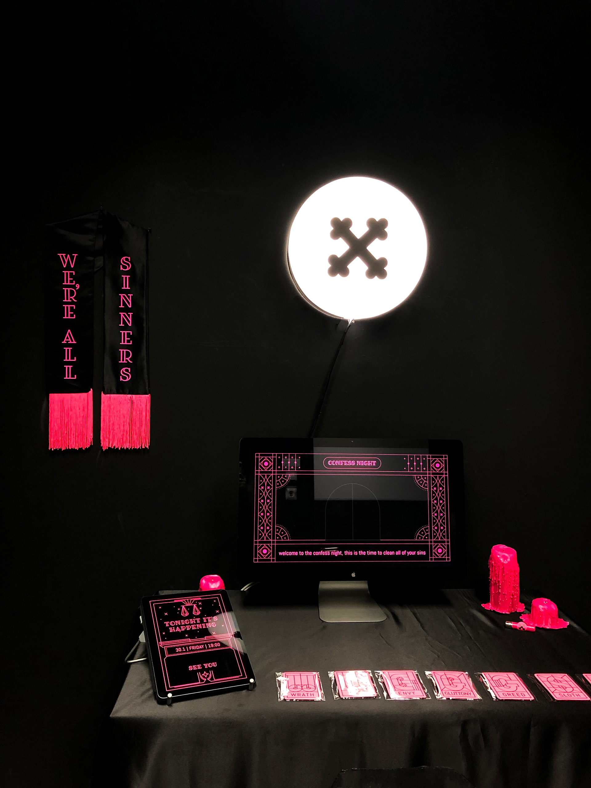
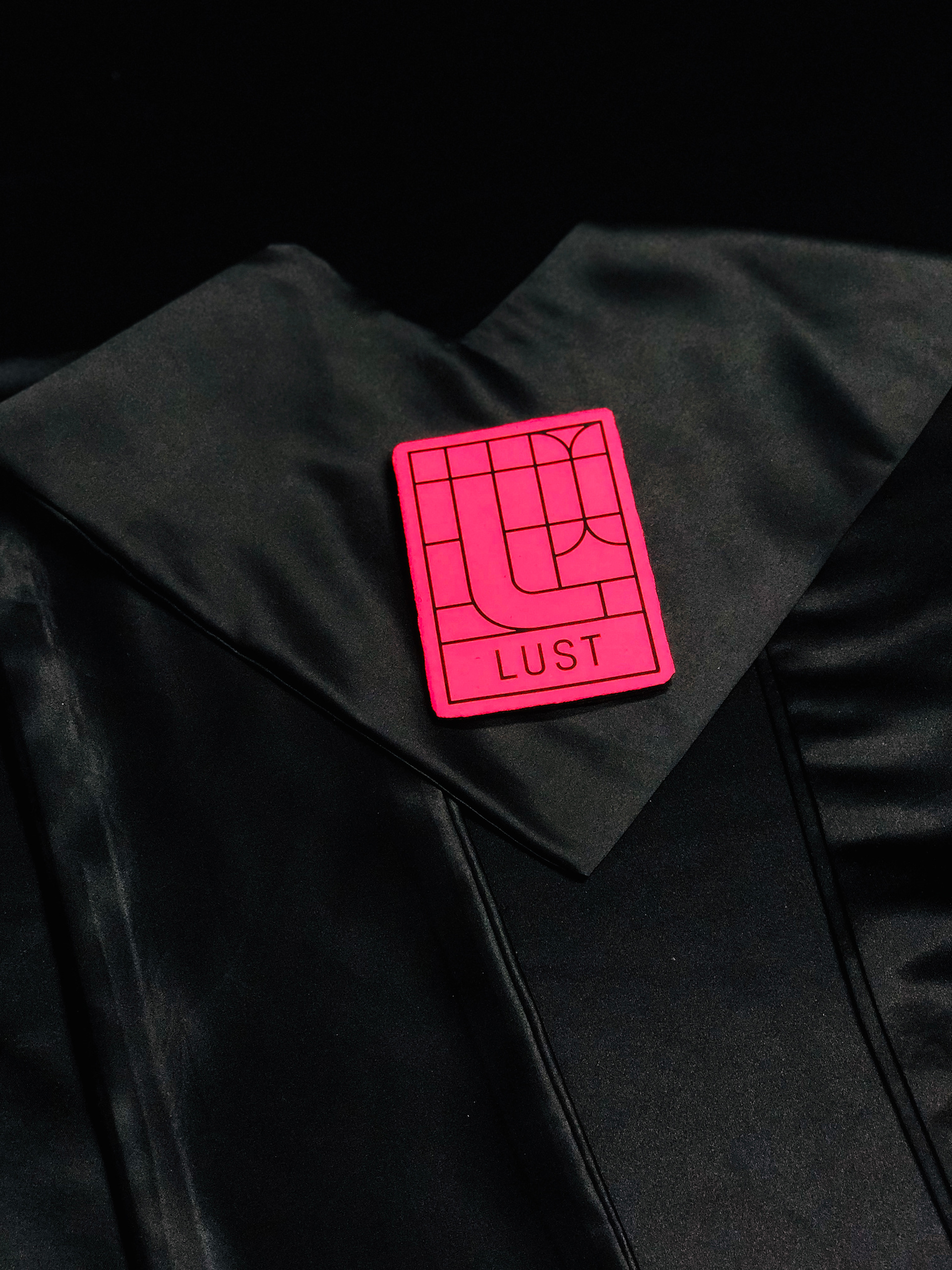
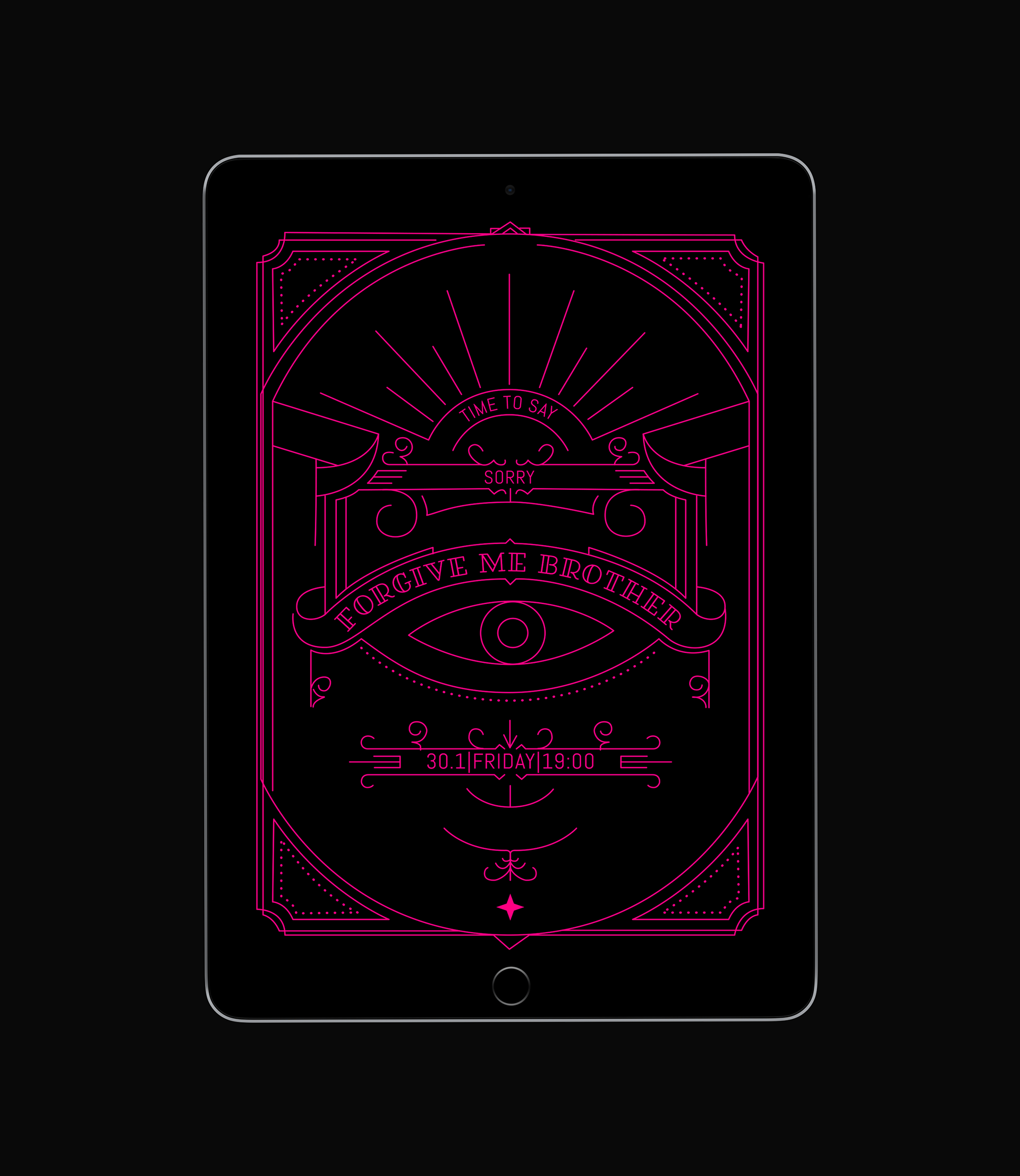
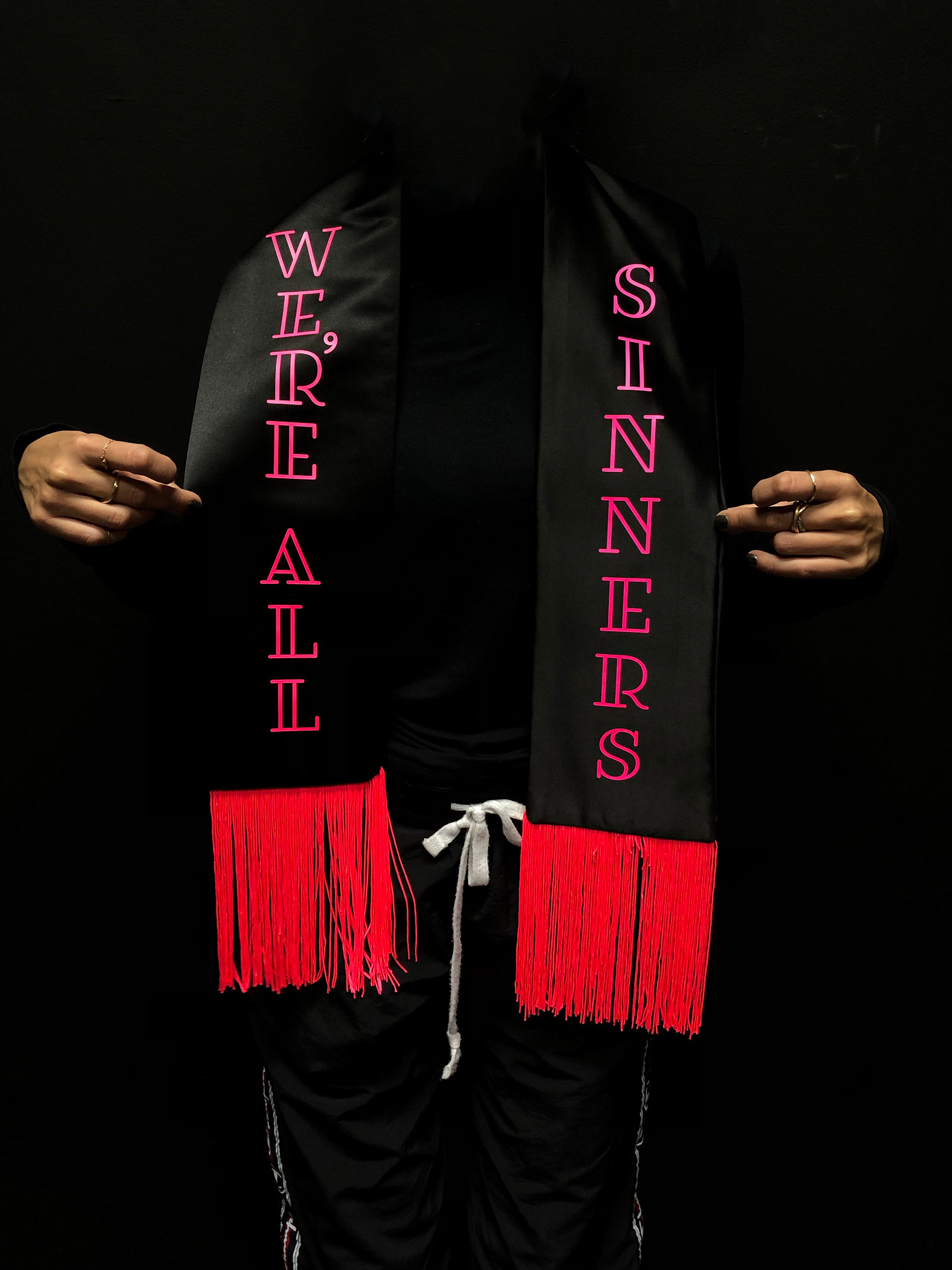
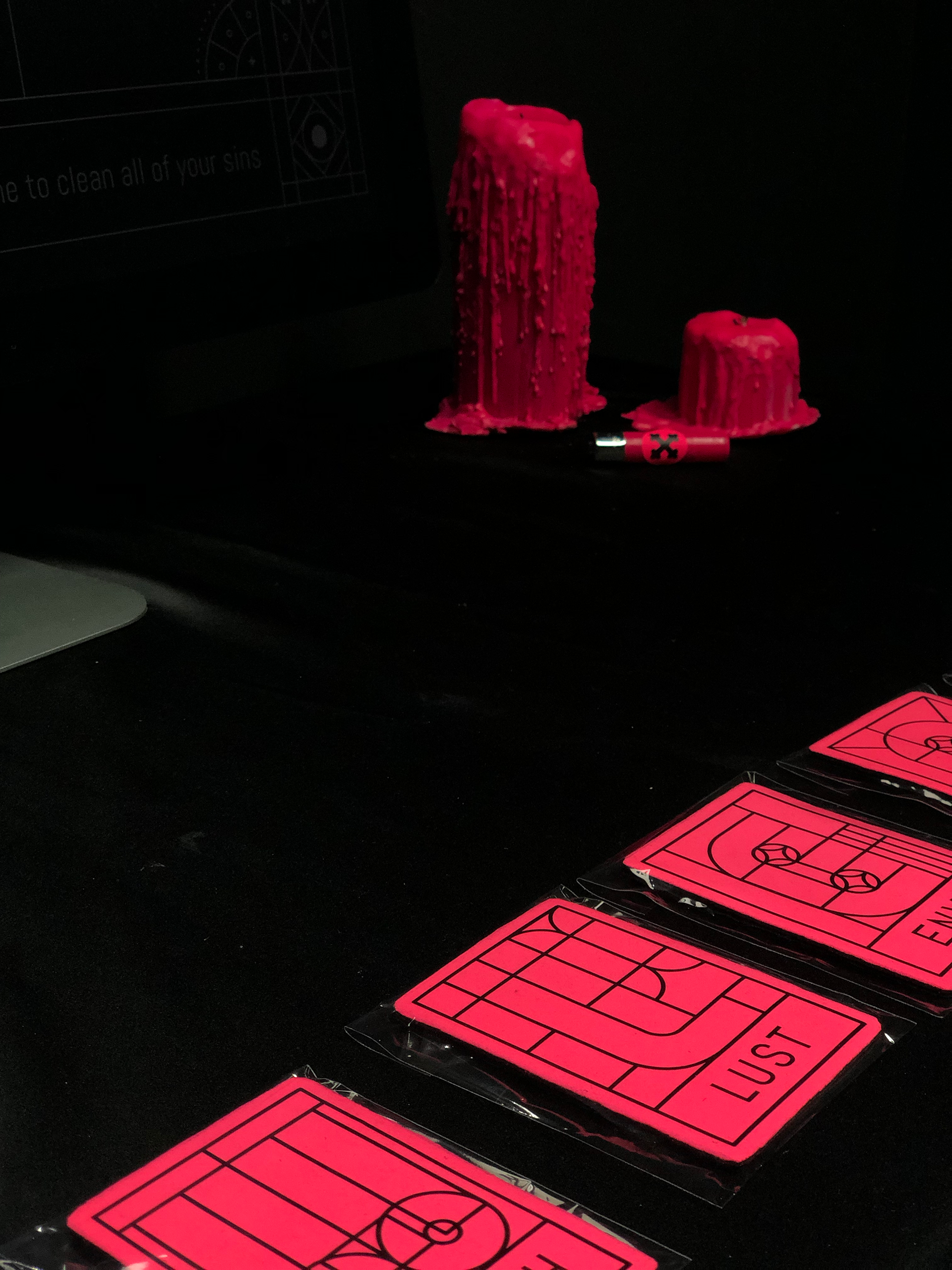
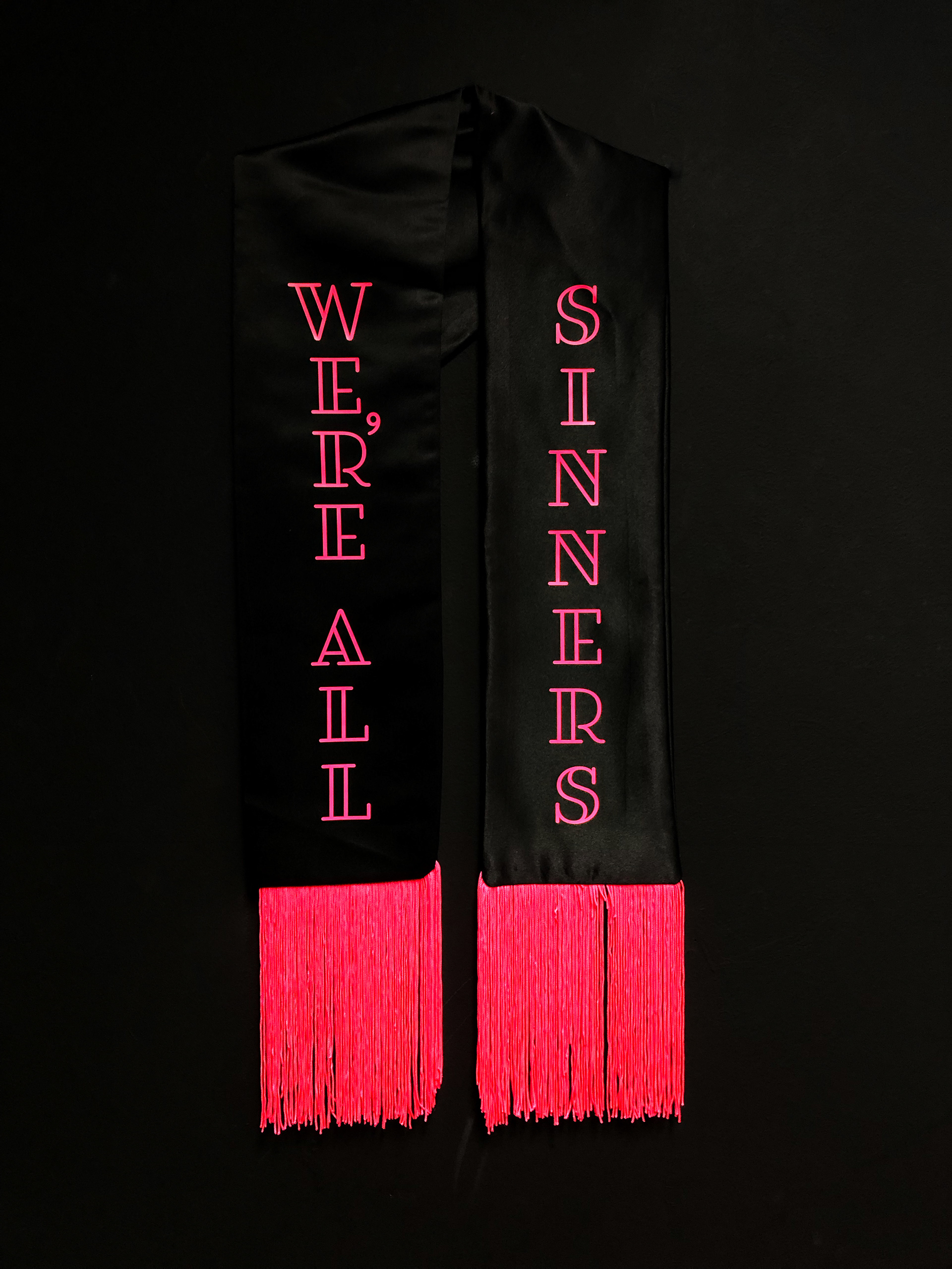
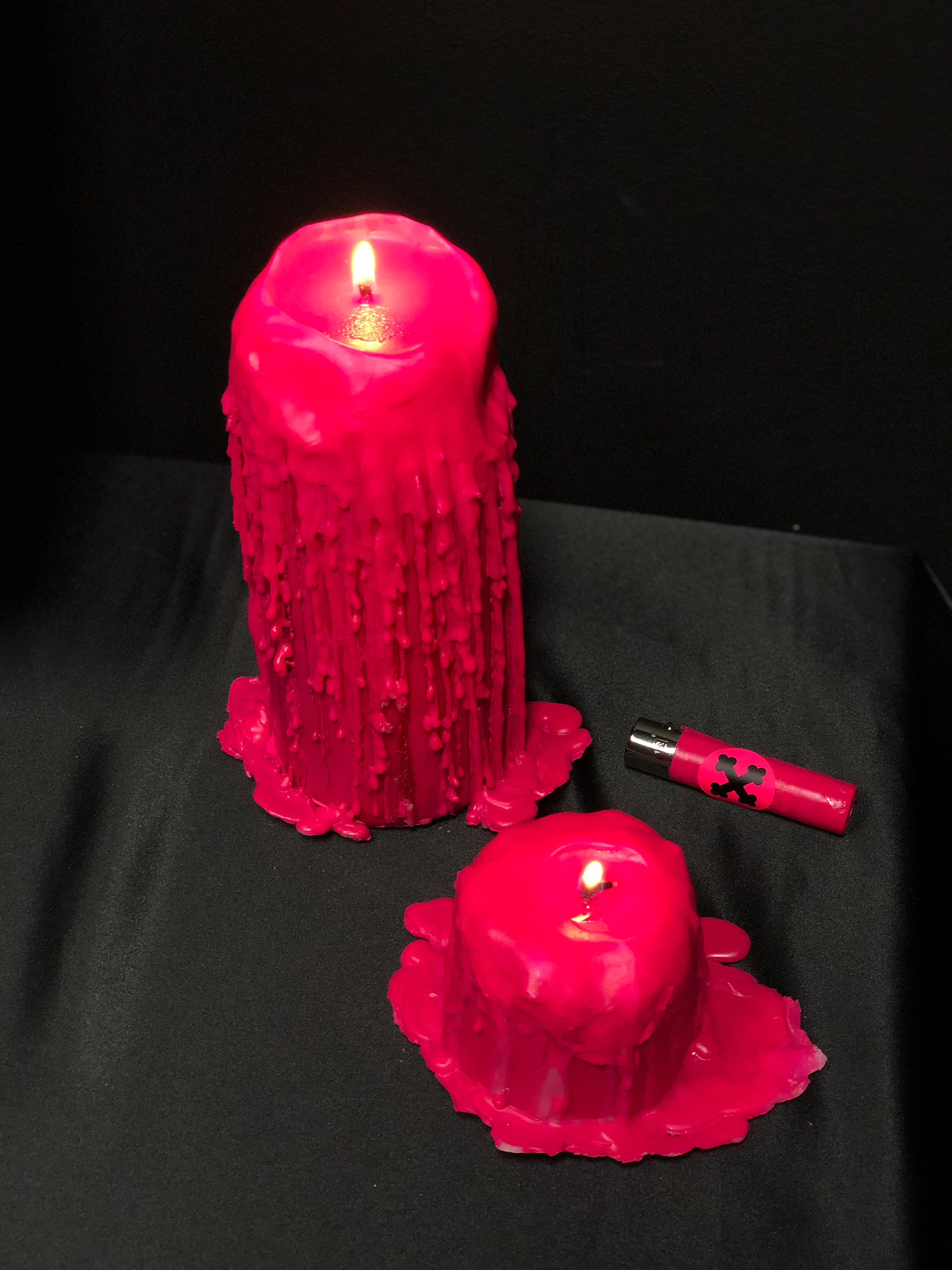
More

Pink skull
Image making pink skull & cactus.
Logos
Some of the logos that I made
La grande dame
soap bracelets that inspired by The Moroccan desert.
Baking packaging
Baking Products being a very basic substance. I compared it to Art. Any being can make art, as any being can create something as basic from baking products. I chose the Bauhaus era. A time that was identified with basic colors and shapes, including the font that was identified and used at that time. Various products have added printed informative knowledge at this time. Vertical and Horizontal graphic art was common use during those years. The topography was all designed and based on these shapes. Each color represents a product with a different flavor and Each shape represents a family group. The shape changes its form as the product becomes more complex. My starting point was the Wheat, flour group. I branched out from that starting point creating a language.
Pablo escobar
Poster, postcard and cigar as an icon called ׳Pablo Escobar׳. The design plays with the colors of black and white, In all aspects and represents both sides of Escobar. On one hand, the evil personality, and on the other hand the one who supports the poor people. The guns are like the wings of angels.
Contemporary Art Website
The site showcases famous contemporary art works from around the world and provides information about the artists behind the scenes. It also features articles regarding issues in the art world, while trying to immerse the viewer in the exciting world of contemporary art.
Gender
An advertisement that simulates the state of wage gaps between men and women in Israel.
Spicy middle east
Working for a startup company is where i fell in love with sticky notes. Their colorfulness, their versatility, and the statement they make. So i chose to design my spice package with inspiration from my sticky friends, and their startup vibe. . I investigated. At first, I researched the shape of the sticky notes. They are square and and an easy size for writing, they are lean, like a startup. secondly, I wanted the colors to show through, so I created a window through which the package naturally reflects the vibrant colors of the spices. Lastly, I researched the world of middle eastern patterns and tried to match the colors and atmosphere to that of each spice. A very hot spice would reflect a much livelier pattern. ​ For the package’s material I chose a compostable, eco-friendly cardboard, representative of the middle eastern culture and land. The package’s color is a neutral brown to accentuate the spice’s natural colors. The packages will stick anywhere in your kitchen, and turn it as lively and as vivid as the middle eastern they were inspired from.
Capsule
The brief was to make a particular site to a native application and refine it. we chose the Capsule site - new kind of pharmacy, prescription delivery service, which is located in the United States, we create a simple system that summarizes all the medical events and advances that have taken place for you or your family this week, have added various features that are relevant in the world of innovative medicine. The app will recognize your health status up to the smallest details, take care of the relevant medications and also as a social community that helps you find more and more people with the same health issues and share between them treatments and medicine reviews.
Screenshot
Screenshot is an interactive bar application, The app combines the experience of going out to a bar in synchronization between the smartphone and the visitor's activity in the bar. The bar is surrounded by screens that dynamically present what is going on in live broadcast. Through the application, the user stays up to date, constantly exposed to new experiences and acquaintances, can order food and drinks and be in the whole partner experience, in exchange for participation, the bar rewards the customers constantly.
Back to Top