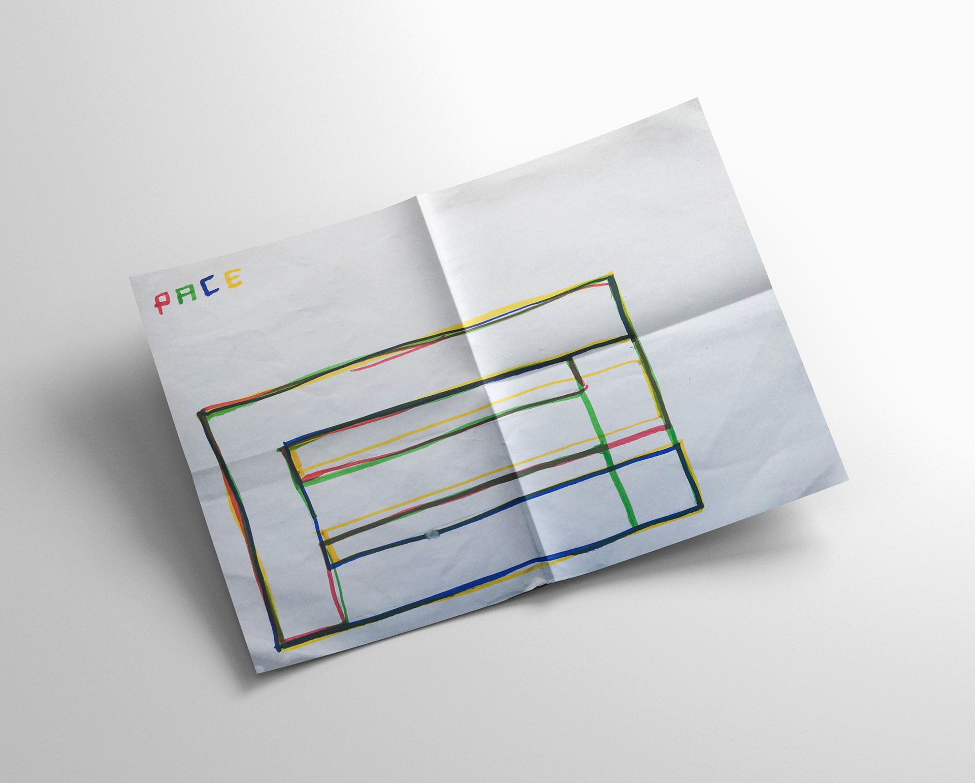
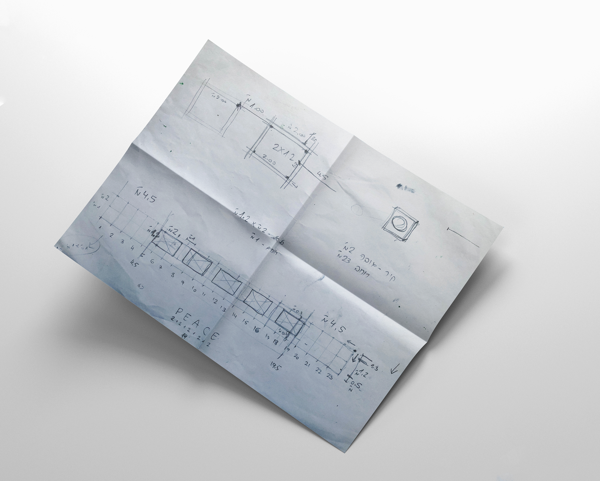
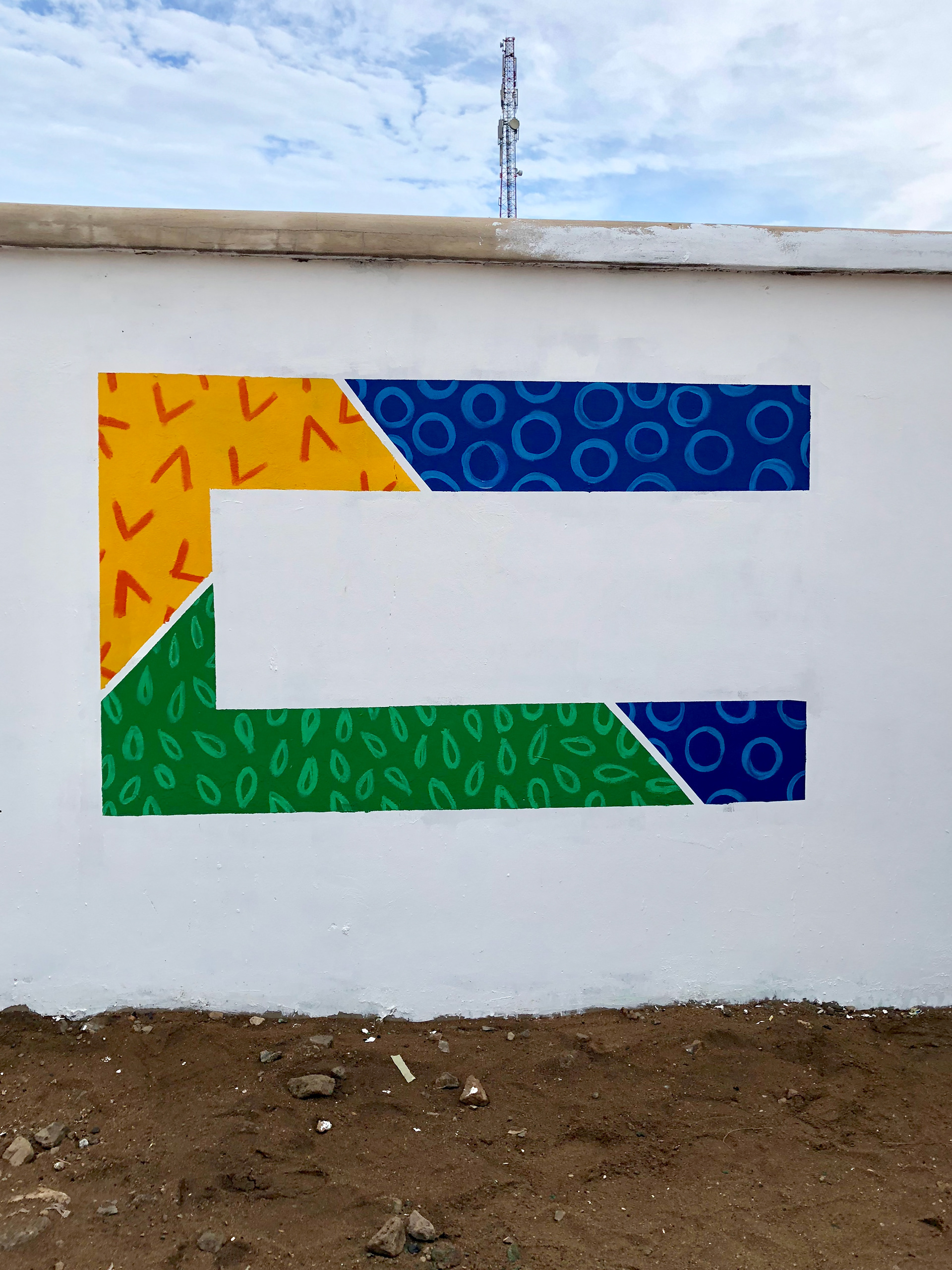
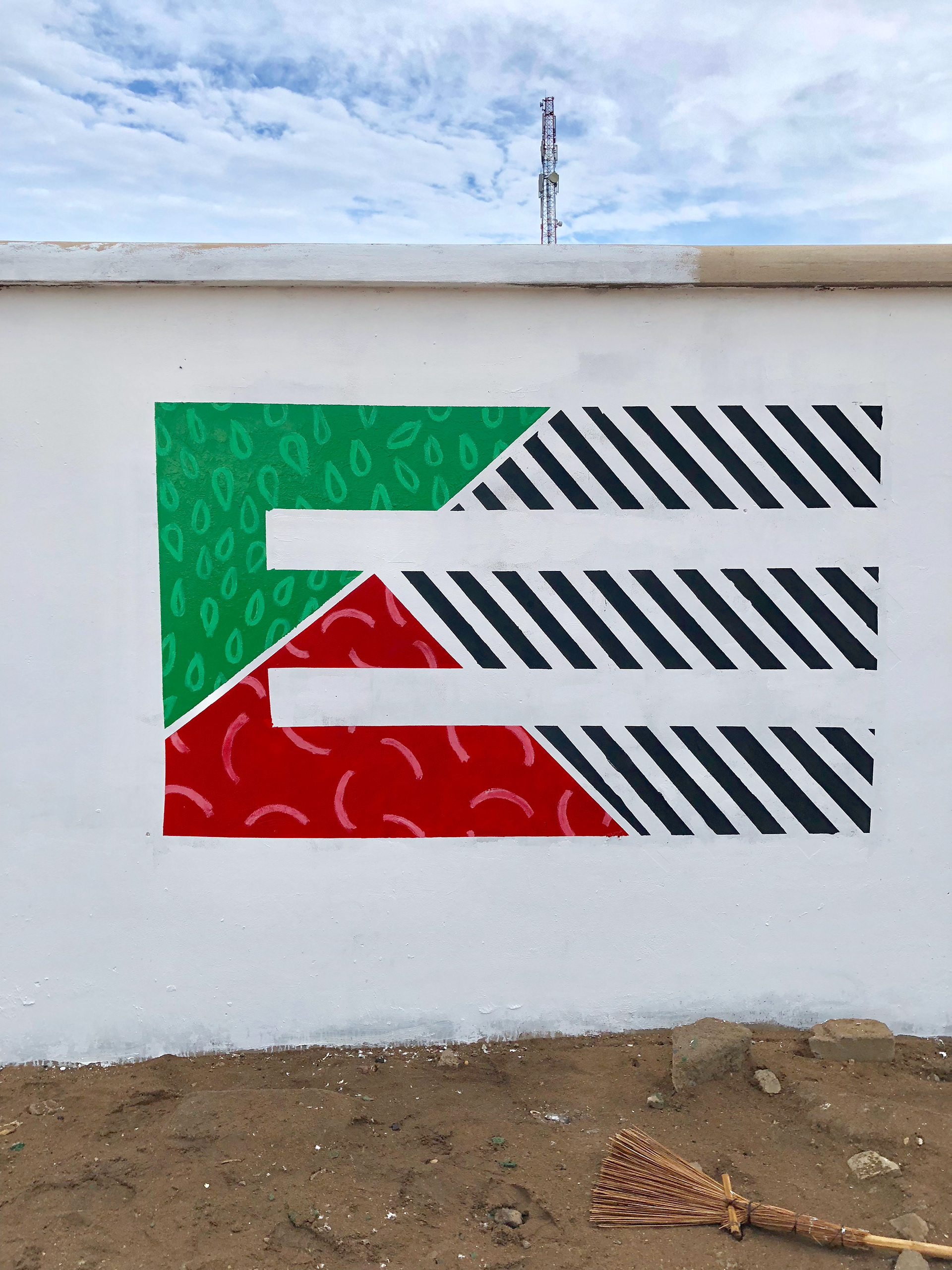
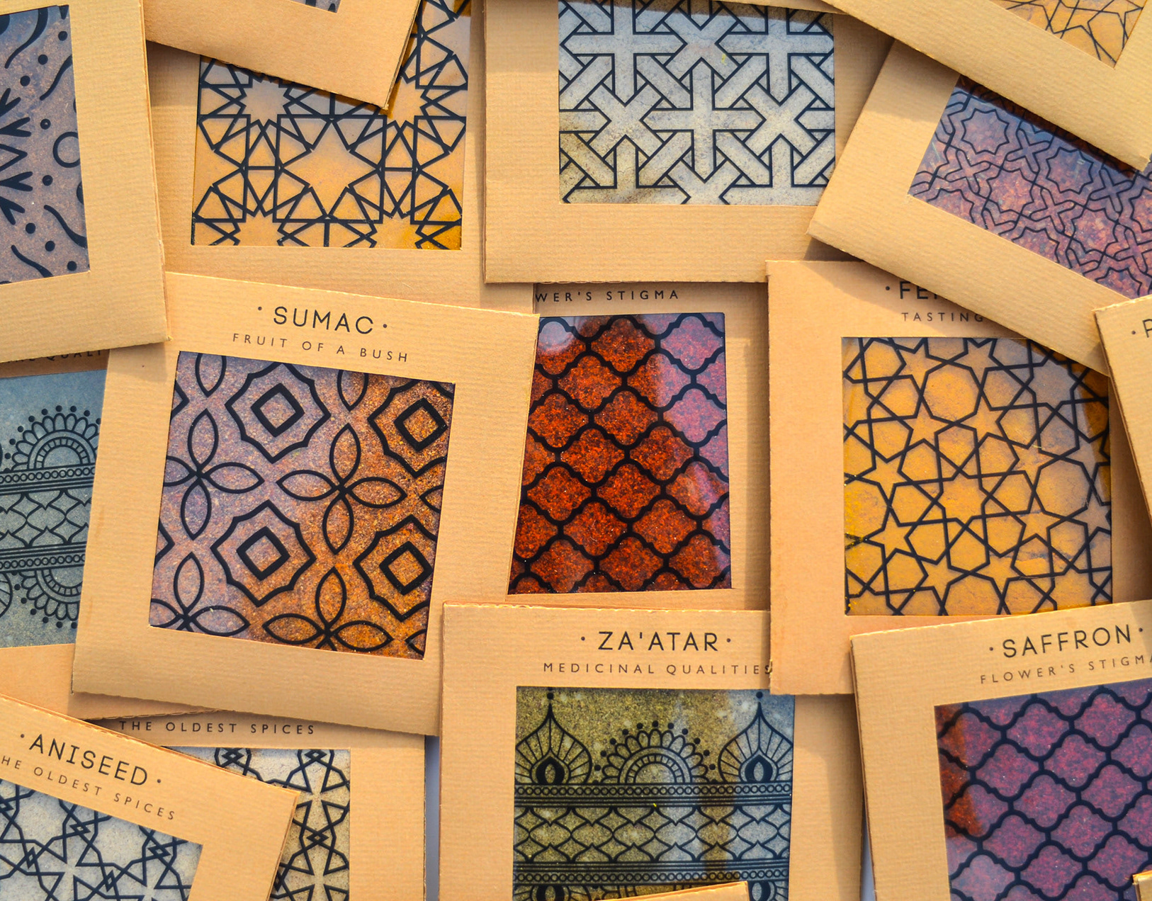
Spicy middle east
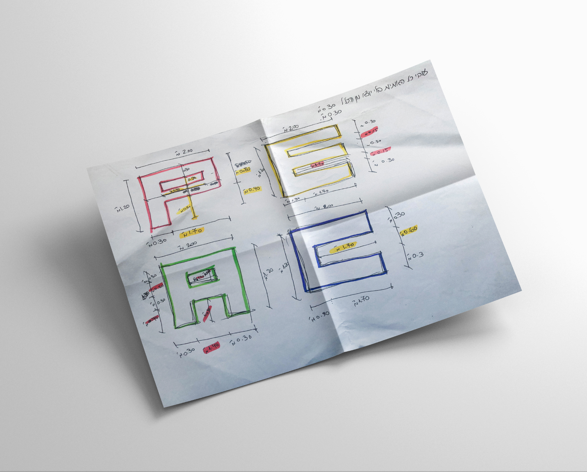
While working at a startup, I fell in love with sticky notes – their bold colors, versatility, and the creative energy they bring. Inspired by that spirit, I designed a spice packaging system that channels the startup vibe through color, shape, and tone.
The packaging mimics the square, lean format of sticky notes – compact and practical. A transparent window lets the natural colors of the spices shine through, acting as both a functional element and a vibrant design feature.
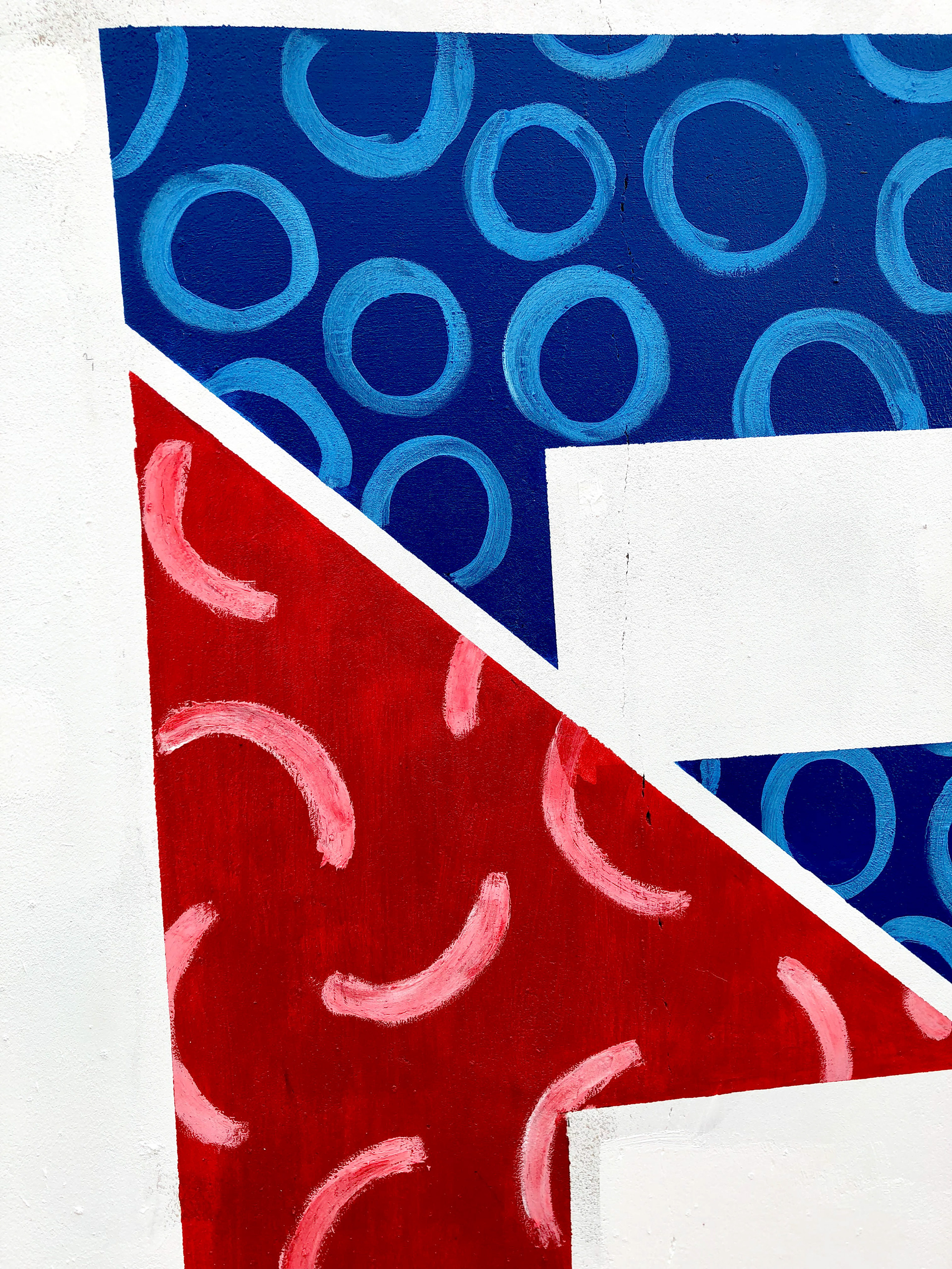
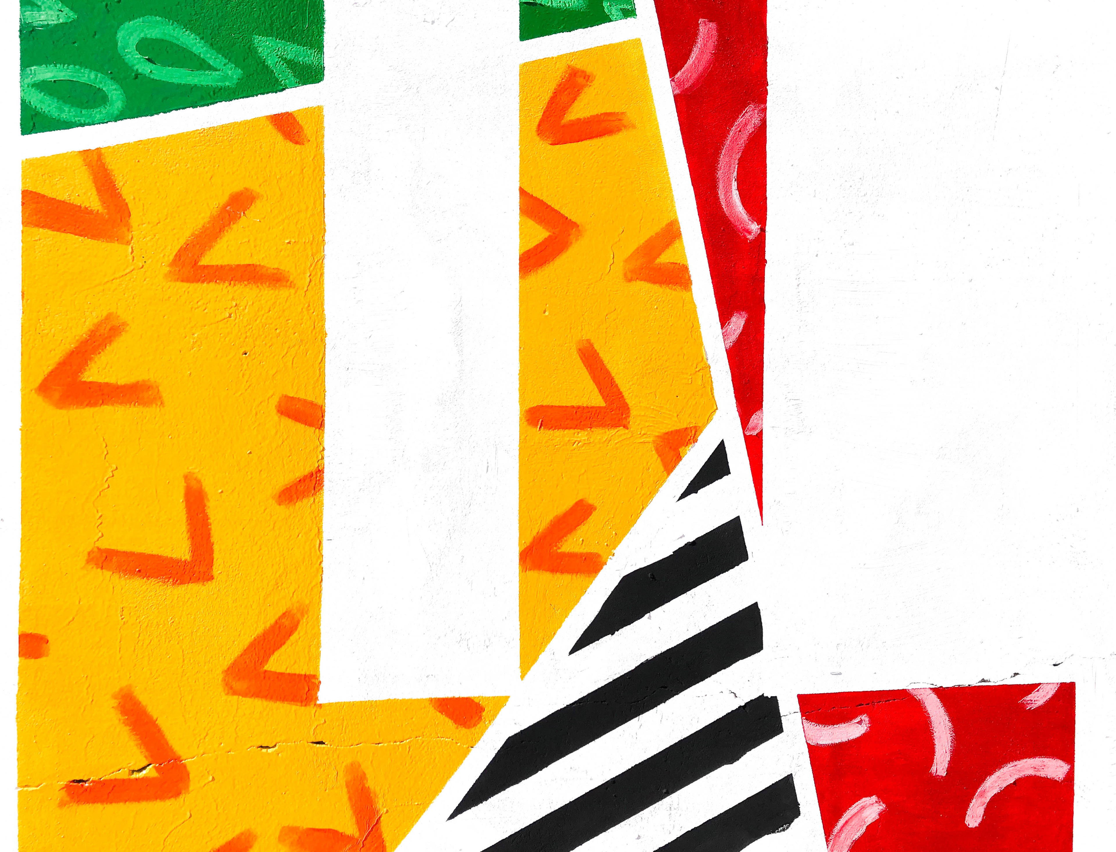
I explored Middle Eastern patterns, matching each spice with a mood and motif: the hotter the spice, the bolder the pattern.
Materials are compostable and eco-friendly, with a neutral brown base that emphasizes the natural beauty of the contents.
Just like sticky notes, these packages are made to stick anywhere in your kitchen – turning it into a colorful, expressive space inspired by the land they came from.