More

Geula
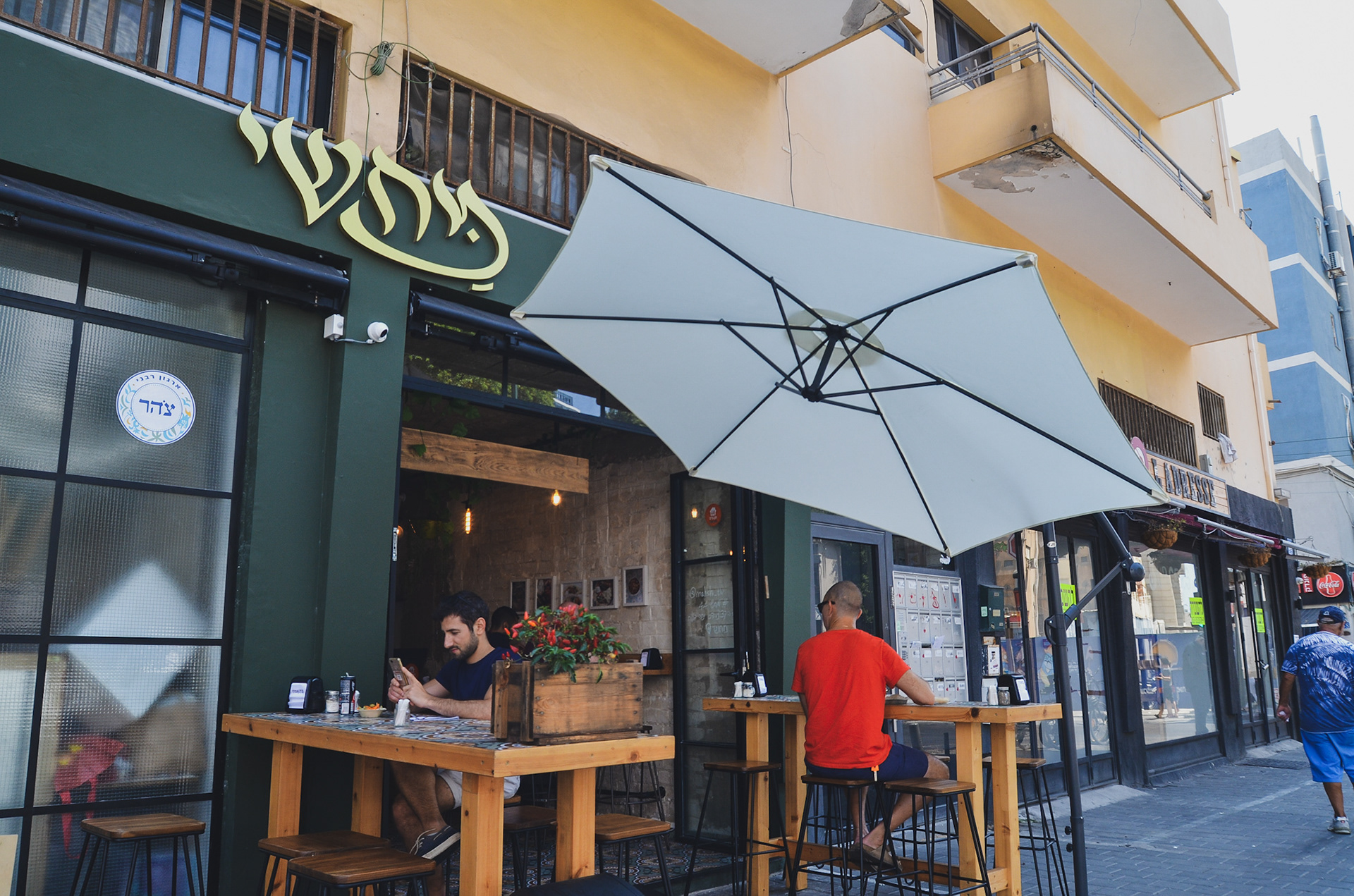
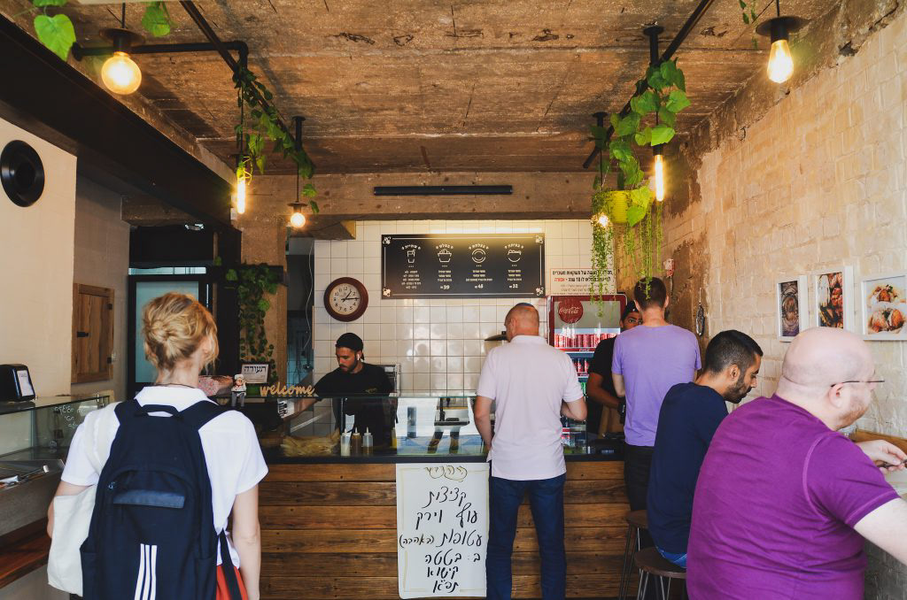
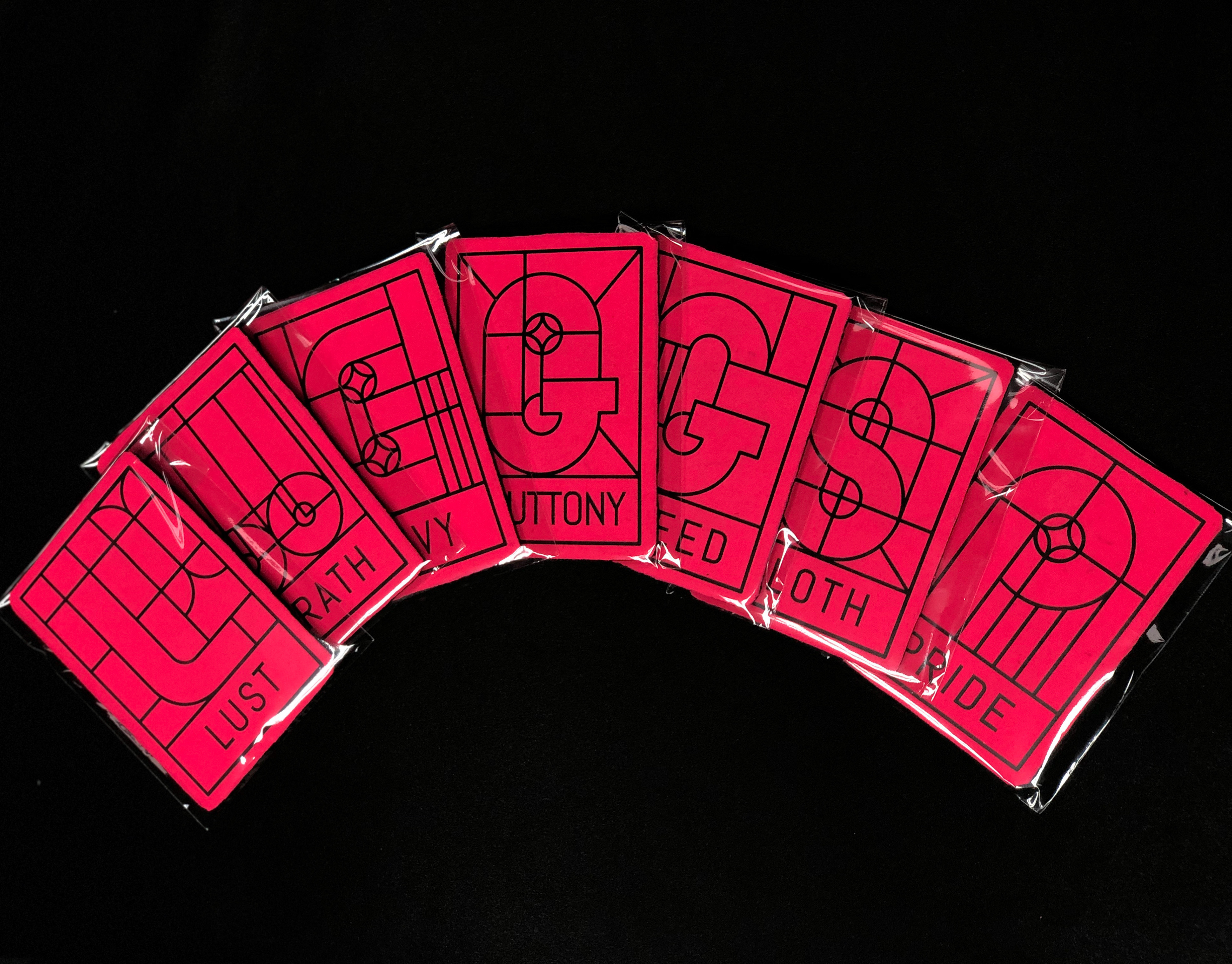
I have spoken from a point that pizza is available, it can be fast food, demands the minimum necessities, personally speaking - I rather eat in an underground pizza place than on some fancy restaurant downtown plus it's always available immediately and cheap and not being ‘’wanna be’’ on you. All these things connected me to the street scene in general and to all of the punk culture in particular. The punk culture is disgusted with materialism, it is very urban. The name Geula (free translate from hebrew to salvation, redemption, freedom), refers to the ideology of the punk culture, to the freedom of peace and redemption they believed in the suppression of the law and the establishment or anything that reminded Western society. The place itself is a pizza bar that provides a stage for music, the place is just delicious and cheap. Everyone who buys a pizza gets a poster, each time a different random poster. Few words on the design language, at first i focused on fanzines whose goal was quick and cheap. I chose a three main colors palette of simple, inexpensive pages. The language also involves layers and patterns of the pizza toppings and also the punk favorite cloths. I chose to do all of the branding in Hebrew and i focused on the late 70’ and early 80’ around the well known club name ‘’penguin’’ and the ‘’Dan Cinema’’ movie place. The punk culture in israel is different from the rest of the world. I studied close about the period and the israeli punk bands who involve in their songs political messages that refers to freedom, redemption and salvation( all connected to one word - Geula. My challenge was taking all this language and time zones and turn in into something modern, that fits the present, but still not taking it to commercialized places, and not for profit interests.
Baking packaging
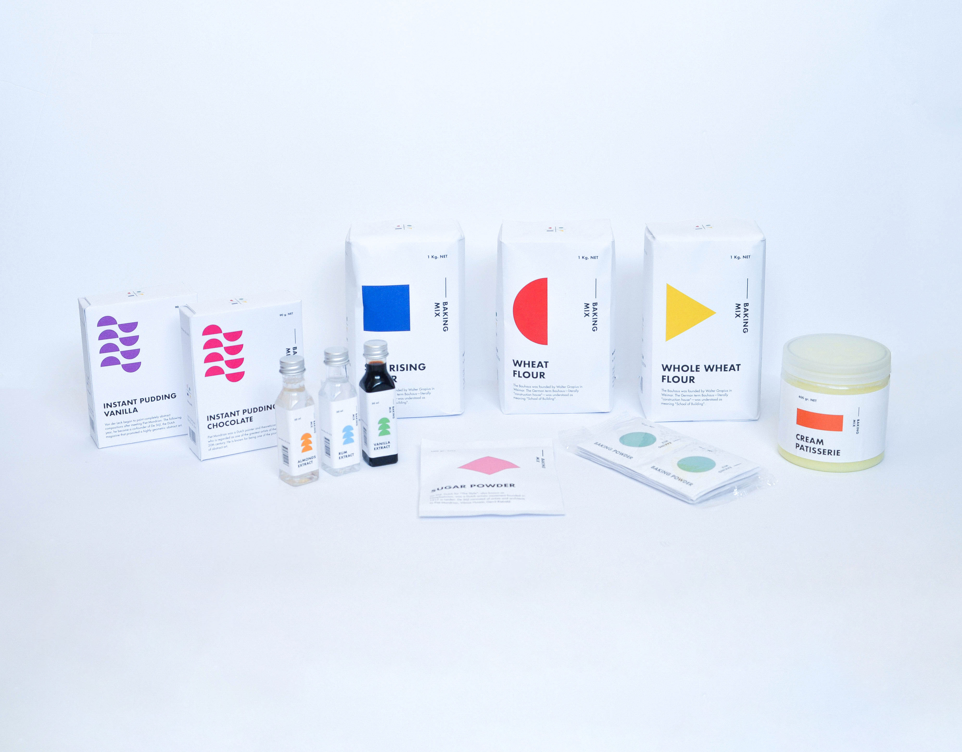
Baking Products being a very basic substance. I compared it to Art. Any being can make art, as any being can create something as basic from baking products. I chose the Bauhaus era. A time that was identified with basic colors and shapes, including the font that was identified and used at that time. Various products have added printed informative knowledge at this time. Vertical and Horizontal graphic art was common use during those years. The topography was all designed and based on these shapes. Each color represents a product with a different flavor and Each shape represents a family group. The shape changes its form as the product becomes more complex. My starting point was the Wheat, flour group. I branched out from that starting point creating a language.
Witchfest
Welcome to the Witchfest festival! A festival in which witches unite in order to discuss the latest magic trends, trade secrets, and eat some nice cookies. All in a a macabre yet stylish way, as fit for a ghastly event such as this! Explore this responsive site in order to find a map of stars guiding you to the event location, instructions on how to get an uber broom, and send invitations to different friends.
Wix
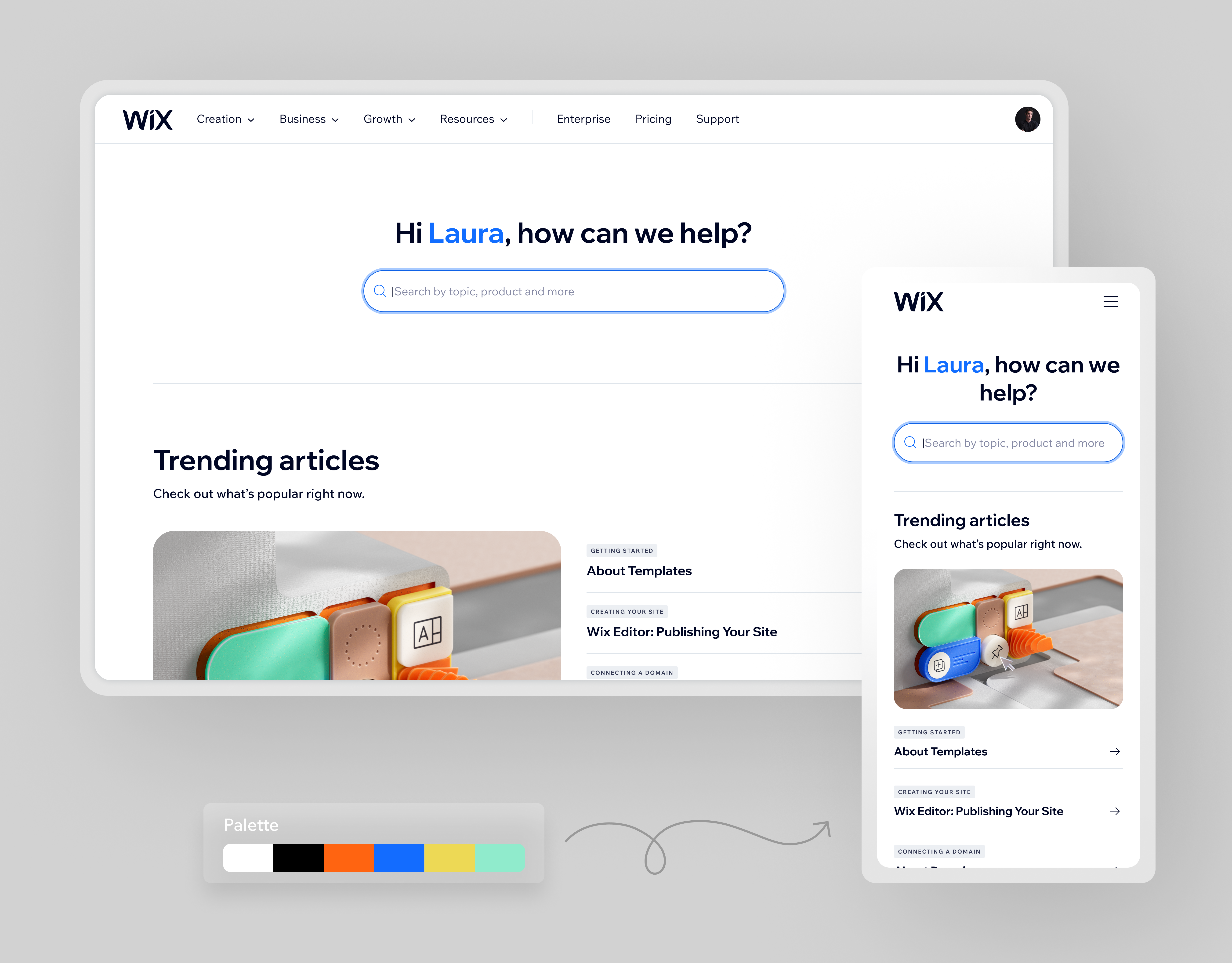
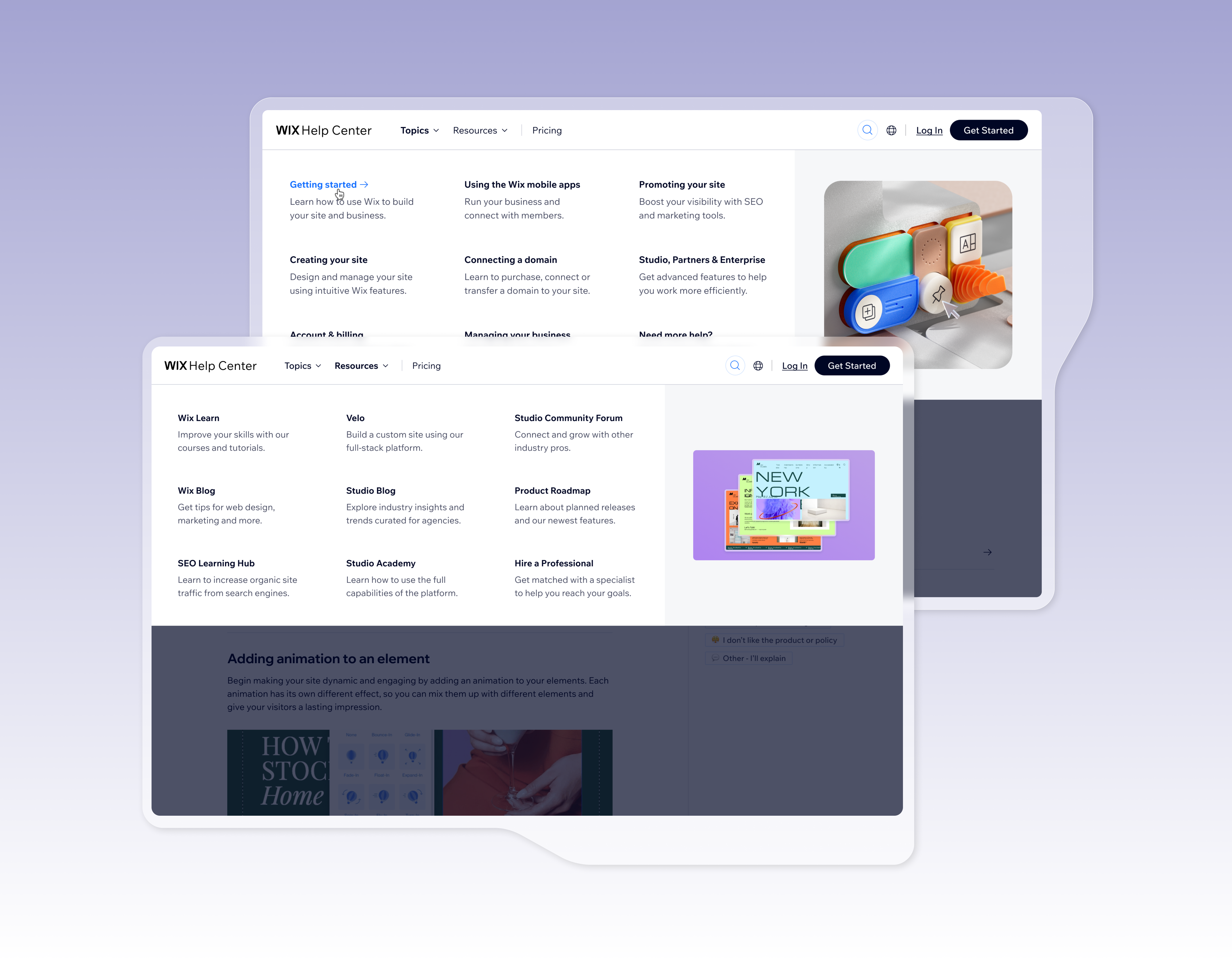
Product Designer at Wix.com | Full-time | Aug 2019 – Present As part of the Wix’s Product Design team who are both masters of UX and have a pixel-perfect approach to UI. We define and design products that have an impact on almost 200 million users around the world. i working with a design system Collaborate with other UX designers, product managers, frontend developers, Illustrators, prototypers and cross-functional stakeholders to understand requirements and provide creative, thoughtful solutions inside and outside the team.
Anxieties Illustrations
As an anxious person, i feel the best way to communicate my fears are illustrations. In this series, some of those thoughts are brought to paper using short comic strips.
Cartel Font
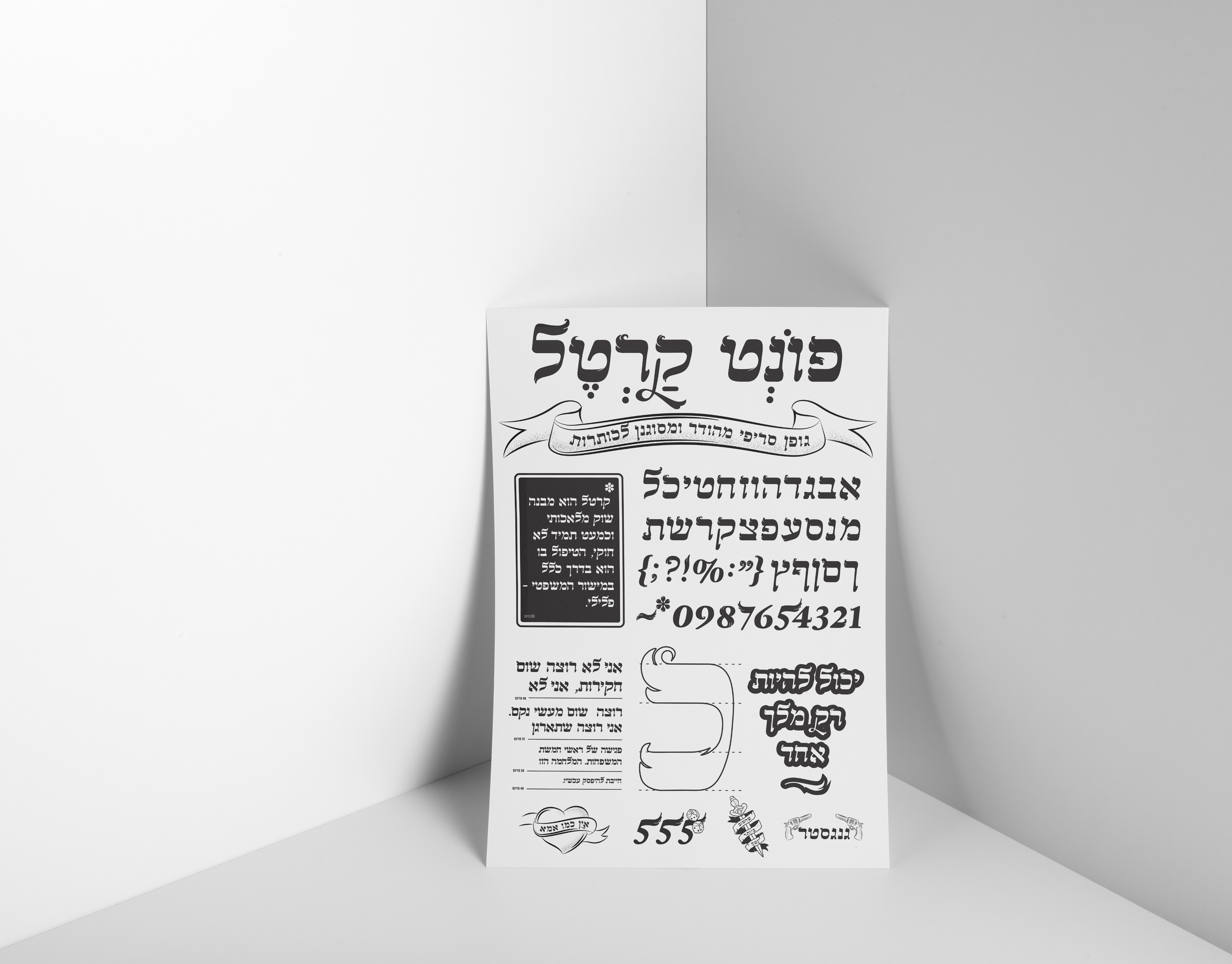
A Hebrew font course which includes all the symbols and numbers. I inspired by a biblical old logo I saw, And from there the font developed.
Contemporary Art Website
The site showcases famous contemporary art works from around the world and provides information about the artists behind the scenes. It also features articles regarding issues in the art world, while trying to immerse the viewer in the exciting world of contemporary art.
3D Hand
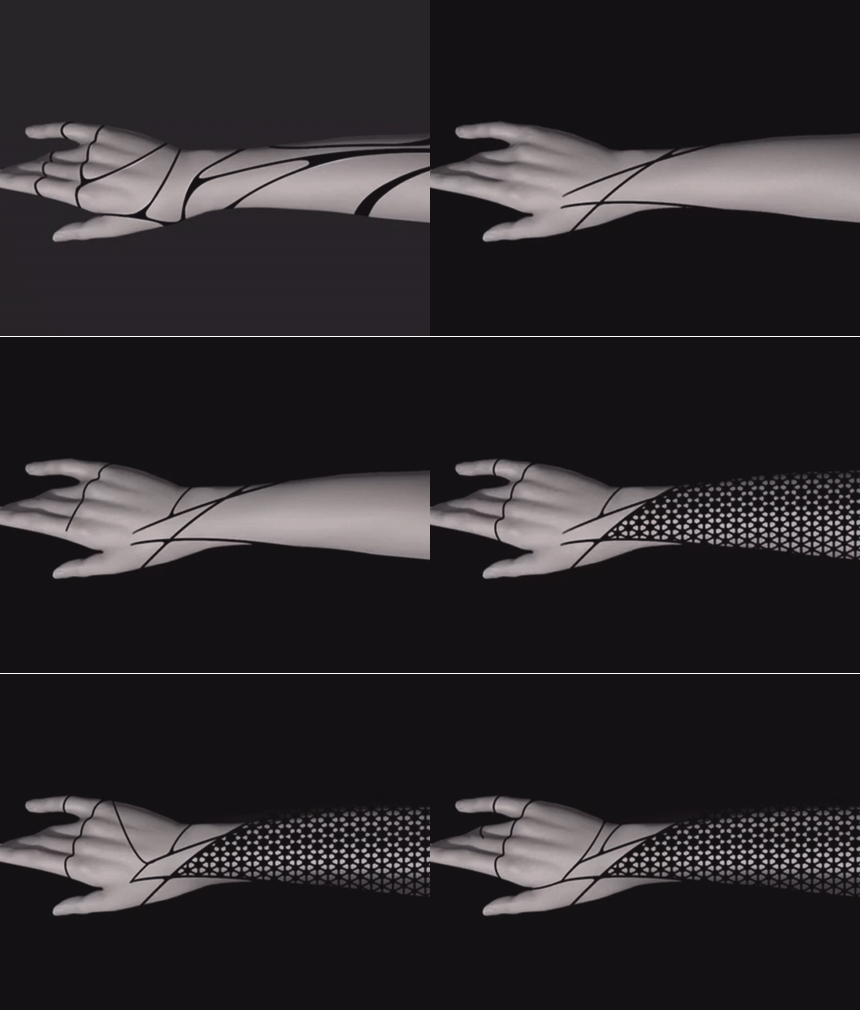
we were asked to redesign the Prosthetic hand and try to think about what can we be improved and renewed of the product. there an ascetic problem in the product. and it is not cynical for the older audience who wants to show more elements and even festive. our main goal was to create a product that is not only functional but also used as a fashion item. we wanna to express the user experience which takes part in the production process until the product reaches the consumer home.
Pillow control
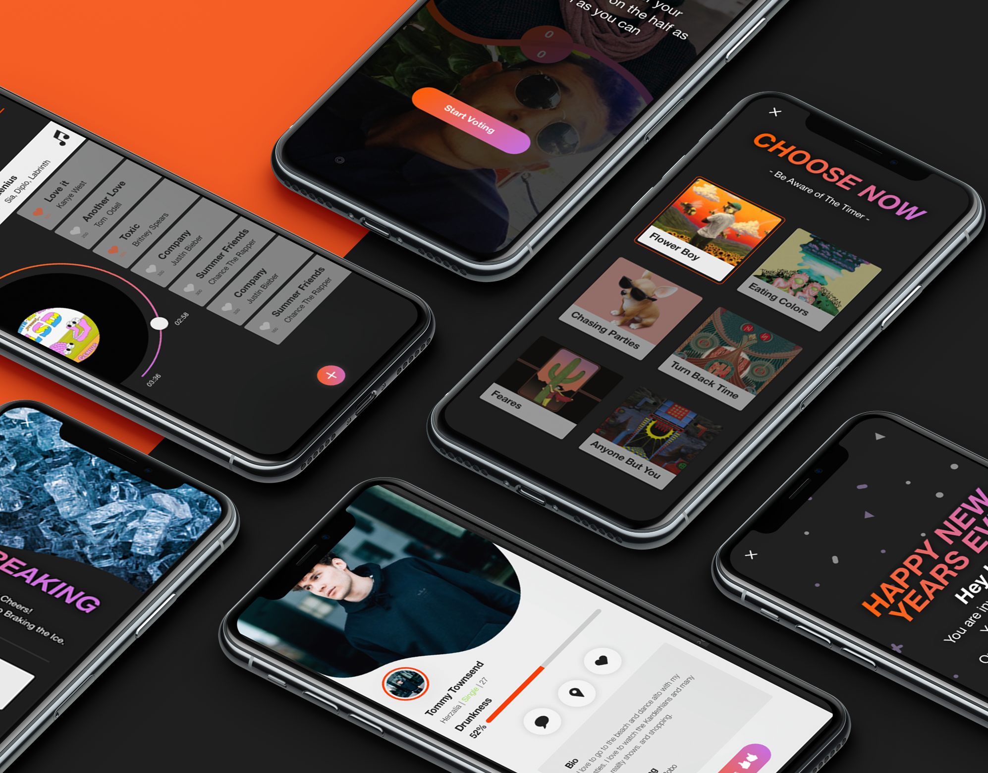
Try to imagine that - your night pillow can switch colors, can play music, massaging and even fresh the air in your bedroom. Concept application that controls your sleeping pillow and monitors your sleep!
Protest catalog
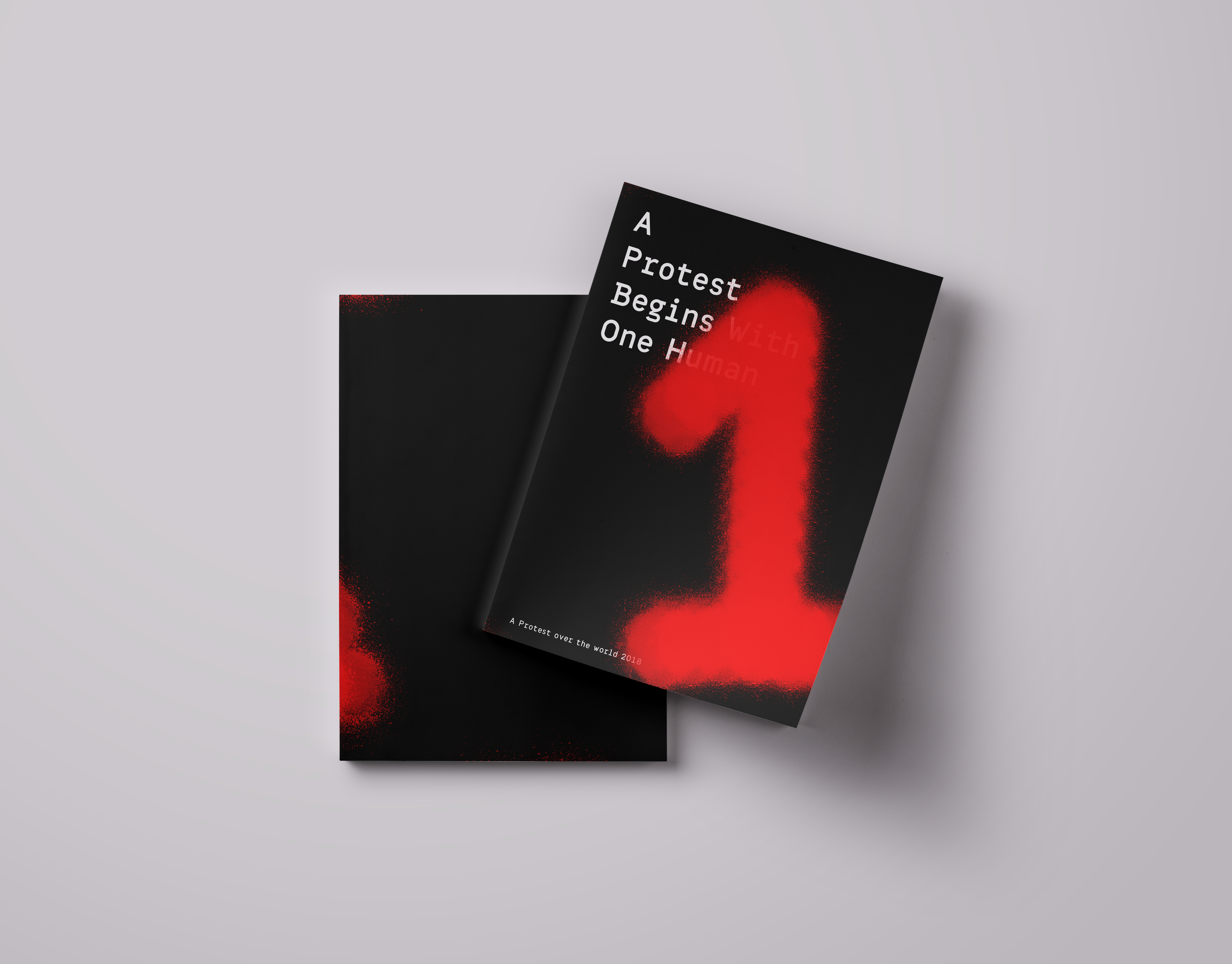
A protest Begin with one human this is a catalog dealing with protests. the catalog is an introduction to the term "protest". The many different shades and layers this term contains. The catalog engages in a trial to see the many shades and layers of the word from the visual point of view. The colors that are bound together on the different billboards exposed in protests. The end focuses on the contrast between the individual as to the masses in a composition.
Back to Top