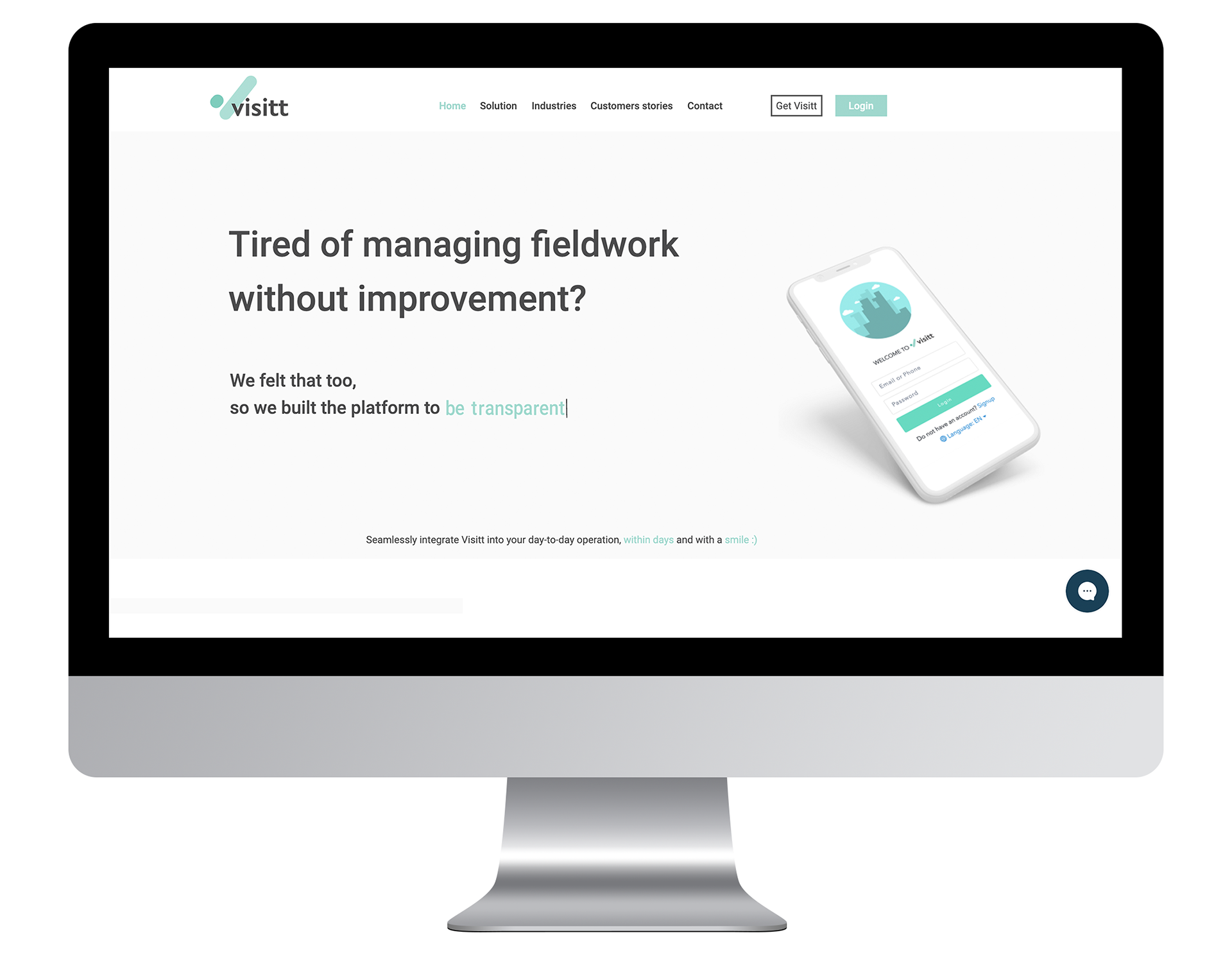
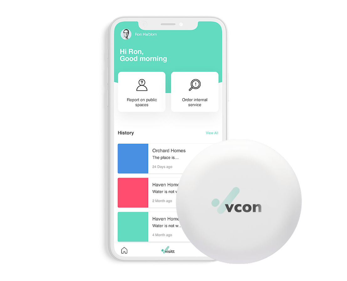
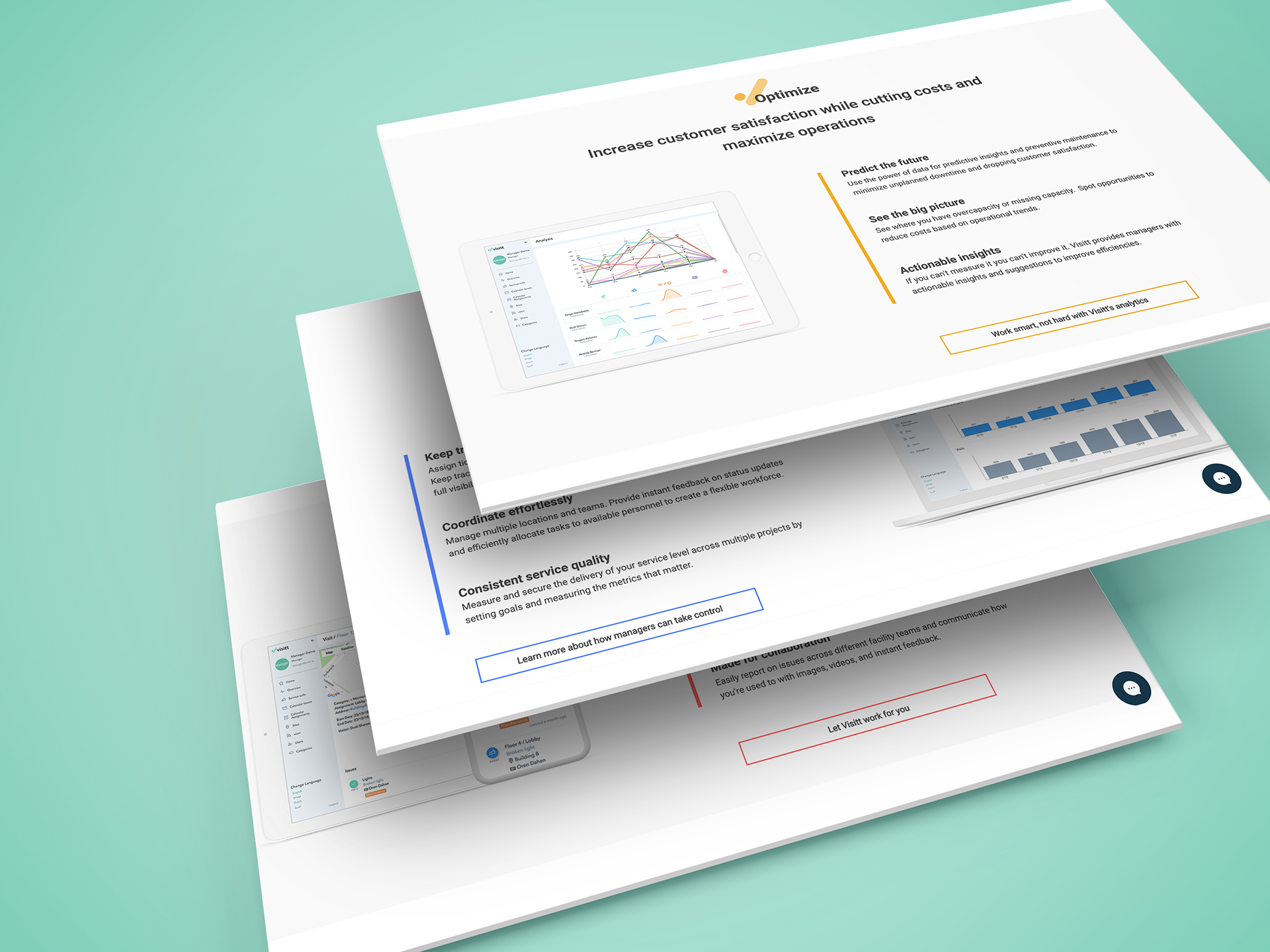
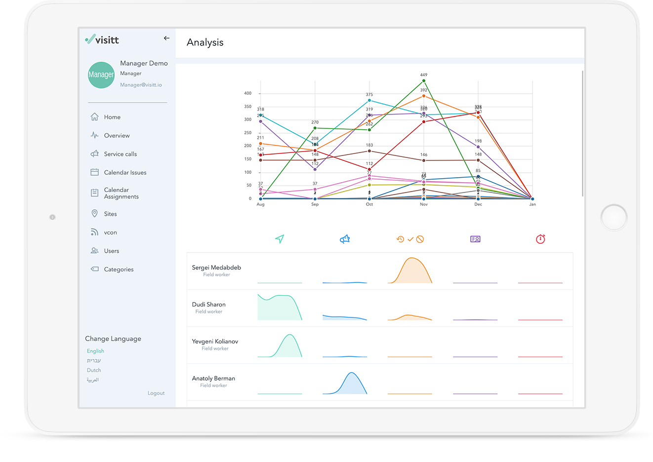
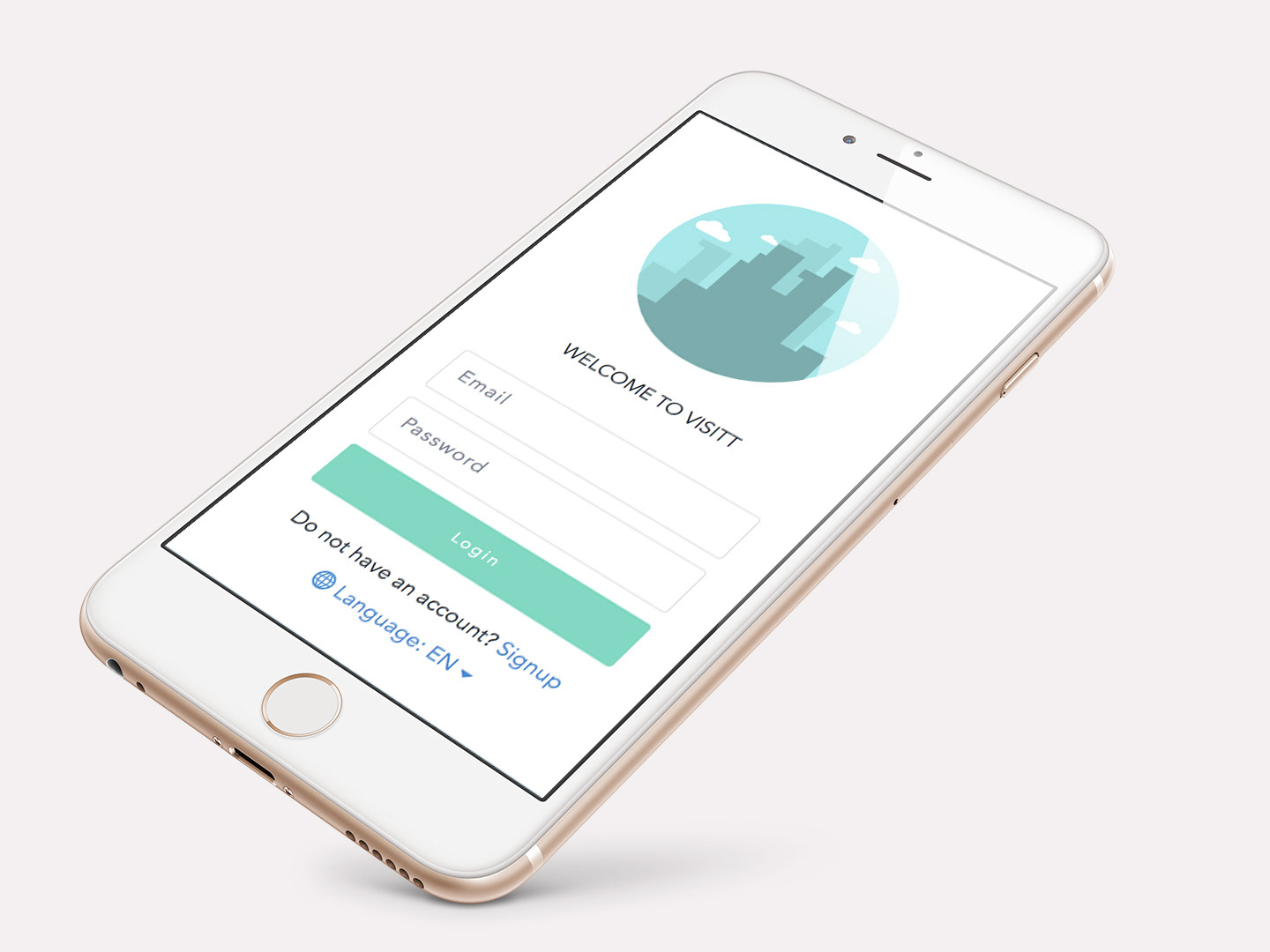
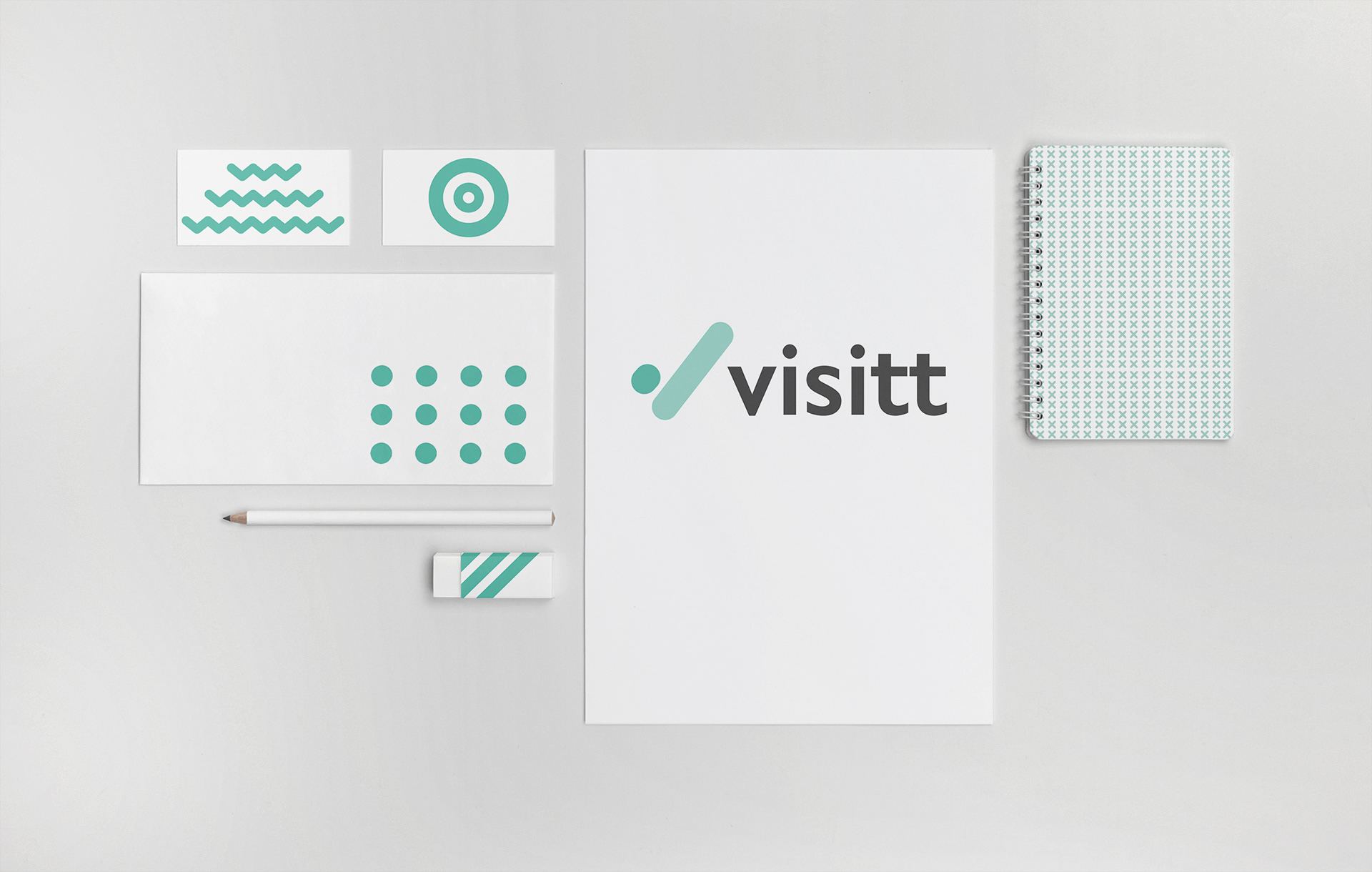
Visitt
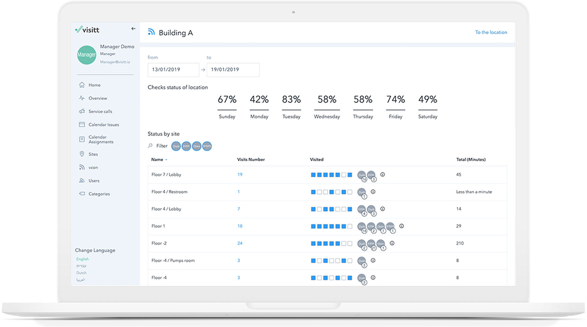
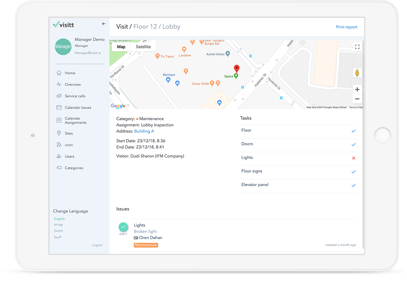
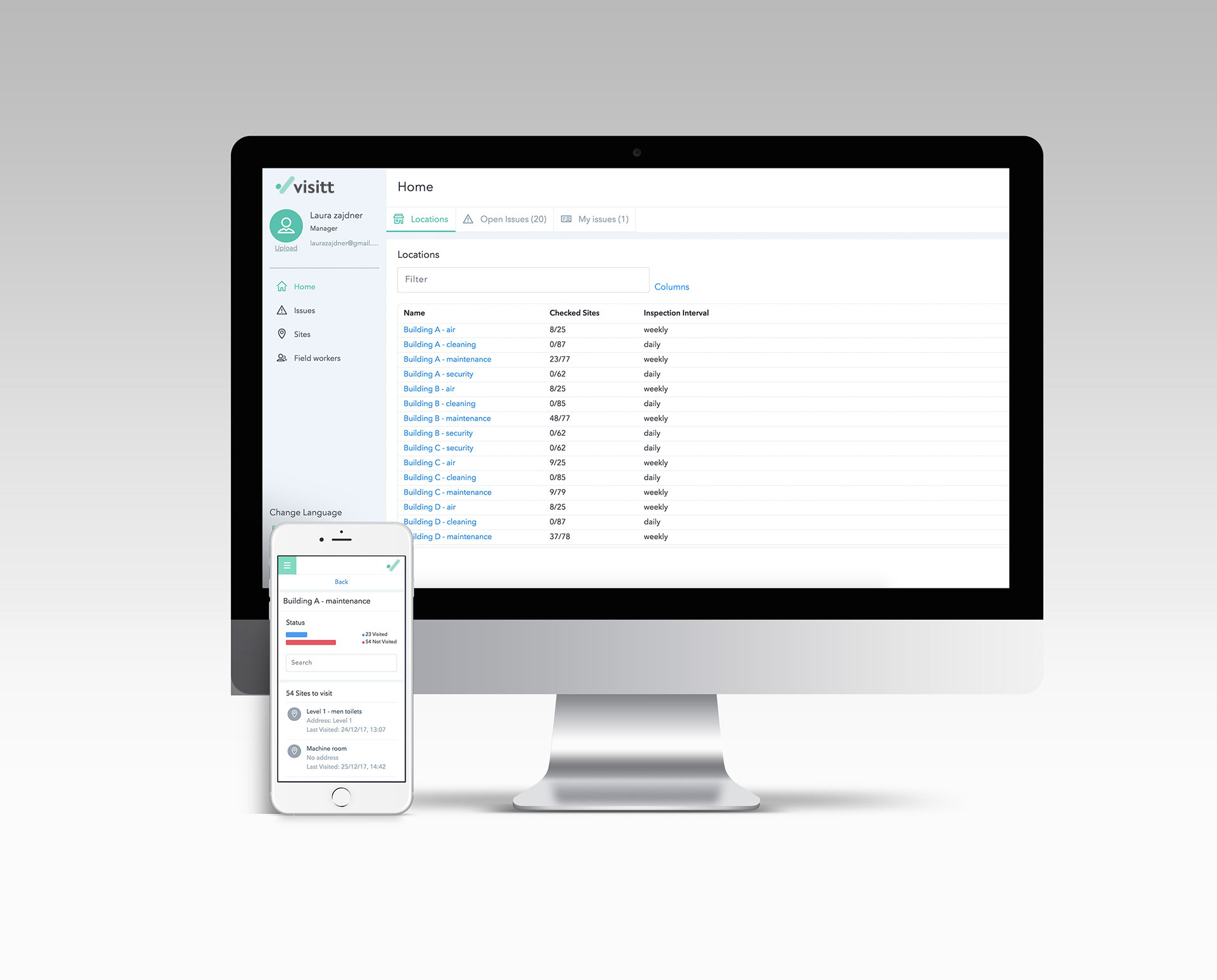
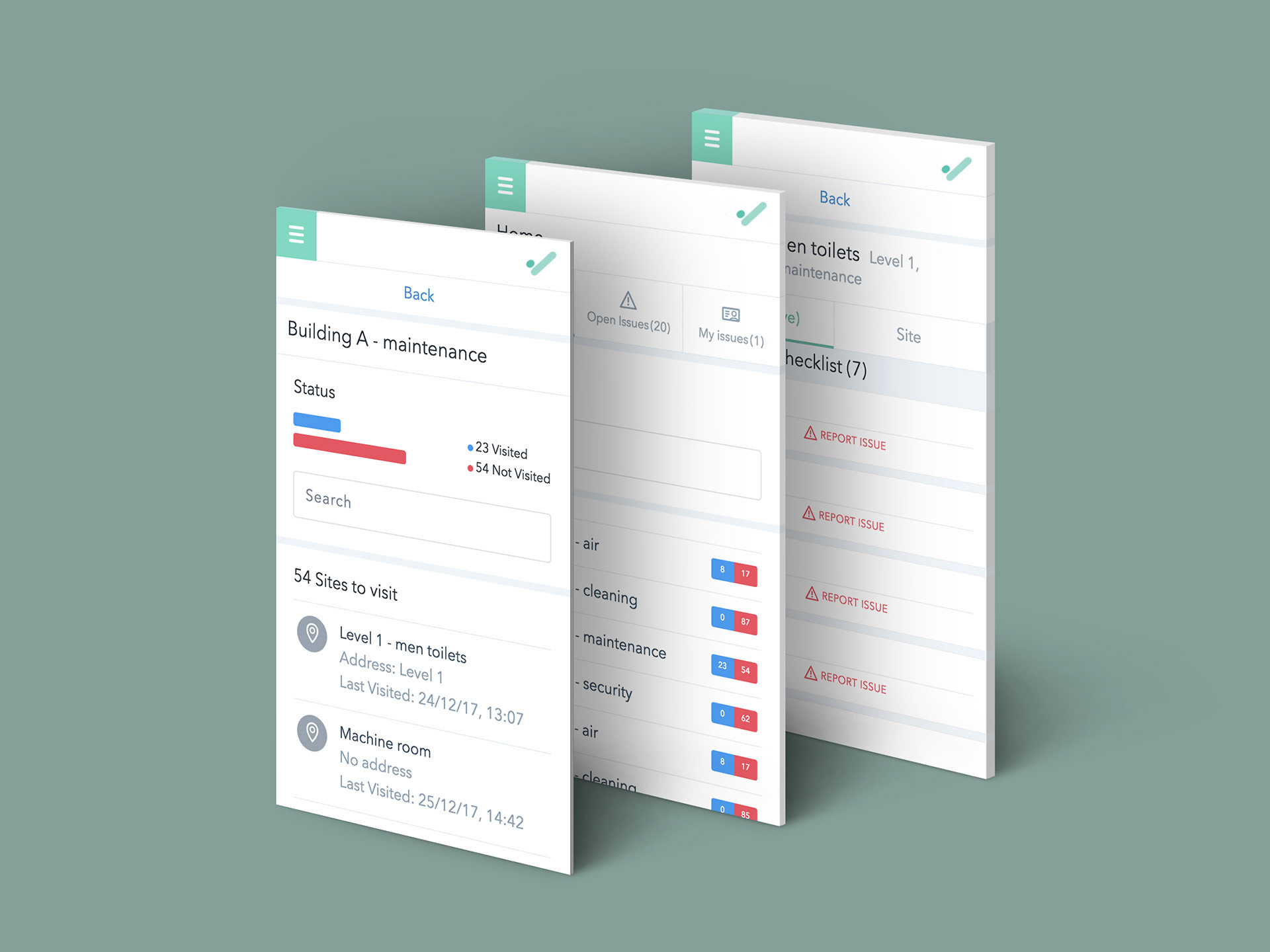
Visitt is a web-based platform designed to streamline routine maintenance inspections and empower both field inspectors and contractors with full operational control. By consolidating every layer of the maintenance workflow hierarchy into one intuitive system, Visitt enables faster, clearer, and more efficient facility management.
Visitt 2016
startup company
More
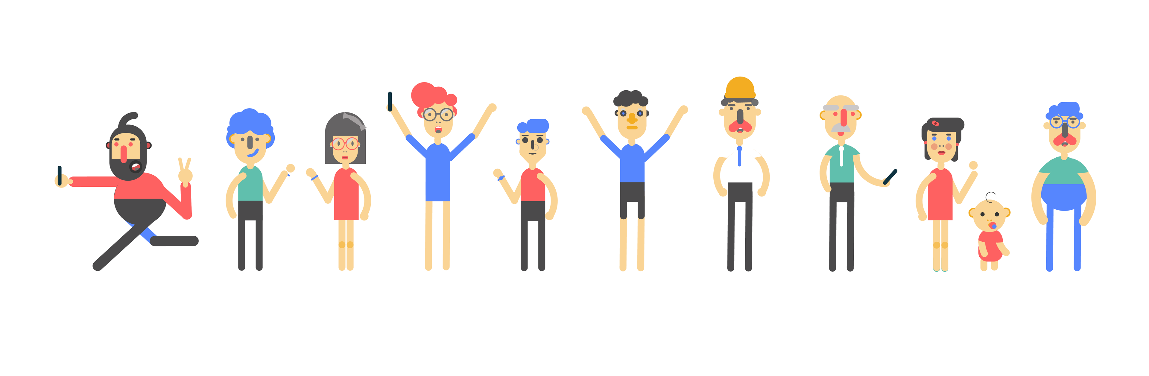
clippy
Clippy is a platform a social network that 's based on video realms and creates
clips that personally coordinate word connections to videos.
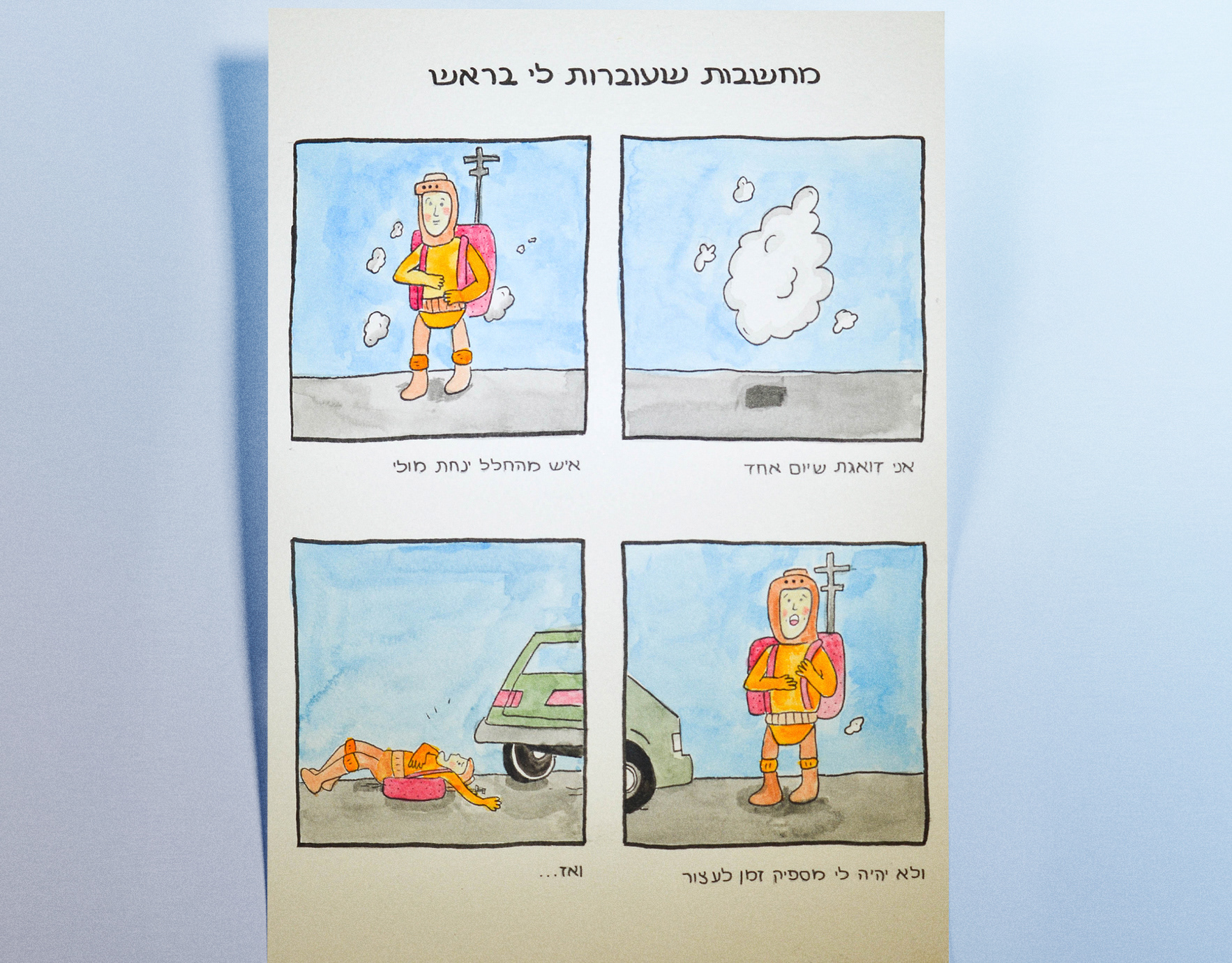
Anxieties Illustrations
As someone who lives with anxiety, illustration is my clearest form of expression.
This series of short comic strips brings inner fears and intrusive thoughts to life — with honesty, dark humor, and a visual language that speaks when words fall short.
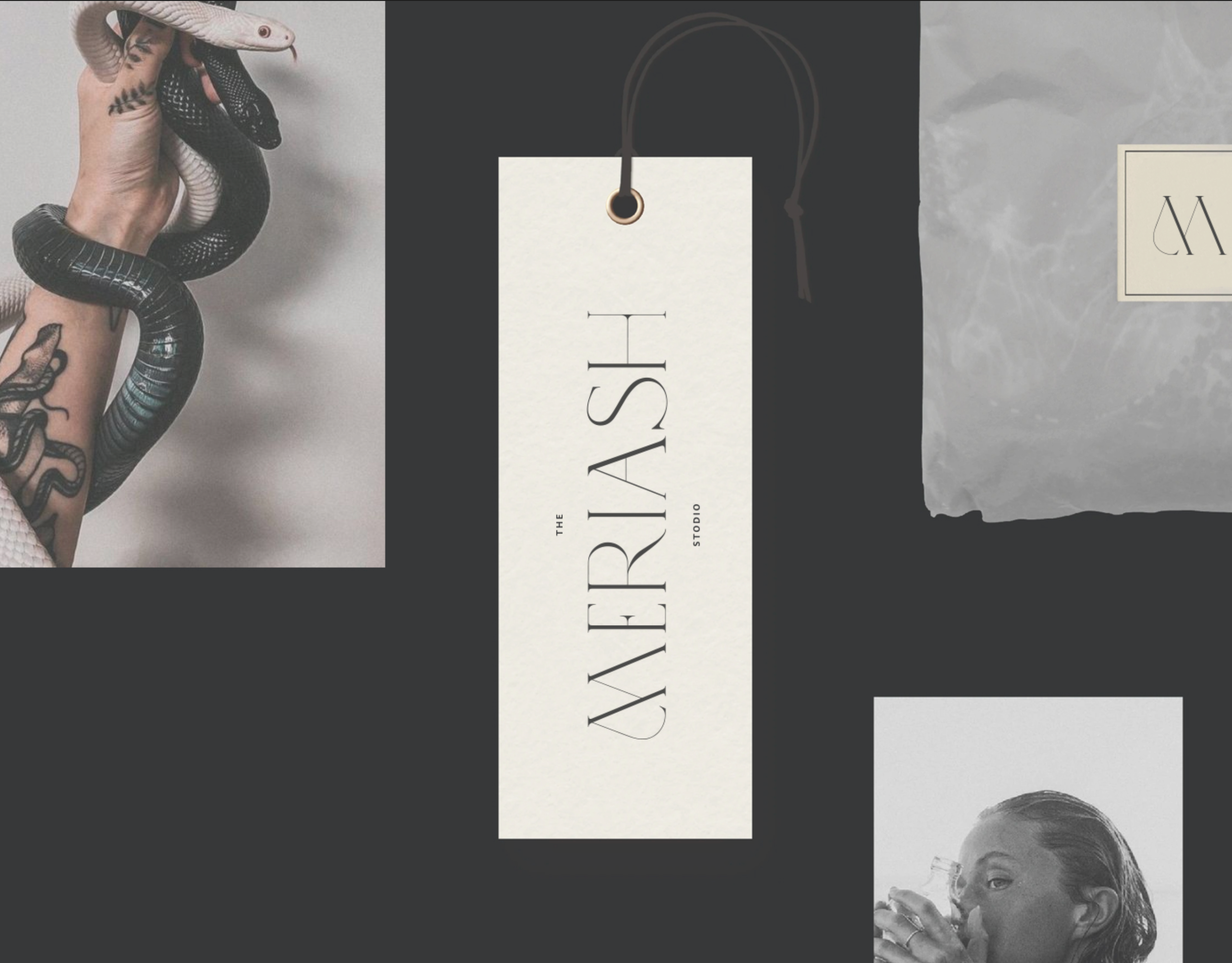
Meriash Logotype
Logotype for fashion designer
MERIASH is an intimate and small young brand that engraves on its banner creative, enchanted and mysterious worlds through which unique clothing items with a distinct design language are created. There is a range of complexity in the same breath - from the most commercial items to the highly invested items. The quantities are not significant.
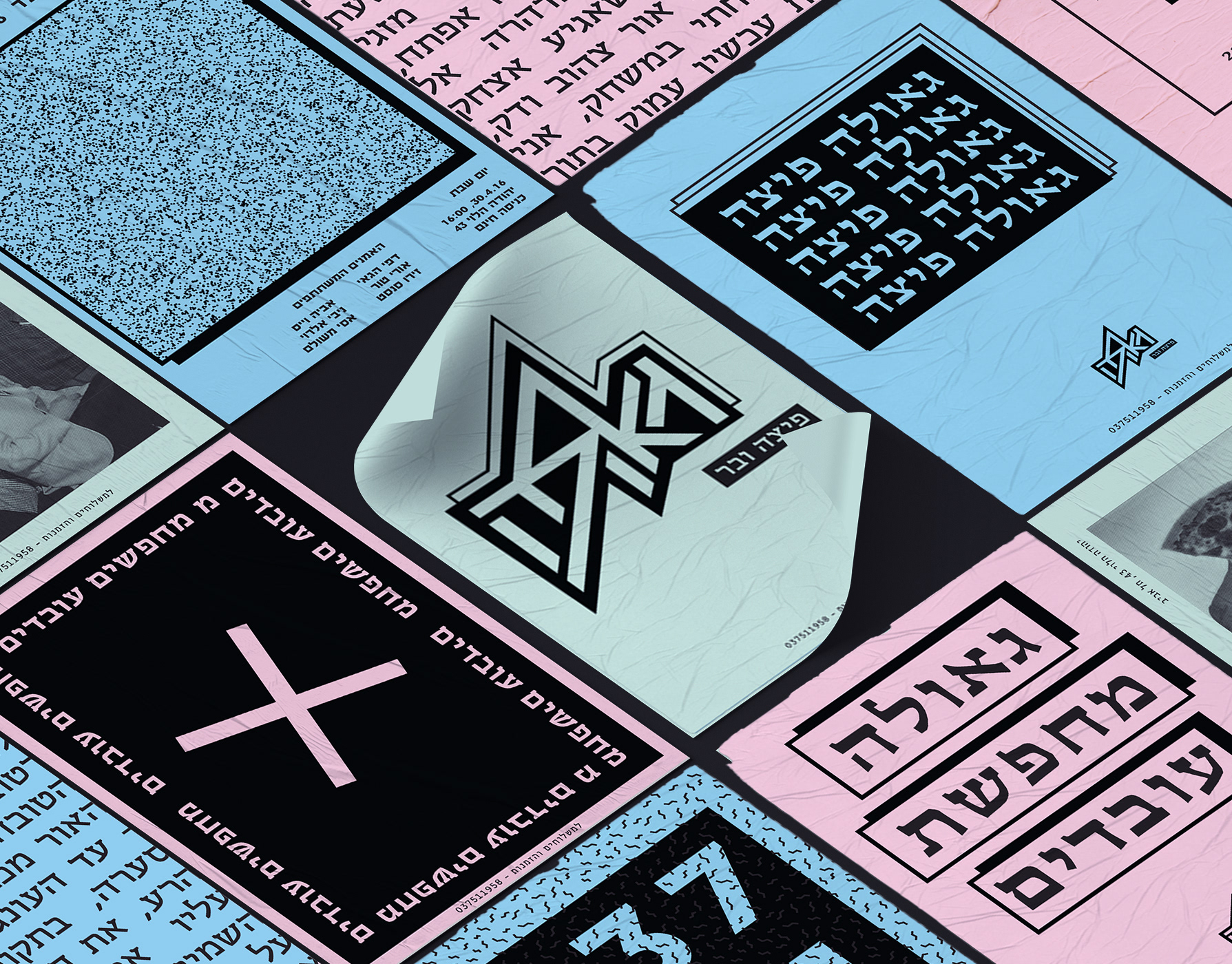
Geula
I have spoken from a point that pizza is available, it can be fast food, demands the minimum necessities, personally speaking - I rather eat in an underground pizza place than on some fancy restaurant downtown plus it's always available immediately and cheap and not being ‘’wanna be’’ on you. All these things connected me to the street scene in general and to all of the punk culture in particular. The punk culture is disgusted with materialism, it is very urban. The name Geula (free translate from hebrew to salvation, redemption, freedom), refers to the ideology of the punk culture, to the freedom of peace and redemption they believed in the suppression of the law and the establishment or anything that reminded Western society. The place itself is a pizza bar that provides a stage for music, the place is just delicious and cheap. Everyone who buys a pizza gets a poster, each time a different random poster. Few words on the design language, at first i focused on fanzines whose goal was quick and cheap. I chose a three main colors palette of simple, inexpensive pages.
The language also involves layers and patterns of the pizza toppings and also the punk favorite cloths. I chose to do all of the branding in Hebrew and i focused on the late 70’ and early 80’ around the well known club name ‘’penguin’’ and the ‘’Dan Cinema’’ movie place. The punk culture in israel is different from the rest of the world. I studied close about the period and the israeli punk bands who involve in their songs political messages that refers to freedom, redemption and salvation( all connected to one word - Geula. My challenge was taking all this language and time zones and turn in into something modern, that fits the present, but still not taking it to commercialized places, and not for profit interests.
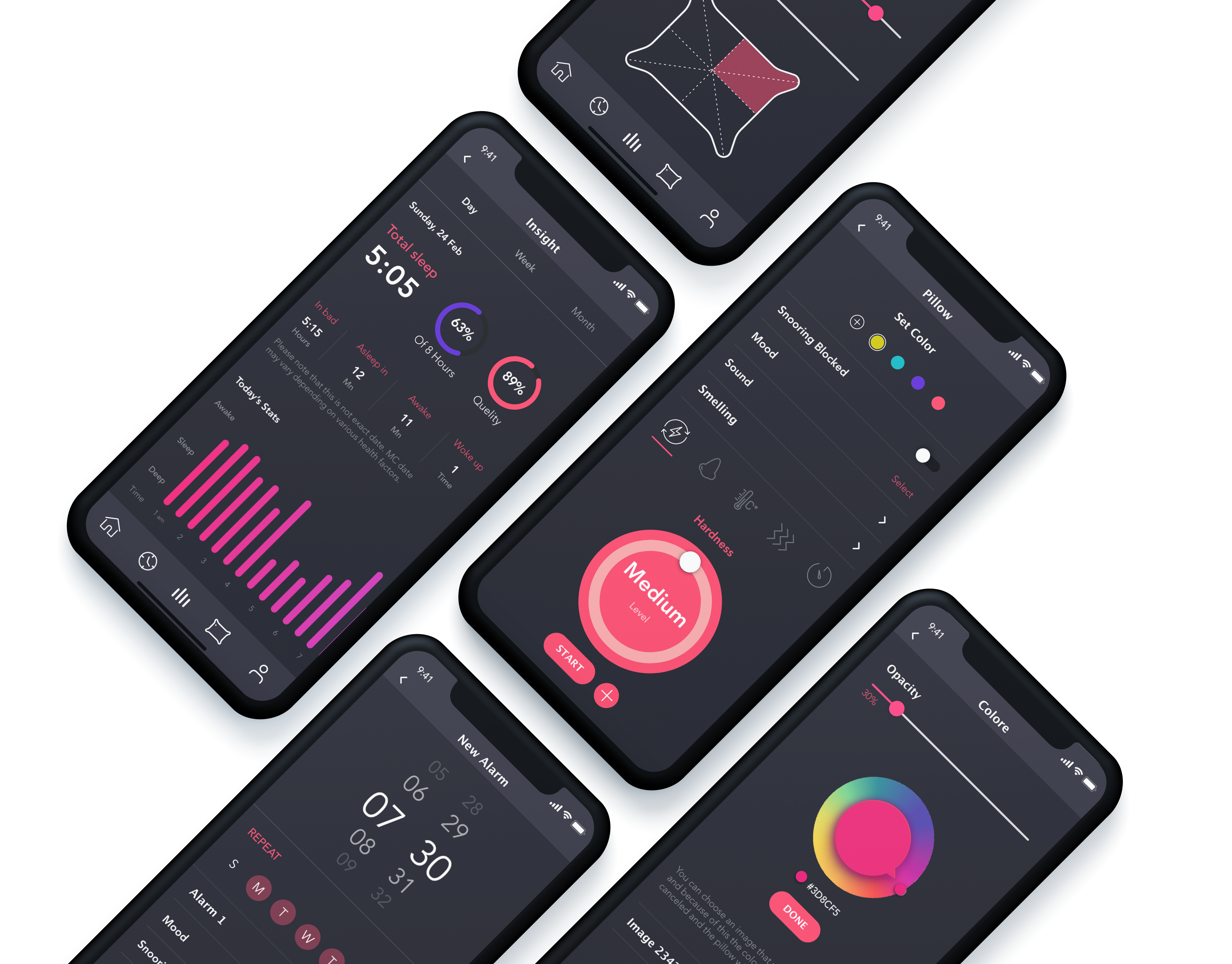
Pillow control
Try to imagine that - your night pillow can switch colors, can play music, massaging
and even fresh the air in your bedroom.
Concept application that controls your sleeping pillow and monitors your sleep!
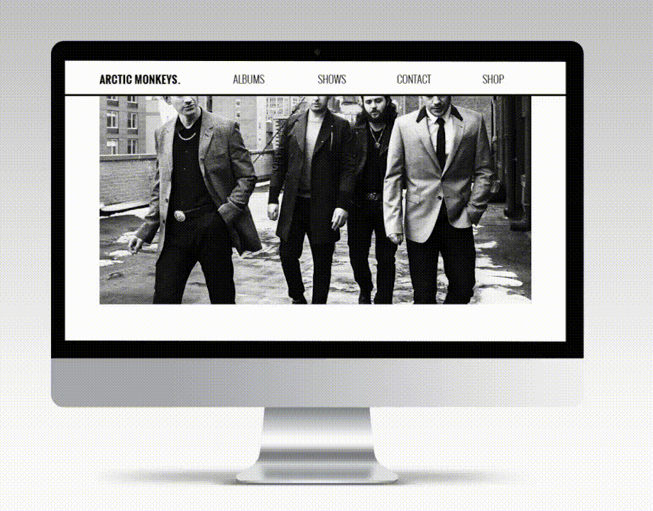
Arctic monkeys
A responsive website concept for the Arctic Monkeys, featuring a band timeline, full discography, and integrated online store – all designed to reflect the band’s unique tone and aesthetic.
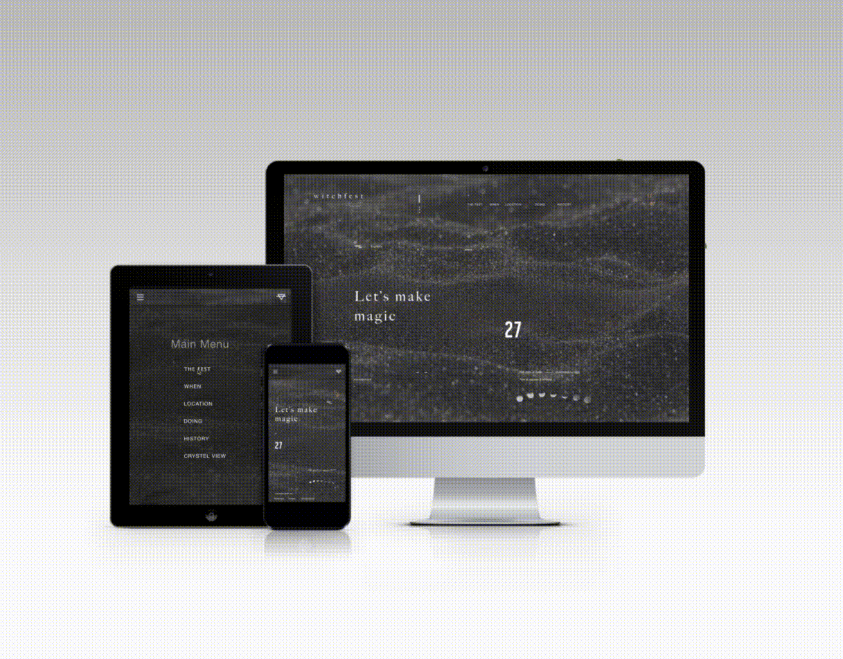
Witchfest
Welcome to Witchfest – a whimsical festival where witches unite to share magical trends, swap secrets, and enjoy eerie-sweet treats.
The responsive website invites visitors to explore event details in true ghastly style: from a celestial map guiding the way, to instructions on how to summon an Uber Broom, and even a way to send magical invitations to friends.
Witchy, witty, and web-ready.
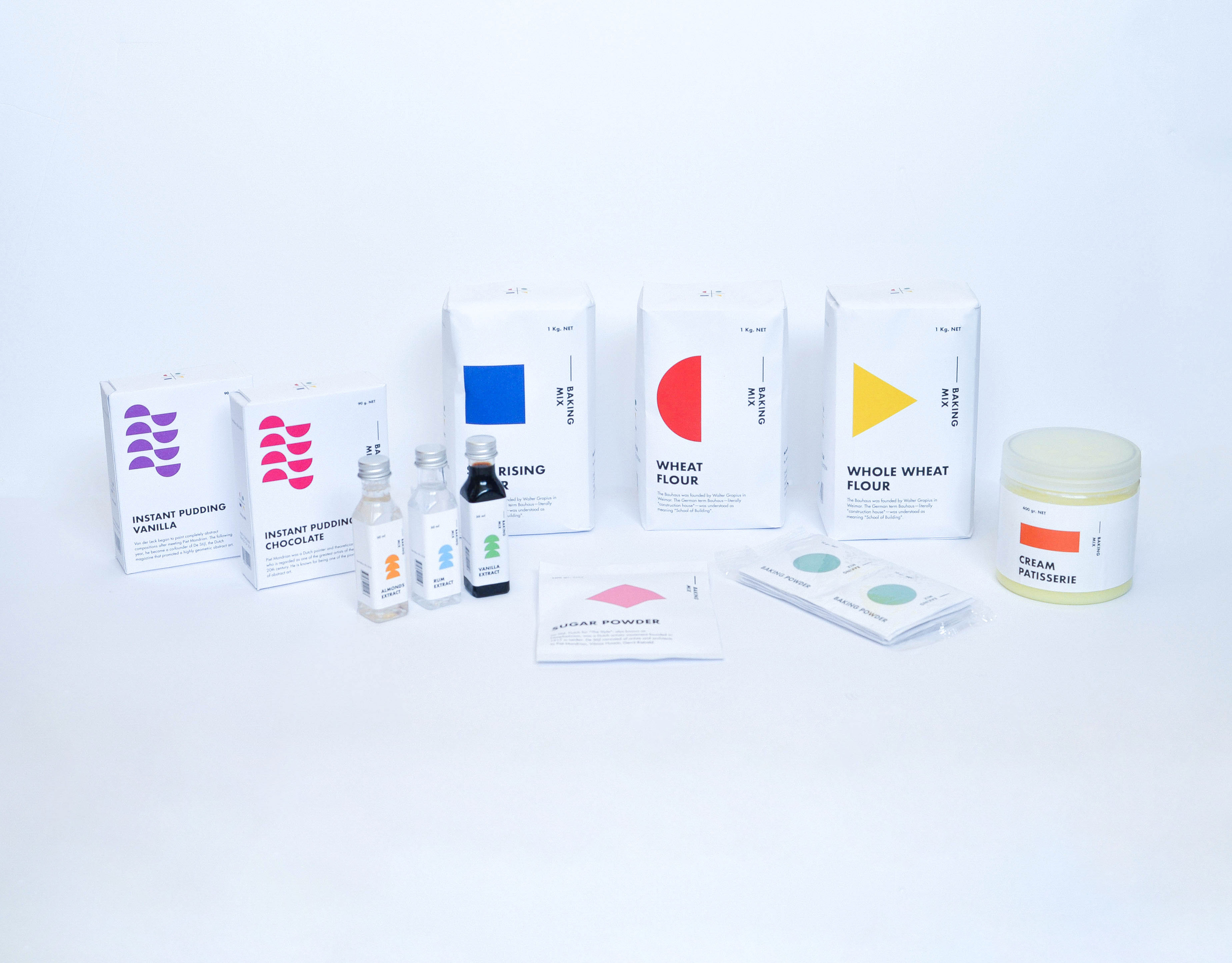
Baking packaging
Baking Products being a very basic substance. I compared it to Art. Any being can make art, as any being can create something as basic from baking products. I chose the Bauhaus era. A time that was identified with basic colors and shapes, including the font that was identified and used at that time. Various products have added printed informative knowledge at this time. Vertical and Horizontal graphic art was common use during those years. The topography was all designed and based on these shapes. Each color represents a product with a different flavor and Each shape represents a family group. The shape changes its form as the product becomes more complex. My starting point was the Wheat, flour group. I branched out from that starting point creating a language.
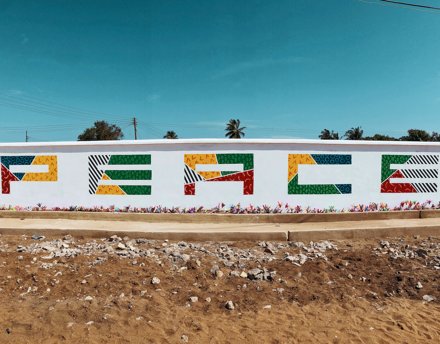
Africa
During a humanitarian expedition to Ghana, I took part in renovating a local school and orphanage.
As part of the project, I created a 30x3 meter mural on the school’s wall, reflecting the school’s core value: PEACE.
The artwork was developed in collaboration with the local community and aims to bring hope, color, and meaning to the everyday environment of the children.
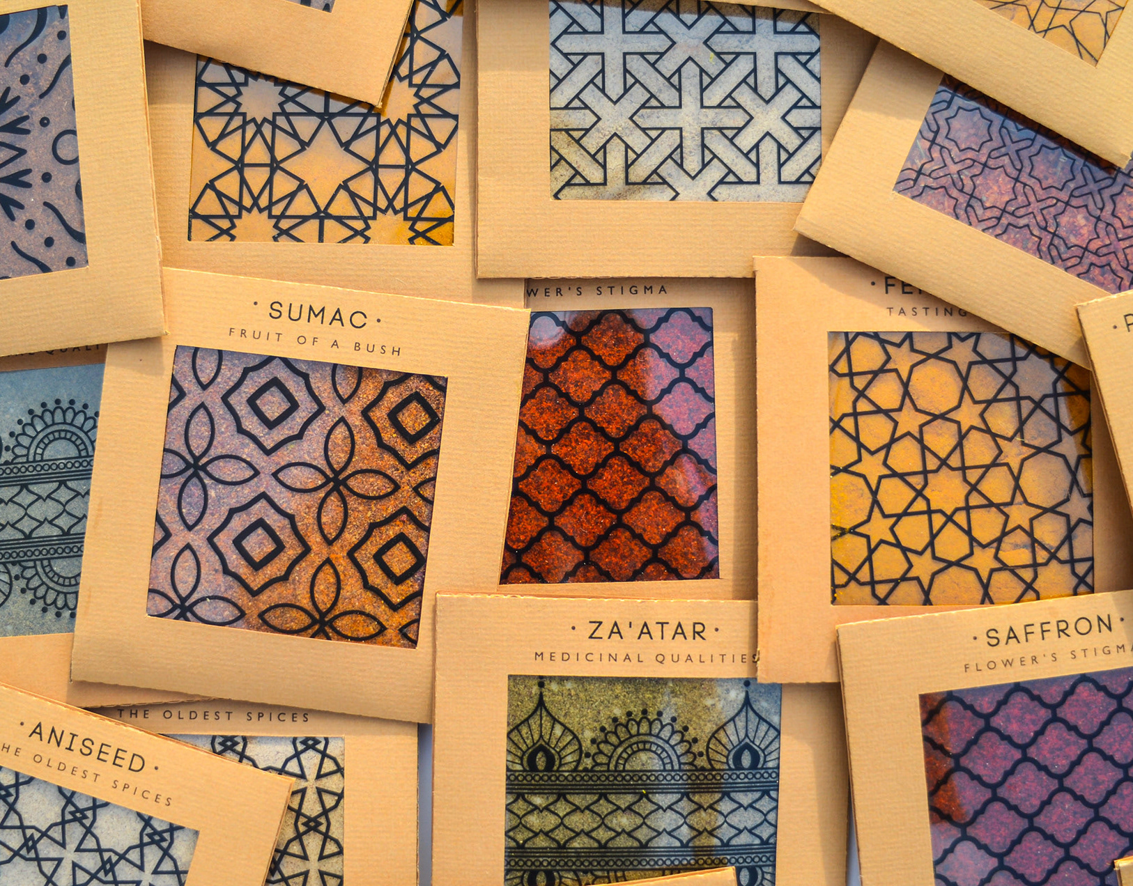
Spicy middle east
While working at a startup, I fell in love with sticky notes – their bold colors, versatility, and the creative energy they bring. Inspired by that spirit, I designed a spice packaging system that channels the startup vibe through color, shape, and tone.
The packaging mimics the square, lean format of sticky notes – compact and practical. A transparent window lets the natural colors of the spices shine through, acting as both a functional element and a vibrant design feature.
I explored Middle Eastern patterns, matching each spice with a mood and motif: the hotter the spice, the bolder the pattern.
Materials are compostable and eco-friendly, with a neutral brown base that emphasizes the natural beauty of the contents.
Just like sticky notes, these packages are made to stick anywhere in your kitchen – turning it into a colorful, expressive space inspired by the land they came from.