Witchfest
Welcome to Witchfest – a whimsical festival where witches unite to share magical trends, swap secrets, and enjoy eerie-sweet treats. The responsive website invites visitors to explore event details in true ghastly style: from a celestial map guiding the way, to instructions on how to summon an Uber Broom, and even a way to send magical invitations to friends. Witchy, witty, and web-ready.
Interactive course, Shenkar college, second year / 2017.
guidance: Haim agami
More
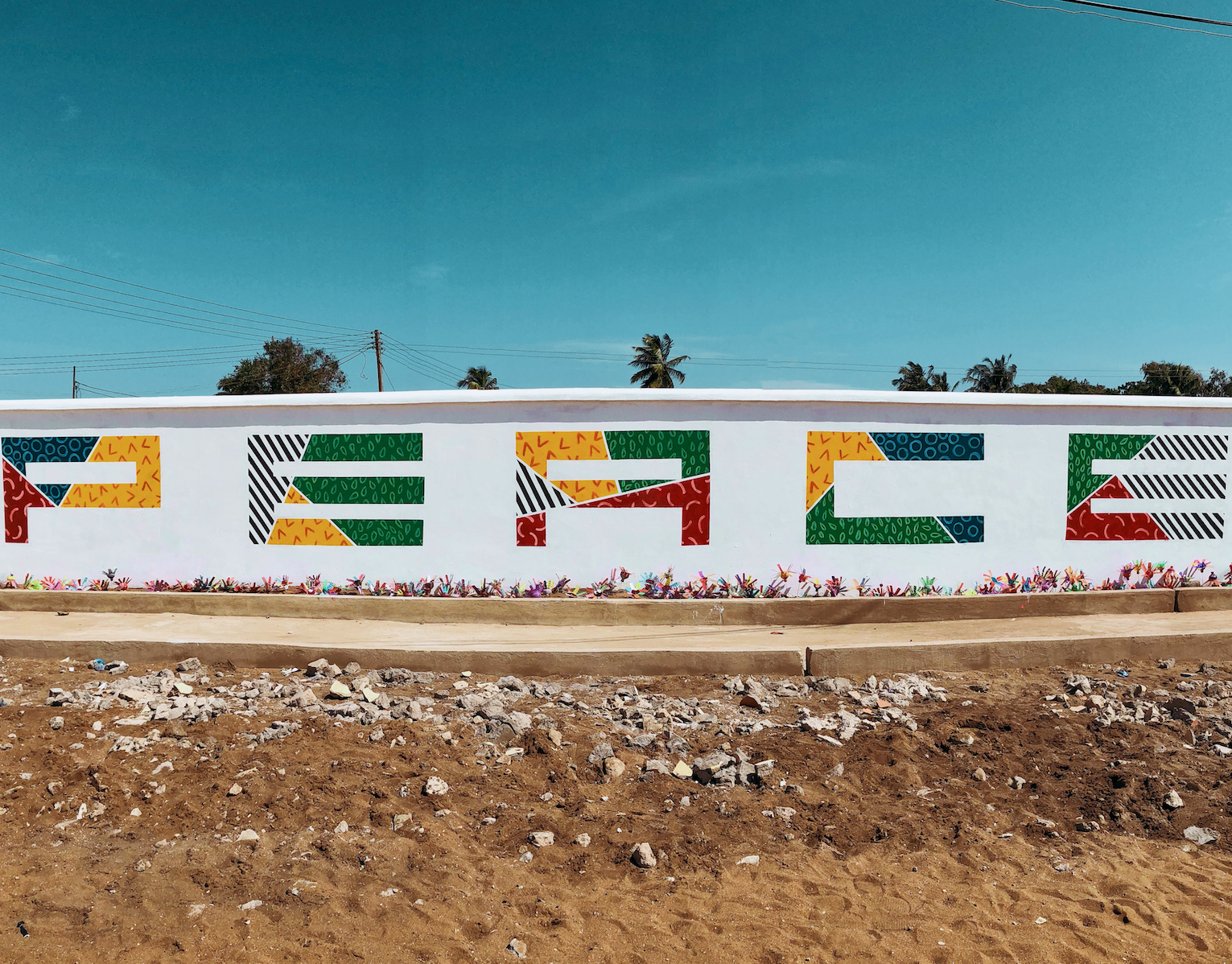
Africa
During a humanitarian expedition to Ghana, I took part in renovating a local school and orphanage.
As part of the project, I created a 30x3 meter mural on the school’s wall, reflecting the school’s core value: PEACE.
The artwork was developed in collaboration with the local community and aims to bring hope, color, and meaning to the everyday environment of the children.
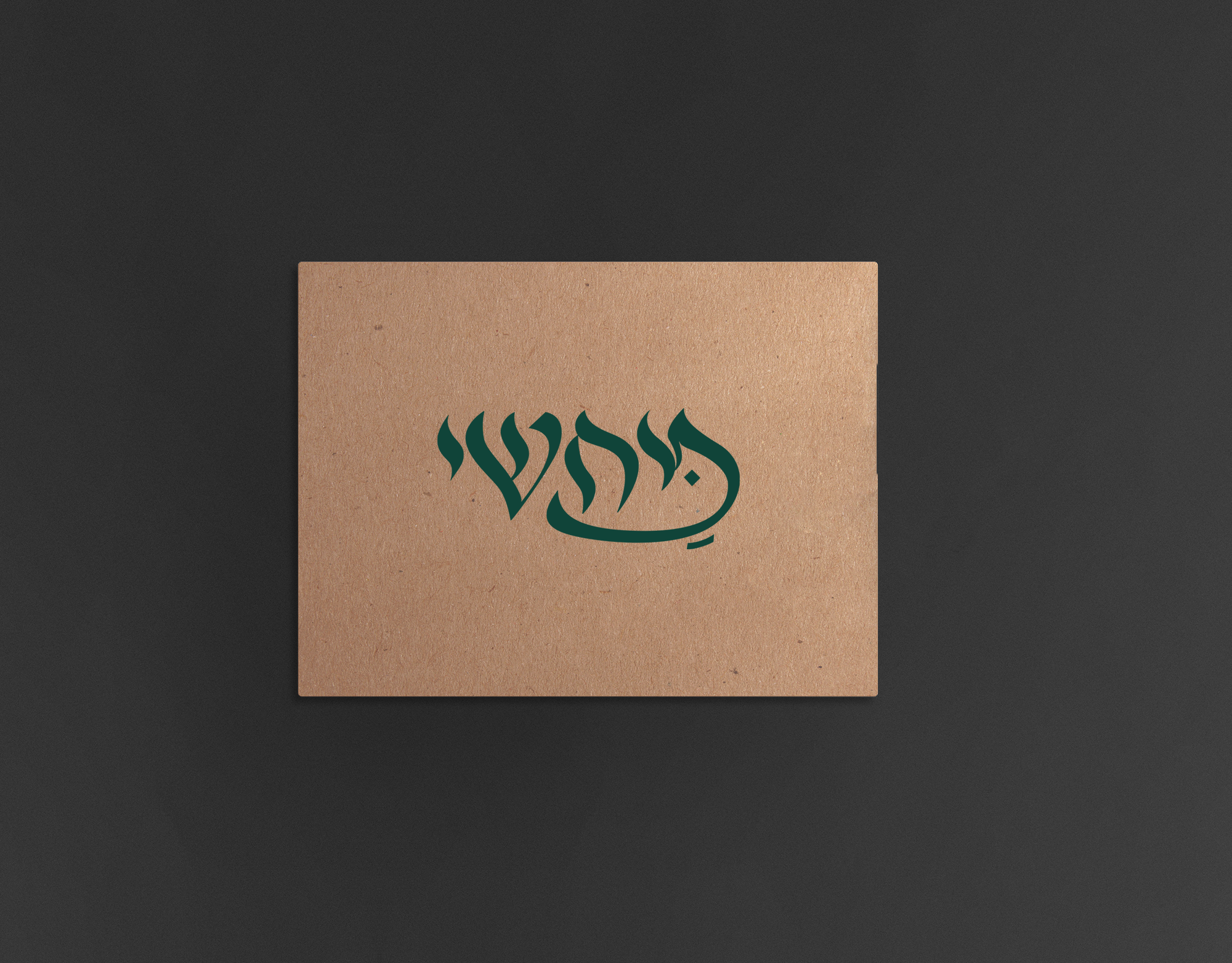
Mahshi
Logo and branding to restaurant tunisian food
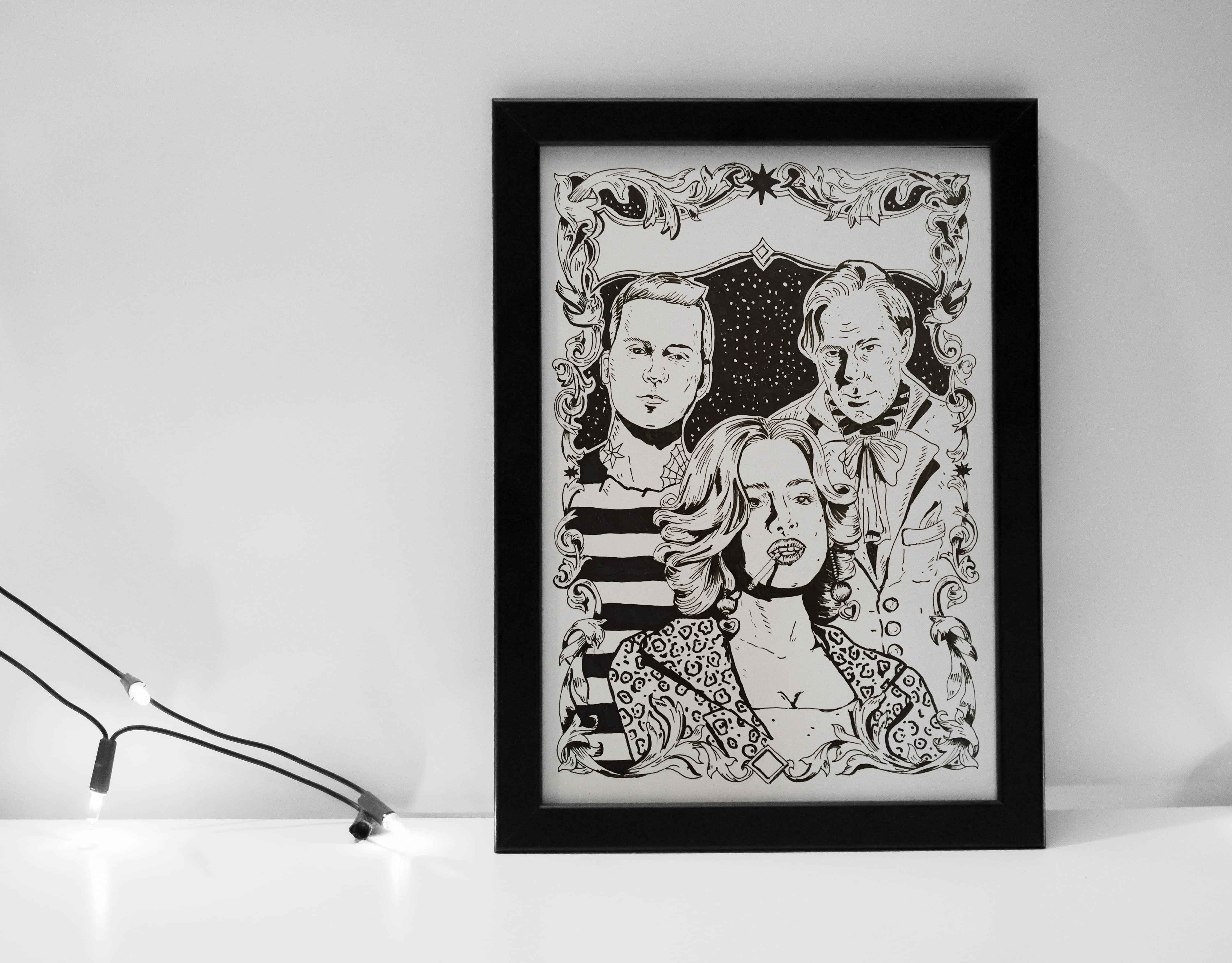
Drawing
poster story that i draw to a project.
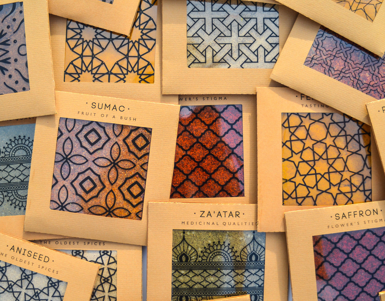
Spicy middle east
While working at a startup, I fell in love with sticky notes – their bold colors, versatility, and the creative energy they bring. Inspired by that spirit, I designed a spice packaging system that channels the startup vibe through color, shape, and tone.
The packaging mimics the square, lean format of sticky notes – compact and practical. A transparent window lets the natural colors of the spices shine through, acting as both a functional element and a vibrant design feature.
I explored Middle Eastern patterns, matching each spice with a mood and motif: the hotter the spice, the bolder the pattern.
Materials are compostable and eco-friendly, with a neutral brown base that emphasizes the natural beauty of the contents.
Just like sticky notes, these packages are made to stick anywhere in your kitchen – turning it into a colorful, expressive space inspired by the land they came from.
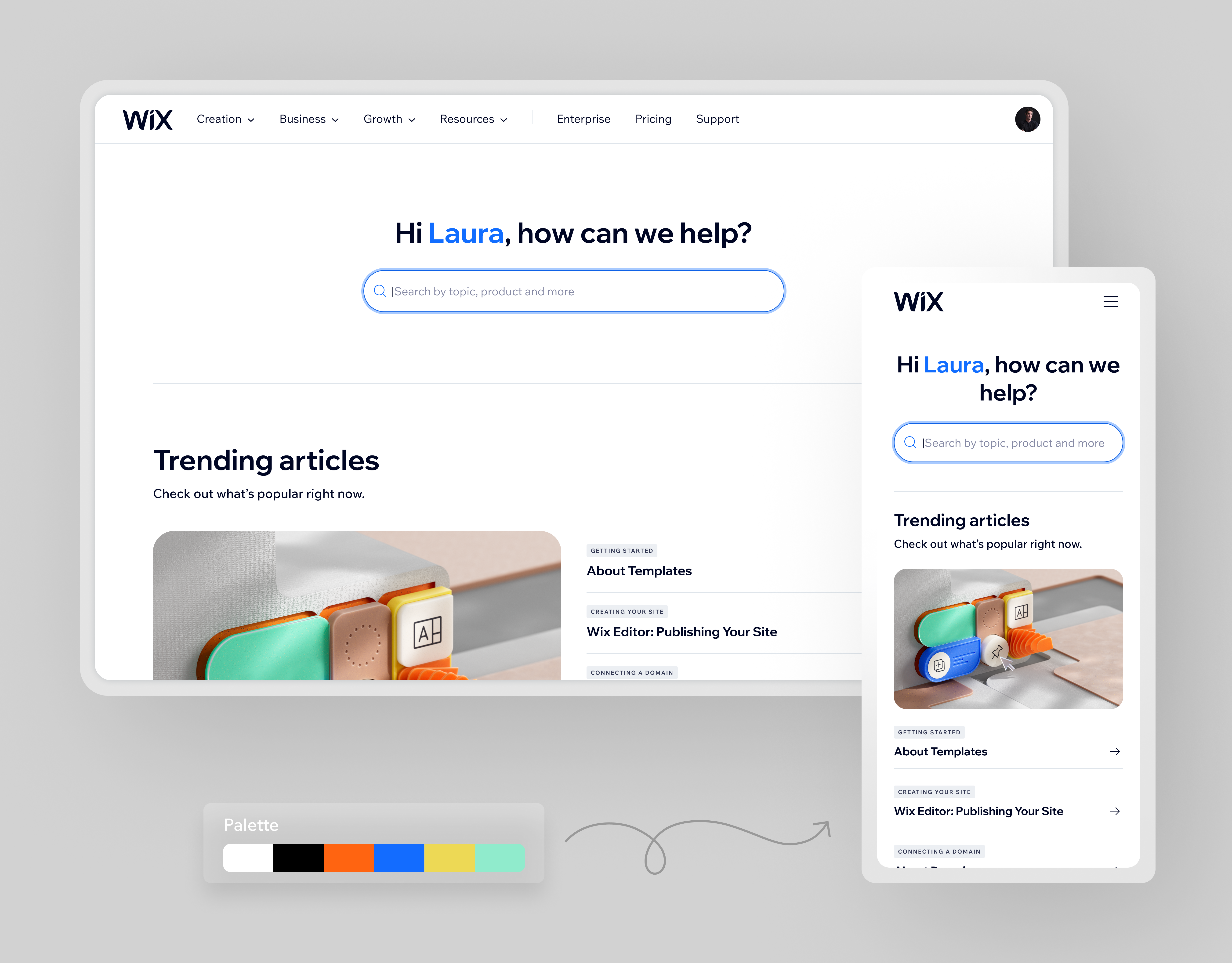
Rebrand Wix Help Center
The Wix Help Center provides a wide range of resources to support users in building and managing their websites. The previous design had become outdated: cluttered, generic, and hard to navigate.
Our goal was to rebrand the entire Help Center — restructuring the hierarchy, refreshing the look & feel, and aligning it with Wix’s evolving brand language.
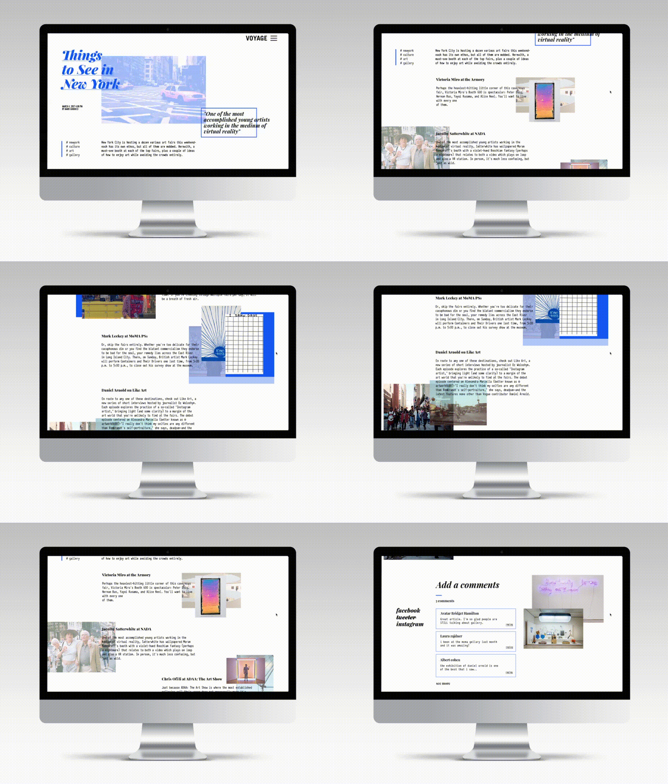
Contemporary Art Website
The site showcases famous contemporary art works from around the world and provides information about the artists behind the scenes. It also features articles regarding issues in the art world, while trying to immerse the viewer in the exciting world of contemporary art.
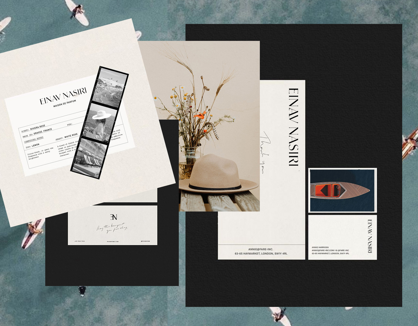
Einav Nasiri
Einav Nashiri is a women's clothing brand. Those who wear Einav feel free, sexy femininity with lots of confidence. She is independent and strong. The clothes are leisure, resort clothes designed with a lot of thought. The brand's message is to be a woman and be in constant freedom.
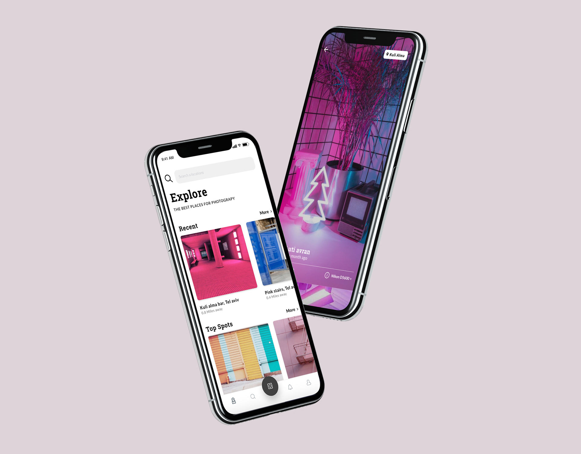
Spotip
SPOTIP is a platform designed for photographers seeking the perfect spot – near or far – to capture their next shot.
The app helps users discover beautiful, photogenic locations, tailored to their interests through a smart search engine with category filters.
Each location includes detailed info: recommended gear, time of day, and tips from other photographers who have already been there – along with sample photos for inspiration.
Once users explore a location, they’re invited to contribute: share new places, upload their photos, and become part of a global photography community.
A premium tier unlocks exclusive features: access to remote or restricted spots, offline saving, photography lectures, and advanced gear recommendations – all designed to help photographers capture the perfect moment, every time.
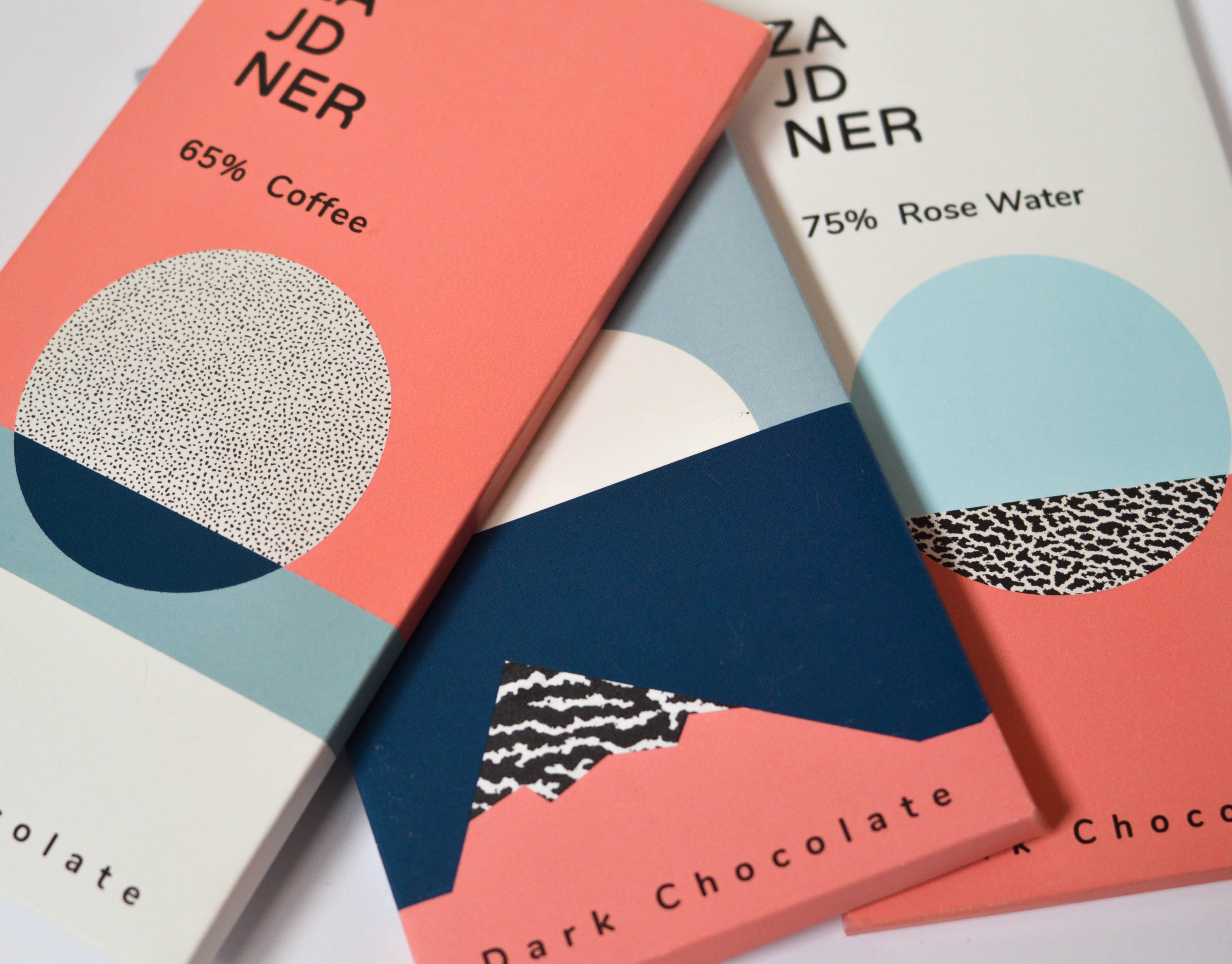
Diamonds chocolate
The journey of chocolate, from seed to finished product, reminded me of the way rocks are formed over time. Both begin as raw materials from nature and transform into something refined, rich, and full of character.
Inspired by this parallel, I designed a chocolate package that draws on geological textures and a desert-inspired color palette. The use of organic, abstract shapes reflects the wildness and unpredictability of natural formation processes.
To give the packaging a postcard-like feel, I incorporated rock textures and added information about various global mines on the back – creating a sensory and narrative-rich unboxing experience that connects the product to the earth it came from.

Good Intentions
A collaborative project between Shenkar’s Fashion Design Department and the Sheba Medical Center’s Rehabilitation Department for war-injured soldiers.
Twelve fashion students worked closely with twelve wounded soldiers, each with unique physical challenges and personal stories, to co-design adaptive, fashionable garments that promote independence and dignity in everyday life.
The process was rooted in design thinking, with occupational therapists guiding the students to create solutions such as magnetic closures, garments compatible with medical braces, and custom features like pockets for white canes.
Beyond aesthetics, the project explored how fashion can be a tool for healing, empowerment, and inclusion.
Maia Arazi, Tamar Mani, Helen Sofrin // Shenkar; Esti Neuhar, occupational therapist// Sheba Medical Center; Dana dariel, Laura Zajdner // Wix.