Cartel Font
A Hebrew font course which includes all the symbols and numbers. I inspired by a biblical old logo I saw, And from there the font developed.
Typography Shenkar College, fourth year / 2019
Guidance: Avraham cornfeld
More
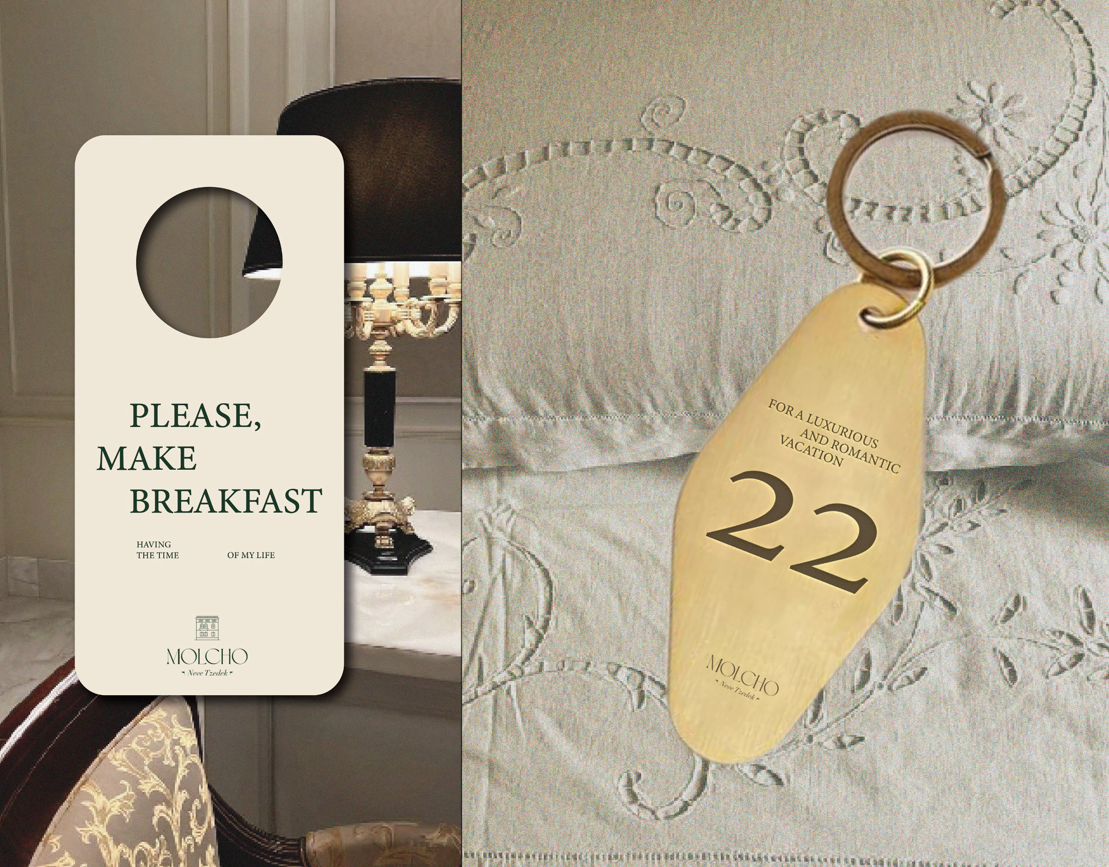
Molcho
A logo for a high-end suite hotel, offering boutique hospitality in the atmosphere of old Tel Aviv, located in Neve Tzedek. A place with history from old Tel Aviv, luxurious yet understated, in a special location on a street of artists and boutiques.
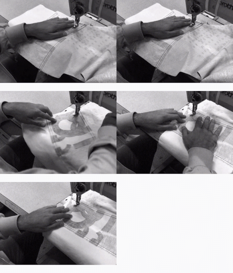
Disruption
created as part of a collaborative educational program, the three ‘disruption jackets’ are inspired
by the difficulties in communication between Chinese and Israeli students at shenkar college, Israel and yale
university, the US. the black and white denim is covered with letters and words falling apart.
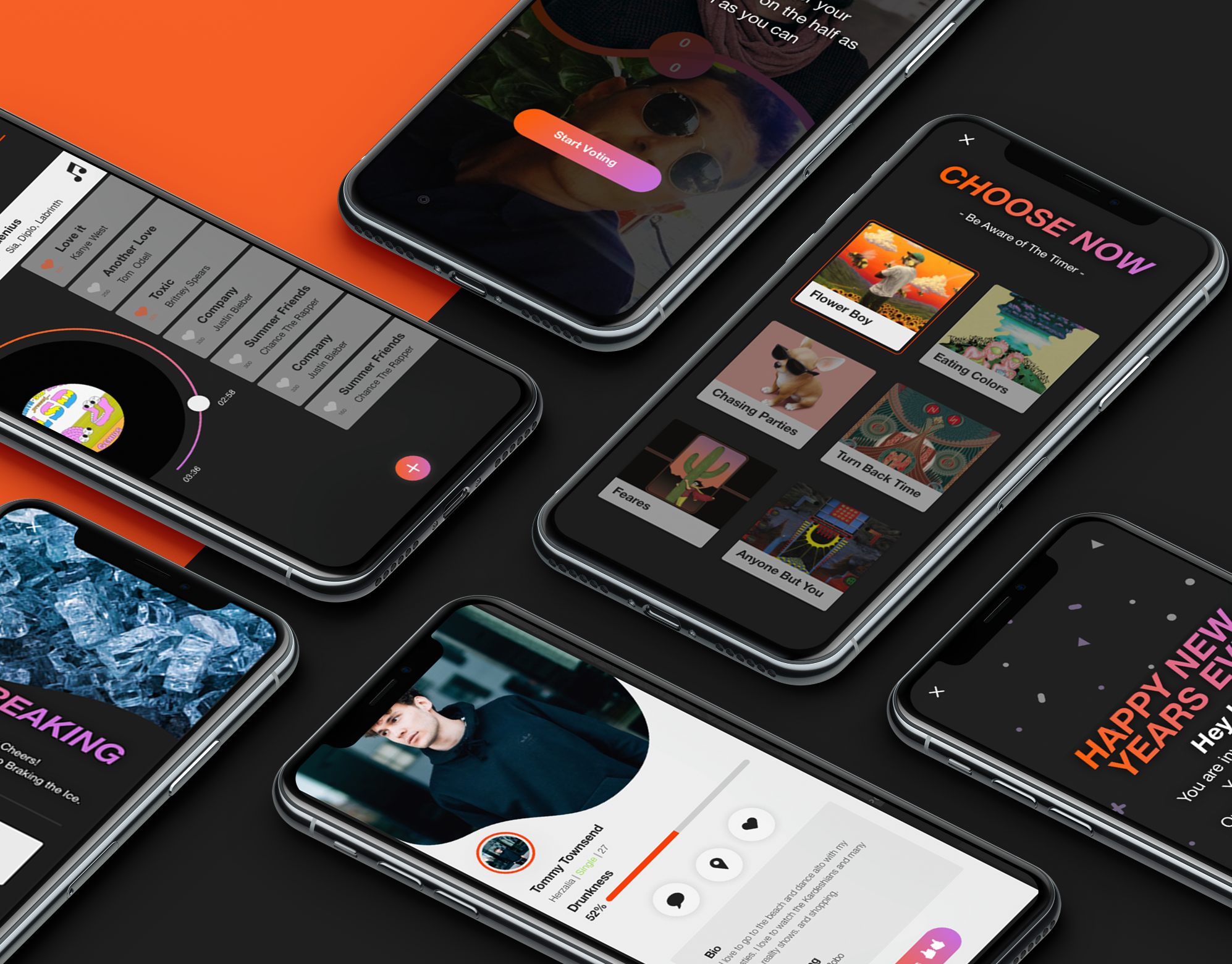
Screenshot
Screenshot is an interactive bar application, The app combines the experience of going out to a bar in synchronization between the smartphone and the visitor's activity in the bar. The bar is surrounded by screens that dynamically present what is going on in live broadcast. Through the application, the user stays up to date, constantly exposed to new experiences and acquaintances, can order food and drinks and be in the whole partner experience, in exchange for participation, the bar rewards the customers constantly.
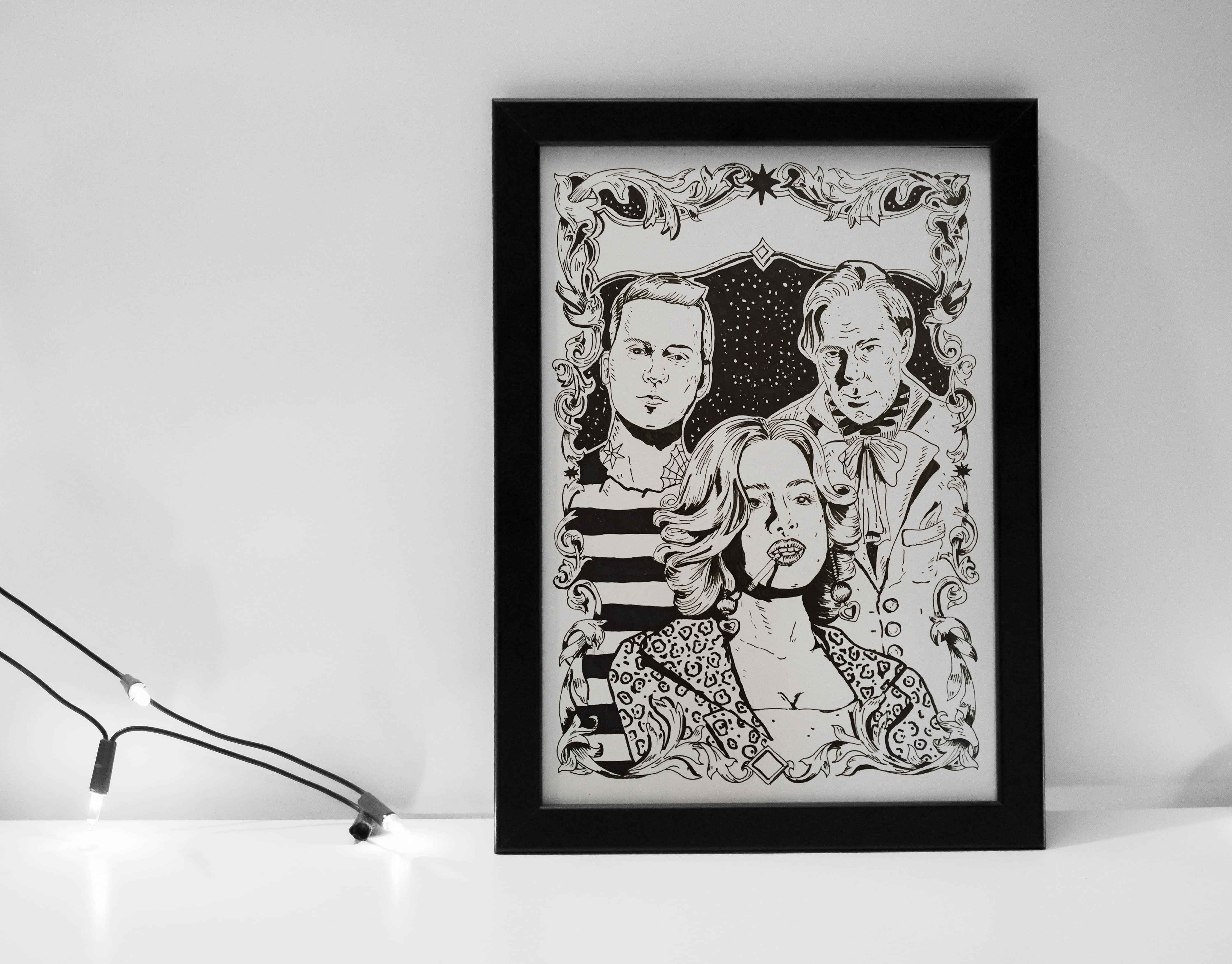
Drawing
poster story that i draw to a project.
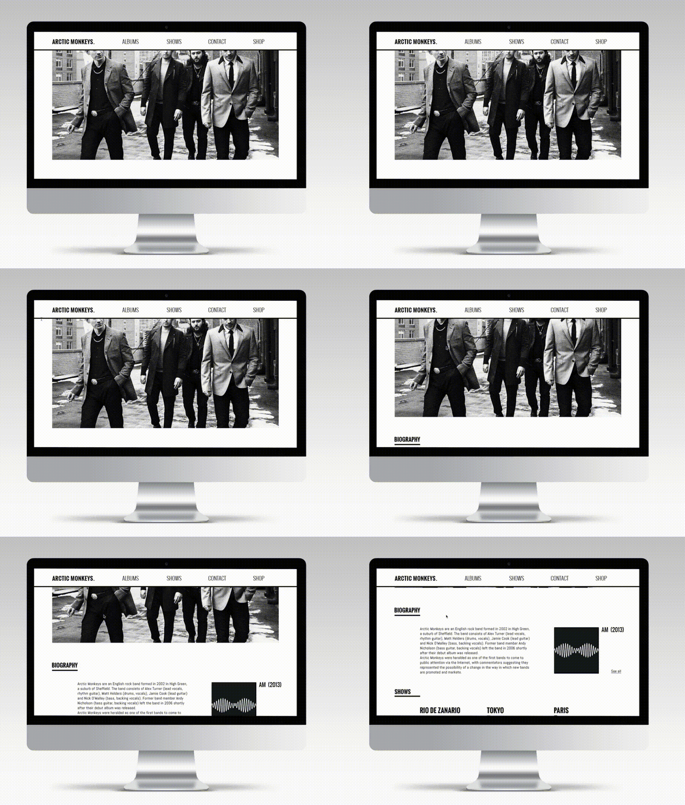
Arctic monkeys
A responsive website concept for the Arctic Monkeys, featuring a band timeline, full discography, and integrated online store – all designed to reflect the band’s unique tone and aesthetic.
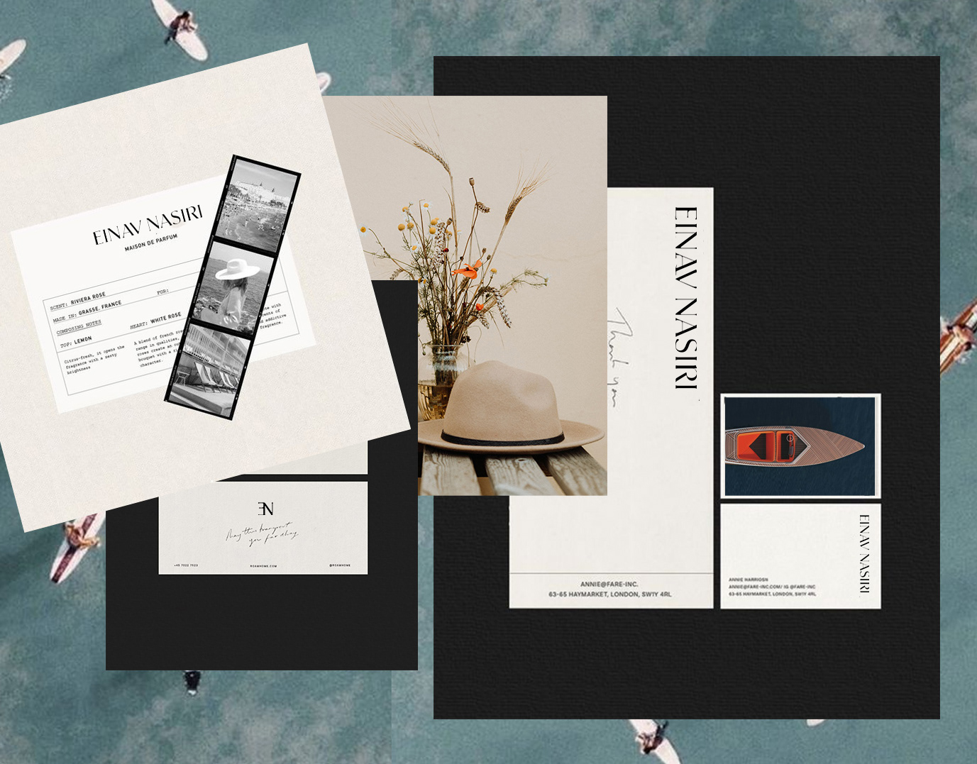
Einav Nasiri
Einav Nashiri is a women's clothing brand. Those who wear Einav feel free, sexy femininity with lots of confidence. She is independent and strong. The clothes are leisure, resort clothes designed with a lot of thought. The brand's message is to be a woman and be in constant freedom.
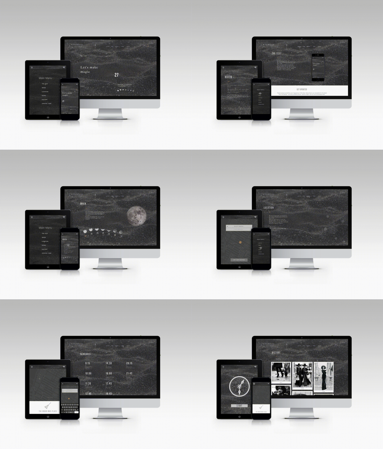
Witchfest
Welcome to Witchfest – a whimsical festival where witches unite to share magical trends, swap secrets, and enjoy eerie-sweet treats.
The responsive website invites visitors to explore event details in true ghastly style: from a celestial map guiding the way, to instructions on how to summon an Uber Broom, and even a way to send magical invitations to friends.
Witchy, witty, and web-ready.

Google Slides – version history
I redesigned Google’s version history experience to improve clarity, scannability, and decision-making in high-density workflows.
The focus was on reducing cognitive load, strengthening visual hierarchy, and helping users understand changes and restore confidence faster.
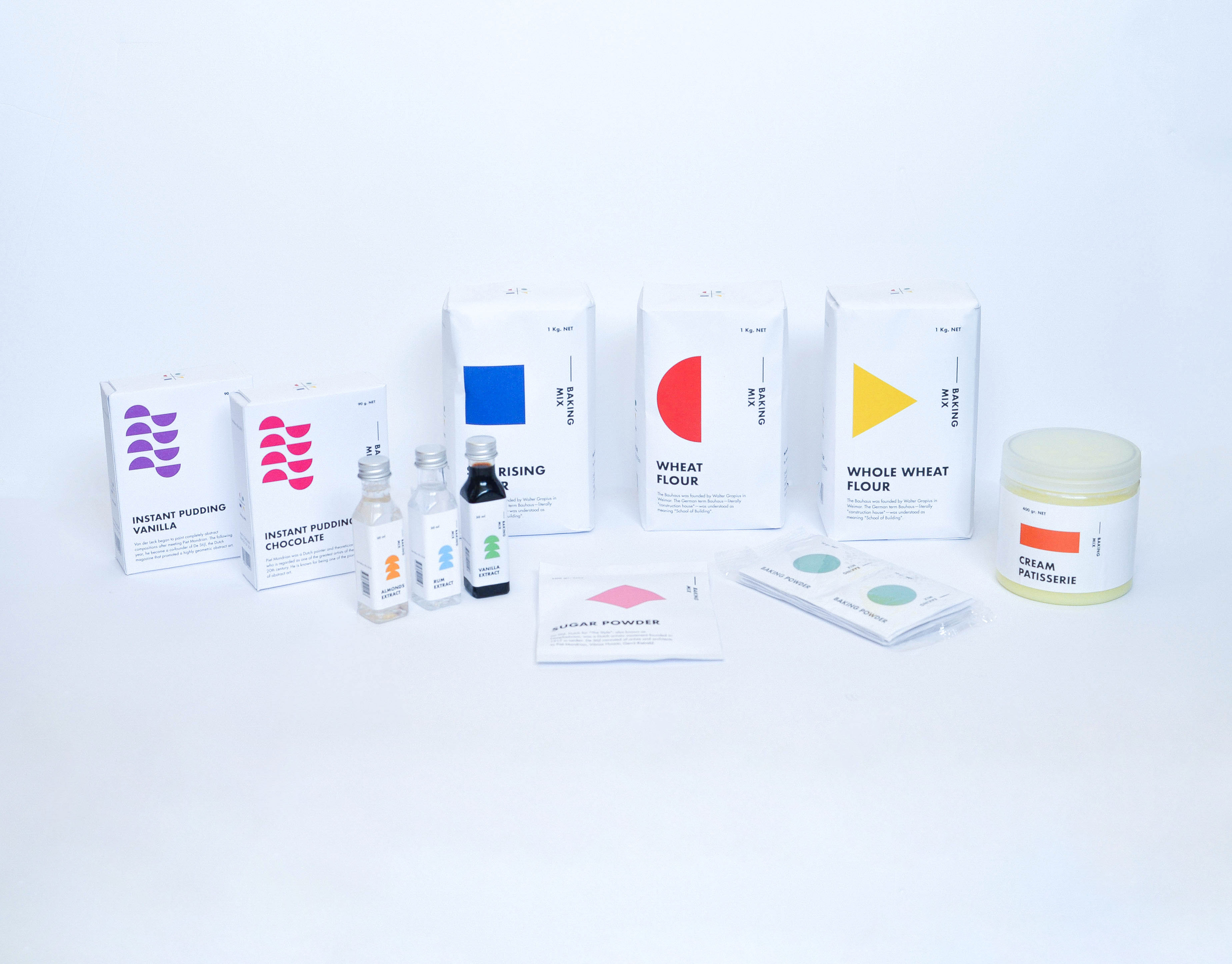
Baking packaging
Baking Products being a very basic substance. I compared it to Art. Any being can make art, as any being can create something as basic from baking products. I chose the Bauhaus era. A time that was identified with basic colors and shapes, including the font that was identified and used at that time. Various products have added printed informative knowledge at this time. Vertical and Horizontal graphic art was common use during those years. The topography was all designed and based on these shapes. Each color represents a product with a different flavor and Each shape represents a family group. The shape changes its form as the product becomes more complex. My starting point was the Wheat, flour group. I branched out from that starting point creating a language.
Spicy middle east
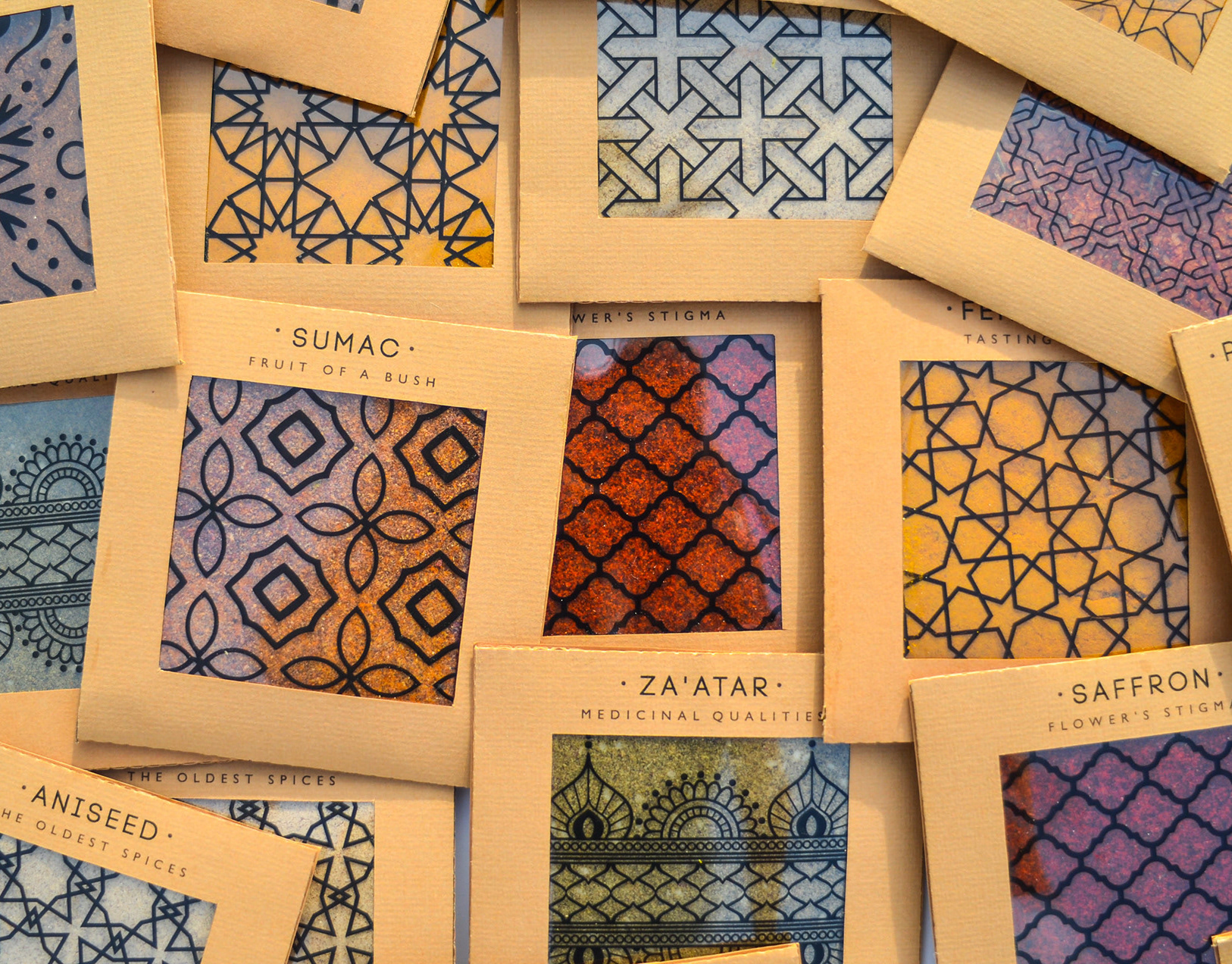
While working at a startup, I fell in love with sticky notes – their bold colors, versatility, and the creative energy they bring. Inspired by that spirit, I designed a spice packaging system that channels the startup vibe through color, shape, and tone.
The packaging mimics the square, lean format of sticky notes – compact and practical. A transparent window lets the natural colors of the spices shine through, acting as both a functional element and a vibrant design feature.
I explored Middle Eastern patterns, matching each spice with a mood and motif: the hotter the spice, the bolder the pattern.
Materials are compostable and eco-friendly, with a neutral brown base that emphasizes the natural beauty of the contents.
Just like sticky notes, these packages are made to stick anywhere in your kitchen – turning it into a colorful, expressive space inspired by the land they came from.