More

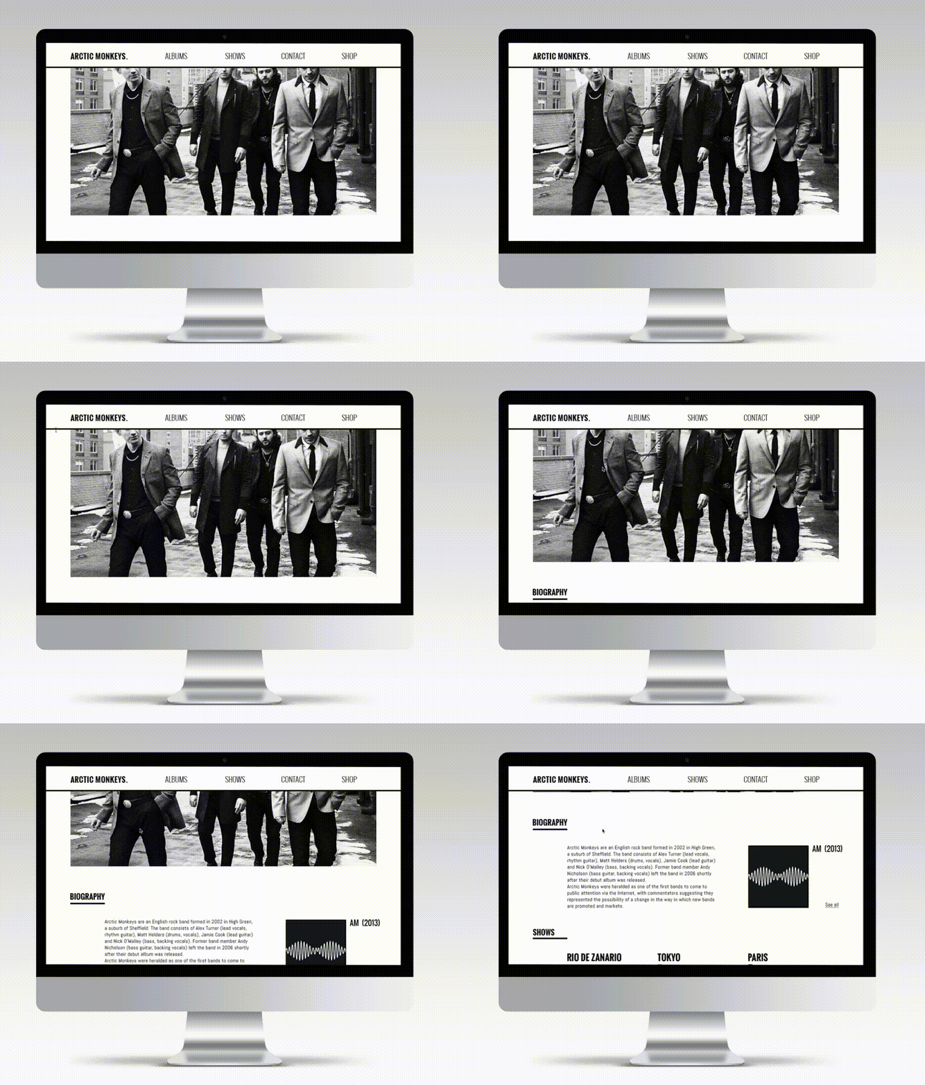
Arctic monkeys
A responsive website concept for the Arctic Monkeys, featuring a band timeline, full discography, and integrated online store – all designed to reflect the band’s unique tone and aesthetic.
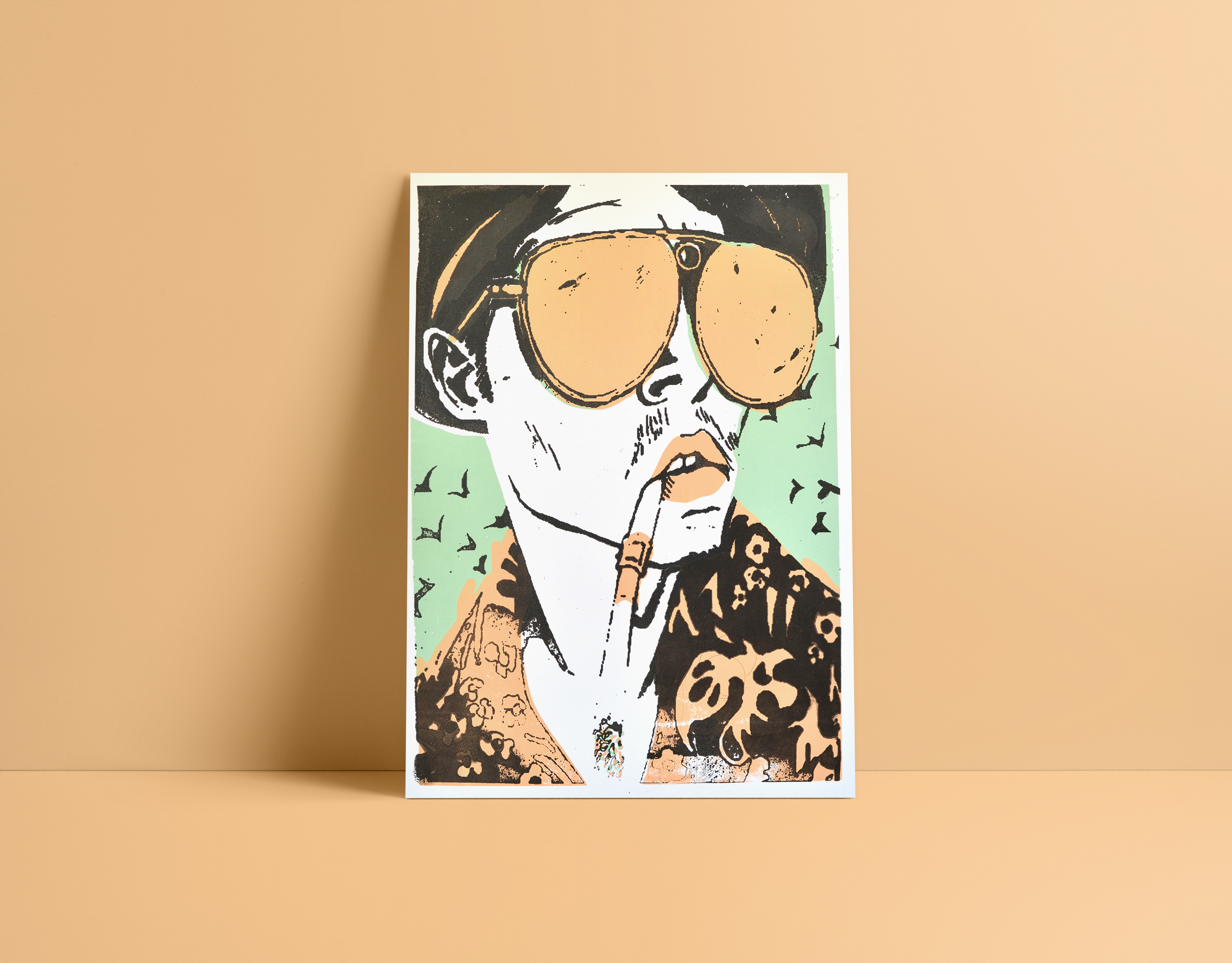
Drawing
poster story that i draw to a project.
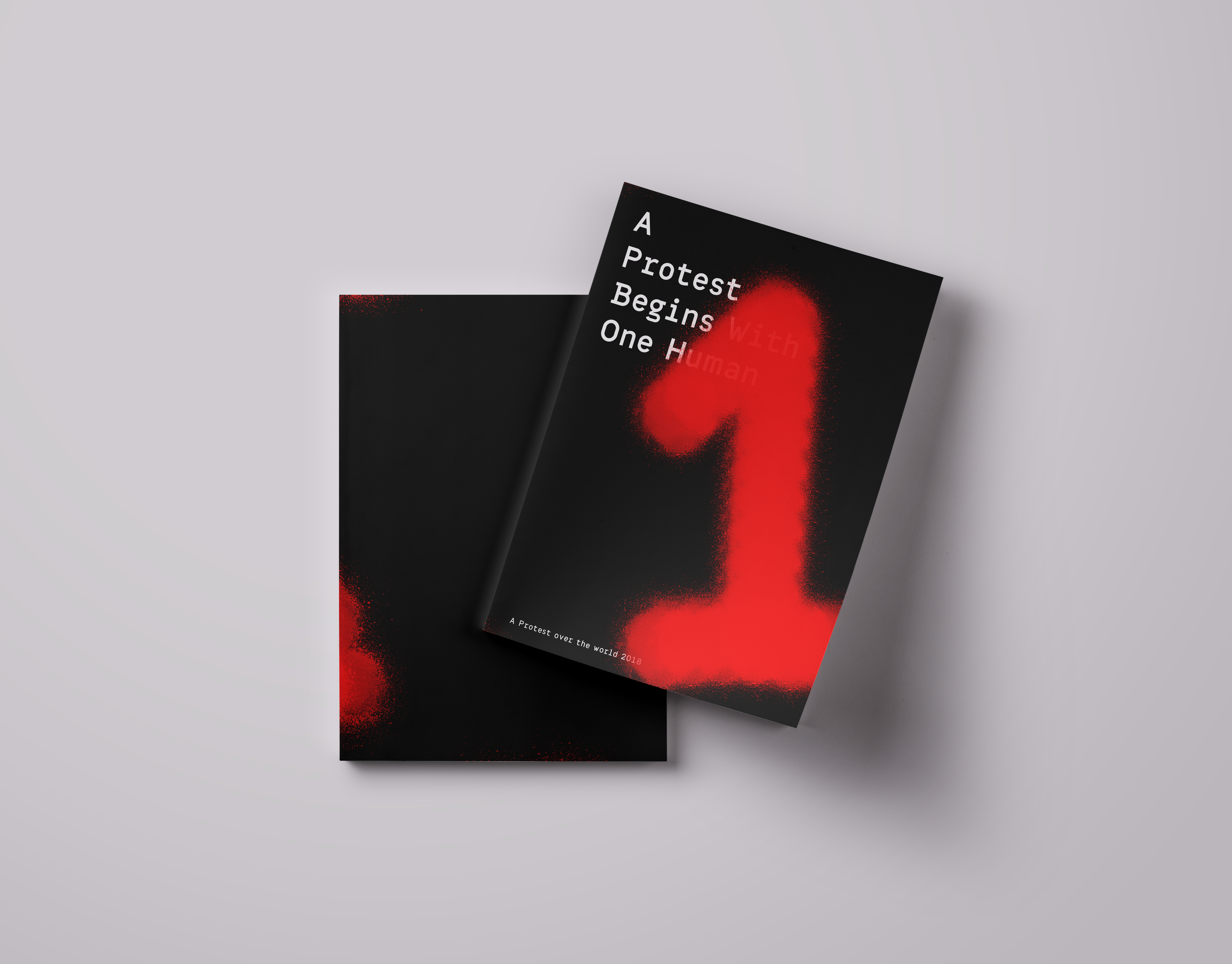
Protest catalog
A protest Begin with one human this is a catalog dealing with protests. the catalog is an introduction to the term "protest". The many different shades and layers this term contains. The catalog engages in a trial to see the many shades and layers of the word from the visual point of view. The colors that are bound together on the different billboards exposed in protests. The end focuses on the contrast between the individual as to the masses in a composition.
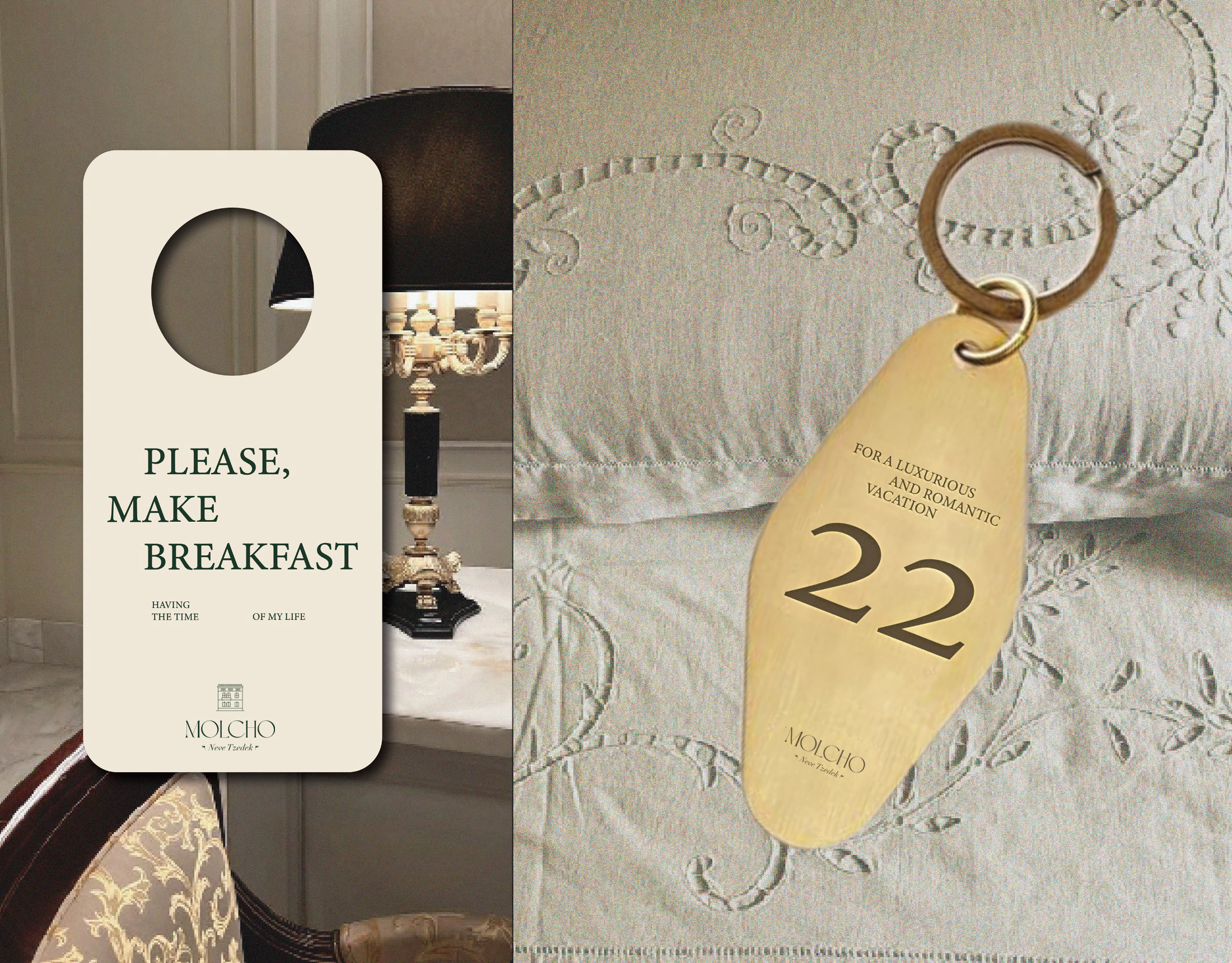
Molcho
A logo for a high-end suite hotel, offering boutique hospitality in the atmosphere of old Tel Aviv, located in Neve Tzedek. A place with history from old Tel Aviv, luxurious yet understated, in a special location on a street of artists and boutiques.
Cartel Font
A Hebrew font course which includes all the symbols and numbers. I inspired by a biblical old logo I saw, And from there the font developed.
Geula
I have spoken from a point that pizza is available, it can be fast food, demands the minimum necessities, personally speaking - I rather eat in an underground pizza place than on some fancy restaurant downtown plus it's always available immediately and cheap and not being ‘’wanna be’’ on you. All these things connected me to the street scene in general and to all of the punk culture in particular. The punk culture is disgusted with materialism, it is very urban. The name Geula (free translate from hebrew to salvation, redemption, freedom), refers to the ideology of the punk culture, to the freedom of peace and redemption they believed in the suppression of the law and the establishment or anything that reminded Western society. The place itself is a pizza bar that provides a stage for music, the place is just delicious and cheap. Everyone who buys a pizza gets a poster, each time a different random poster. Few words on the design language, at first i focused on fanzines whose goal was quick and cheap. I chose a three main colors palette of simple, inexpensive pages. The language also involves layers and patterns of the pizza toppings and also the punk favorite cloths. I chose to do all of the branding in Hebrew and i focused on the late 70’ and early 80’ around the well known club name ‘’penguin’’ and the ‘’Dan Cinema’’ movie place. The punk culture in israel is different from the rest of the world. I studied close about the period and the israeli punk bands who involve in their songs political messages that refers to freedom, redemption and salvation( all connected to one word - Geula. My challenge was taking all this language and time zones and turn in into something modern, that fits the present, but still not taking it to commercialized places, and not for profit interests.
Spicy middle east
While working at a startup, I fell in love with sticky notes – their bold colors, versatility, and the creative energy they bring. Inspired by that spirit, I designed a spice packaging system that channels the startup vibe through color, shape, and tone. The packaging mimics the square, lean format of sticky notes – compact and practical. A transparent window lets the natural colors of the spices shine through, acting as both a functional element and a vibrant design feature. I explored Middle Eastern patterns, matching each spice with a mood and motif: the hotter the spice, the bolder the pattern. Materials are compostable and eco-friendly, with a neutral brown base that emphasizes the natural beauty of the contents. Just like sticky notes, these packages are made to stick anywhere in your kitchen – turning it into a colorful, expressive space inspired by the land they came from.
Spotip
SPOTIP is a platform designed for photographers seeking the perfect spot – near or far – to capture their next shot. The app helps users discover beautiful, photogenic locations, tailored to their interests through a smart search engine with category filters. Each location includes detailed info: recommended gear, time of day, and tips from other photographers who have already been there – along with sample photos for inspiration. Once users explore a location, they’re invited to contribute: share new places, upload their photos, and become part of a global photography community. A premium tier unlocks exclusive features: access to remote or restricted spots, offline saving, photography lectures, and advanced gear recommendations – all designed to help photographers capture the perfect moment, every time.
Meriash Logotype
Logotype for fashion designer MERIASH is an intimate and small young brand that engraves on its banner creative, enchanted and mysterious worlds through which unique clothing items with a distinct design language are created. There is a range of complexity in the same breath - from the most commercial items to the highly invested items. The quantities are not significant.
Music 3
A visual identity for a music channel inspired by the evolution of rap culture and technology. The icon set reflects three decades of sound, featuring a vinyl record (1980s), a boombox (1990s), and an iPod (2000s) – each representing how rap music was consumed and lived through the years. The logotype and icons combine bold rhythm and nostalgic references to express the channel’s dynamic voice.
Back to Top