Contemporary Art Website
The site showcases famous contemporary art works from around the world and provides information about the artists behind the scenes. It also features articles regarding issues in the art world, while trying to immerse the viewer in the exciting world of contemporary art.
Interactive course, Shenkar college, second year / 2017.
guidance: Haim agami
More
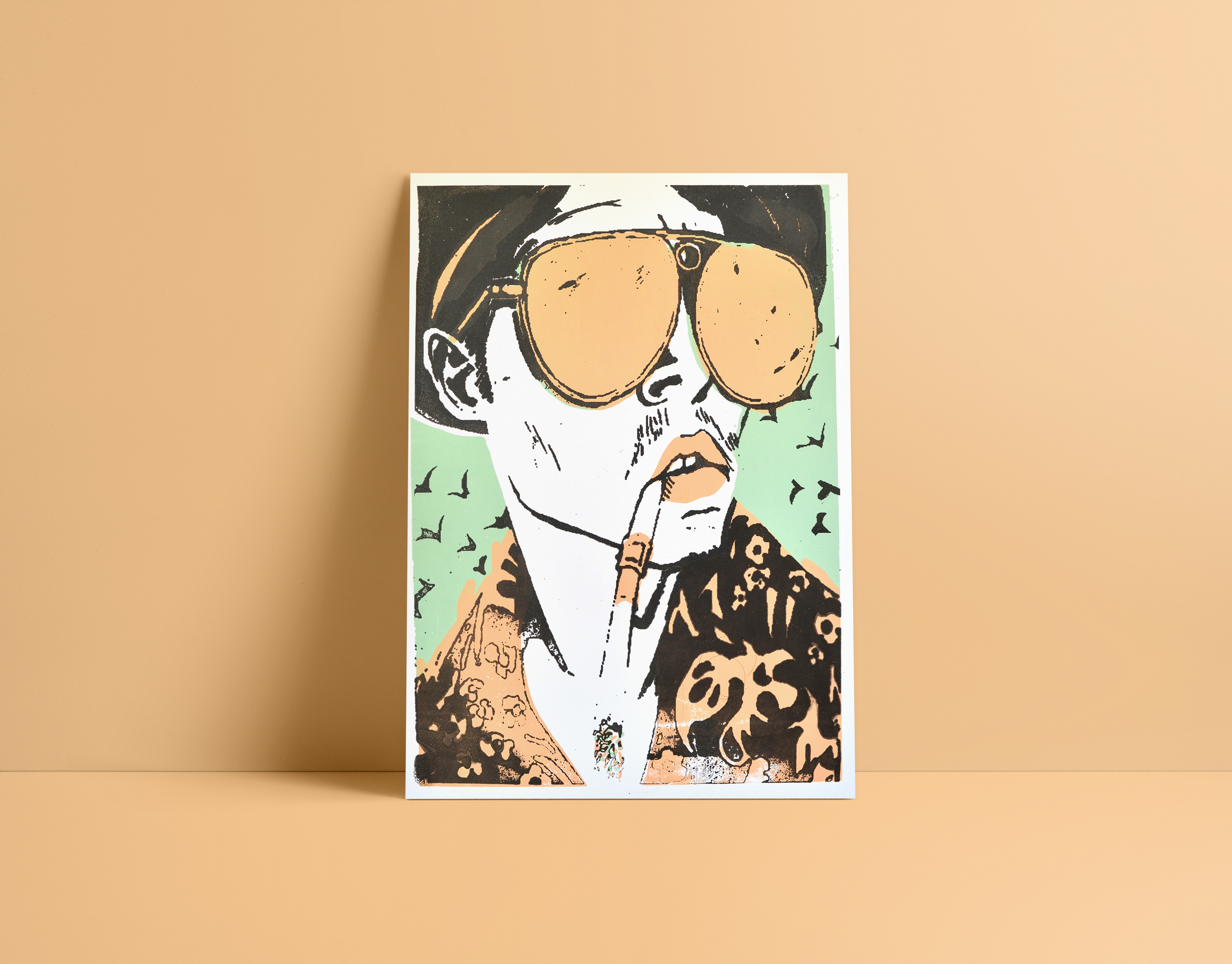
Silk print
Silk screen printing.
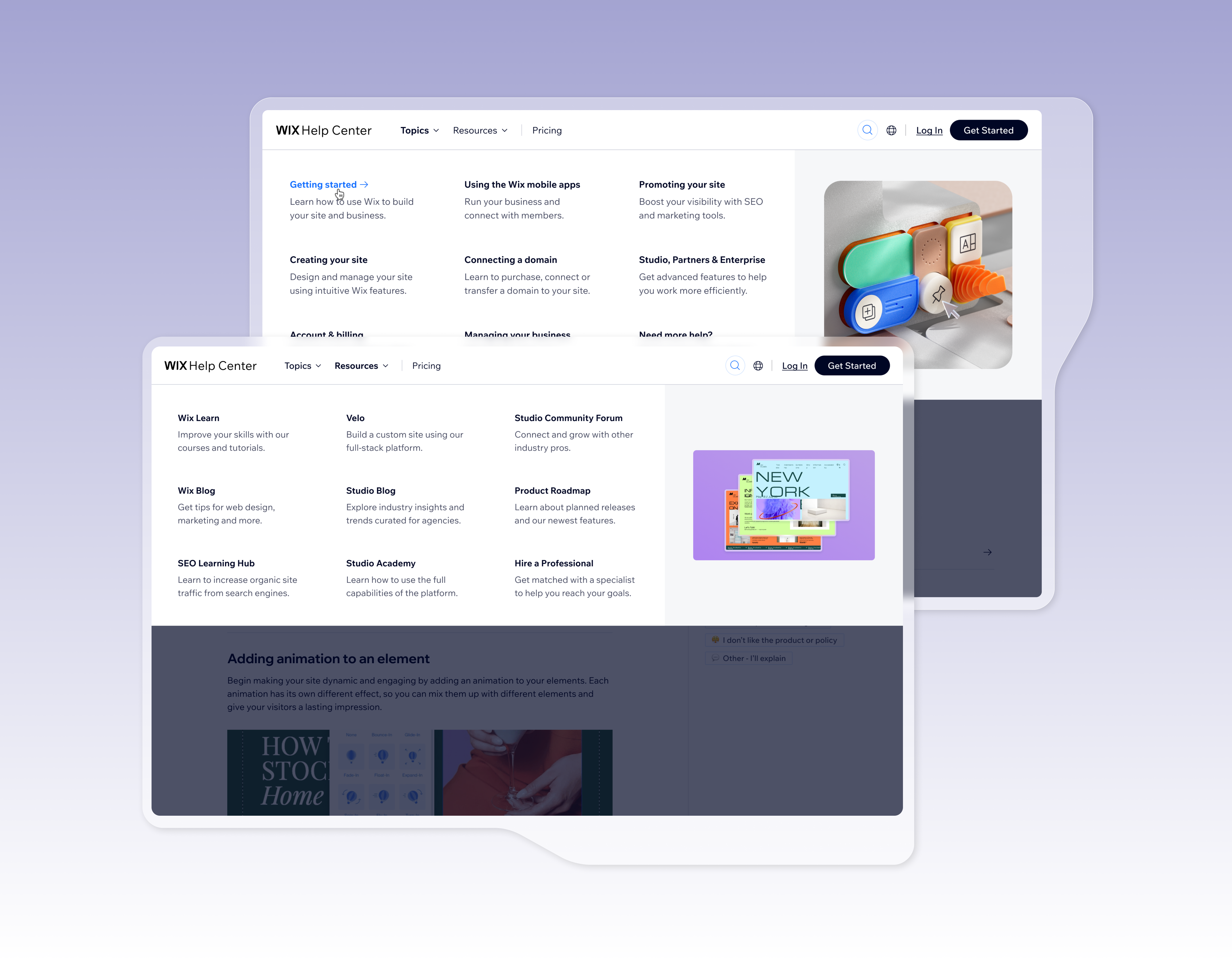
Help center header
The Wix Help Center used to inherit the global Wix.com header. This created several problems: it took up too much space, included irrelevant links, wasn’t aligned with support best practices, and we had no control over its content or data. The goal was to design a dedicated, independent header tailored for support, aligned with industry standards, and optimized for Help Center users.
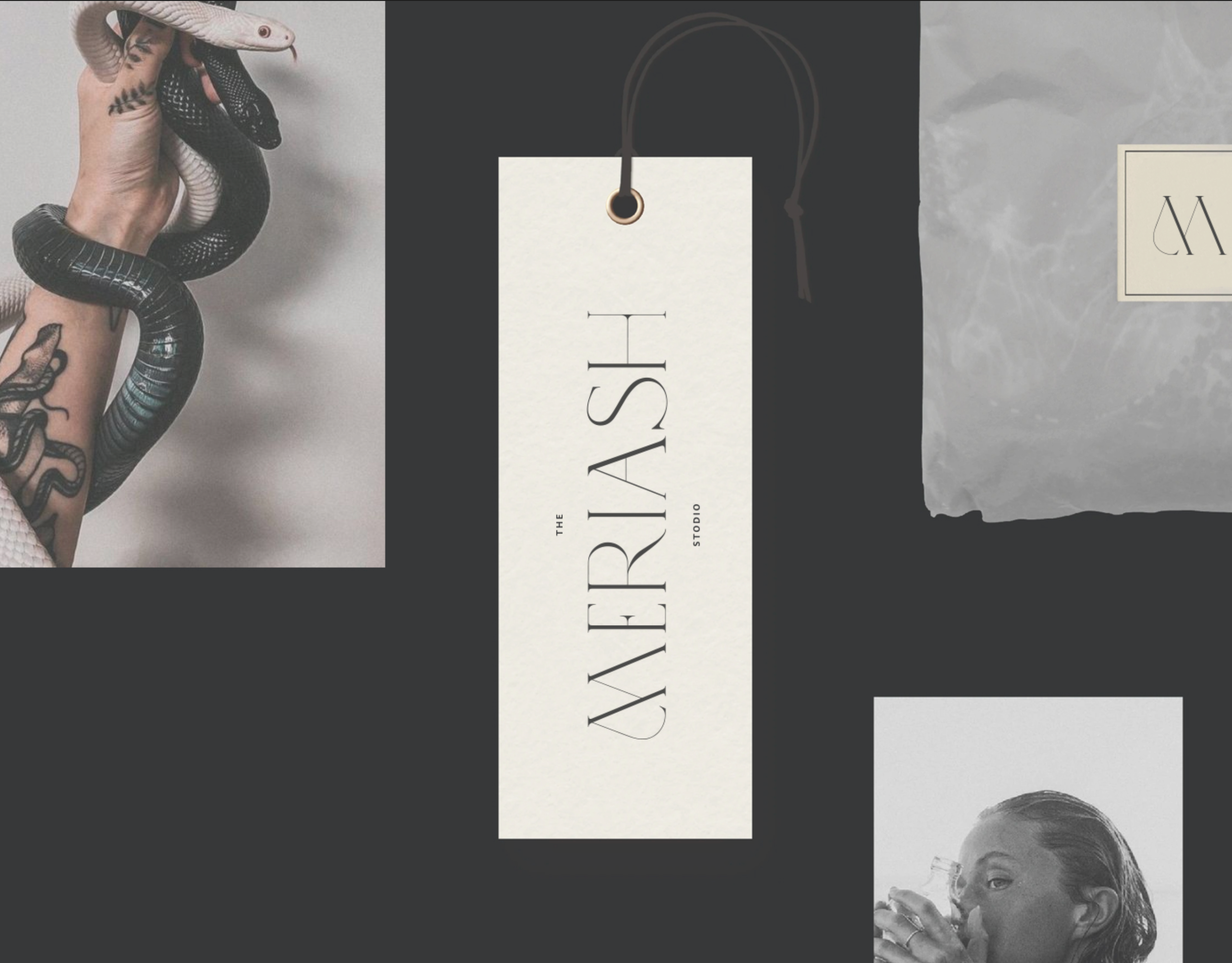
Meriash Logotype
Logotype for fashion designer
MERIASH is an intimate and small young brand that engraves on its banner creative, enchanted and mysterious worlds through which unique clothing items with a distinct design language are created. There is a range of complexity in the same breath - from the most commercial items to the highly invested items. The quantities are not significant.
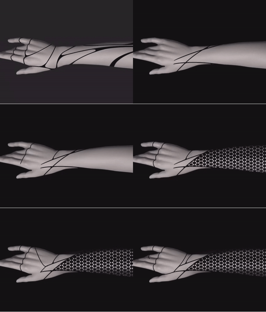
3D Hand
Prosthetic Hand Redesign – Function Meets Fashion
As part of this project, we were asked to redesign the prosthetic hand and rethink how it could be improved both functionally and emotionally.
We identified an aesthetic gap in existing solutions – especially for an older audience seeking to express individuality and even celebration, rather than hiding or neutralizing the prosthesis.Our goal was to create a product that’s not only functional and ergonomic, but also fashionable – a personal accessory that reflects the user’s style.The concept also places emphasis on the user experience throughout the process: from design customization to production and, finally, to delivery – making the user feel like a co-creator of their own prosthetic.
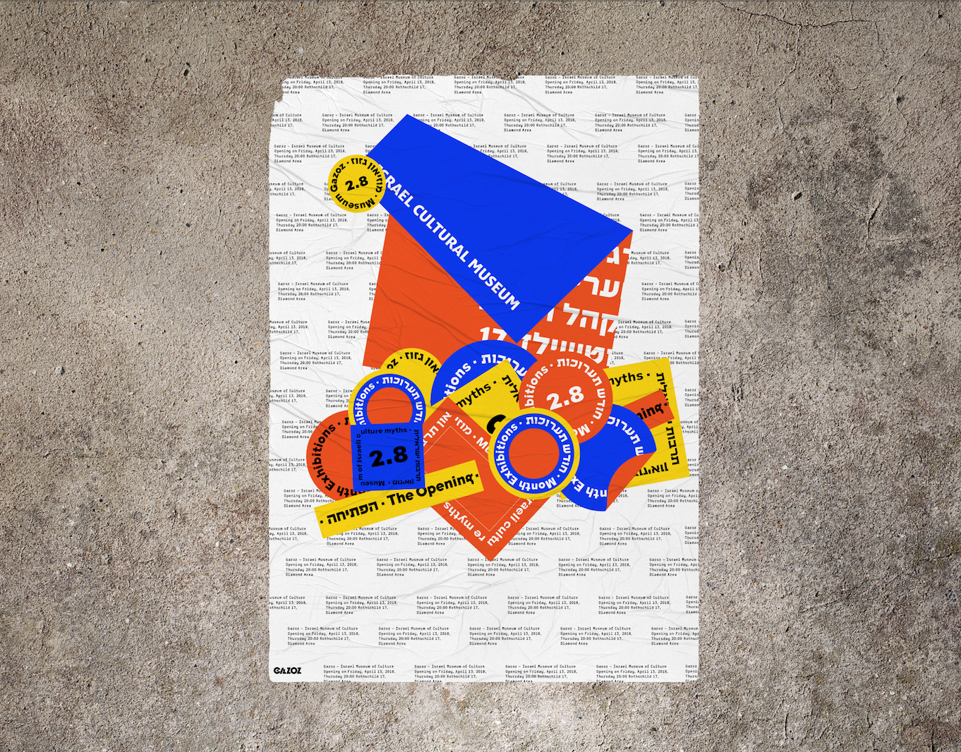
Gazoz israeli museum
Branding of "Gazoz Museum of Israeli culture"
The colors used are of the Mediterranean sands, sea, and sun.
I was inspired by the amount of stickers that vary, represent and express, the multitude of cultural connections in Israel.
My design is based on the informative, somewhat boring and mundane side of the Museum in contrast of the sassy, unpretentious Israeli side that's glued on layers and layers of different views and expressive ideas.
I chose a naked cement wall that in my view symbolizes true and hard israeliness.
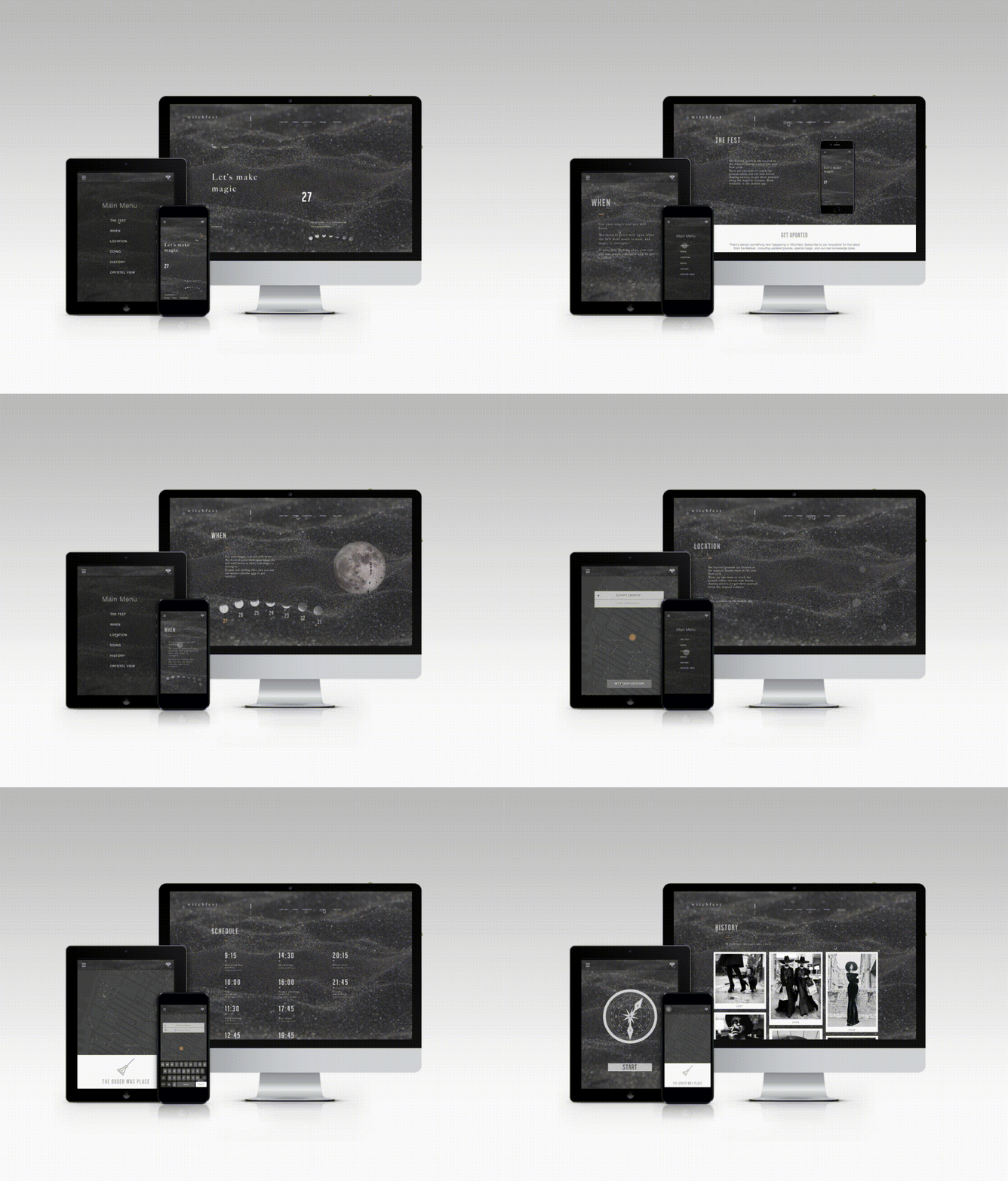
Witchfest
Welcome to Witchfest – a whimsical festival where witches unite to share magical trends, swap secrets, and enjoy eerie-sweet treats.
The responsive website invites visitors to explore event details in true ghastly style: from a celestial map guiding the way, to instructions on how to summon an Uber Broom, and even a way to send magical invitations to friends.
Witchy, witty, and web-ready.
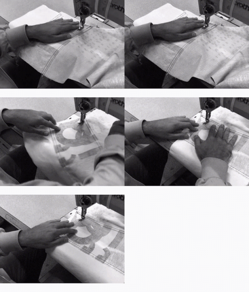
Disruption
created as part of a collaborative educational program, the three ‘disruption jackets’ are inspired
by the difficulties in communication between Chinese and Israeli students at shenkar college, Israel and yale
university, the US. the black and white denim is covered with letters and words falling apart.
Logos
Some of the logos that I made
Spicy middle east
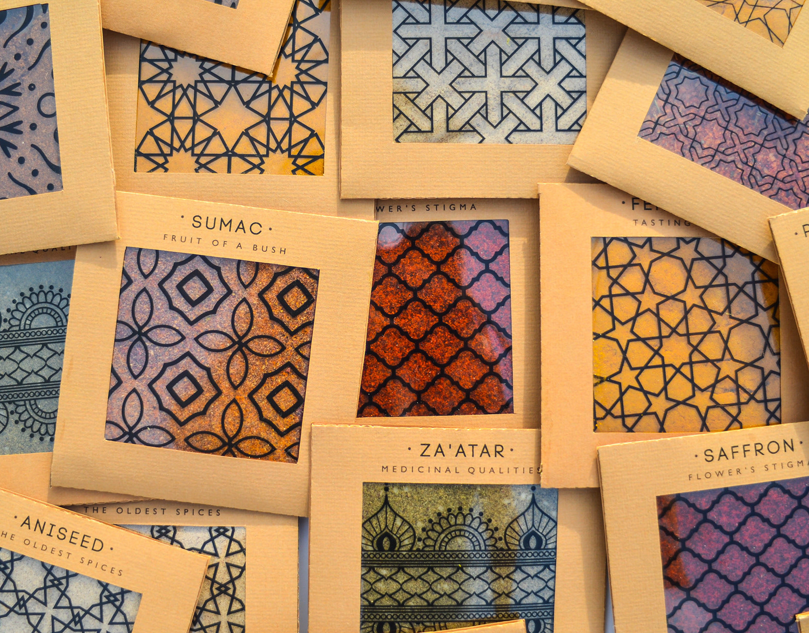
While working at a startup, I fell in love with sticky notes – their bold colors, versatility, and the creative energy they bring. Inspired by that spirit, I designed a spice packaging system that channels the startup vibe through color, shape, and tone.
The packaging mimics the square, lean format of sticky notes – compact and practical. A transparent window lets the natural colors of the spices shine through, acting as both a functional element and a vibrant design feature.
I explored Middle Eastern patterns, matching each spice with a mood and motif: the hotter the spice, the bolder the pattern.
Materials are compostable and eco-friendly, with a neutral brown base that emphasizes the natural beauty of the contents.
Just like sticky notes, these packages are made to stick anywhere in your kitchen – turning it into a colorful, expressive space inspired by the land they came from.
Avney Derech
A New Model for Burial Rooted in Ancient Jewish Tradition
Avnei Derech is a conceptual burial system based on the ancient Jewish practice of “gathering of bones” – a two-stage burial technique mentioned in biblical and historical sources, and widely practiced in communities such as Morocco.
This project responds to a pressing issue: the increasing shortage of burial space in Israel. Existing solutions, like multi-level cemeteries, are expensive and spatially inefficient.
In contrast, this method allows for up to 65 times more burial plots per dunam (1,000 sqm) without compromising religious law.
The process includes:
*Stage 1: Temporary burial (“subsidiary burial”)
*Stage 2: After one year, the bones are respectfully transferred to a permanent stone or clay grave
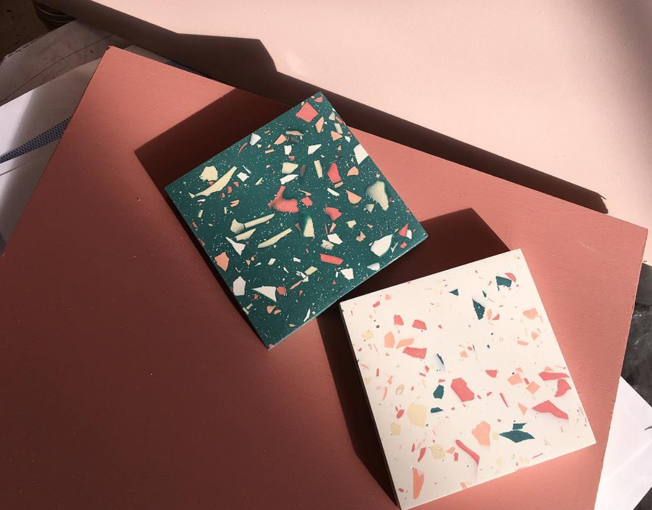
The design system I developed translates this spiritual, practical solution into a modern, respectful, and personal experience. Inspired by the terrazzo aesthetic – a material rooted in Israeli architecture – I created a series of modular, recycled-stone graves, each customizable in color, texture, density, and form.
The graves are arranged in vertical structures, up to four stories high, forming an urban geometric landscape that is both solemn and poetic. A narrow slit between graves serves as a tray for small personal objects like flowers or stones. Viewed from above, the arrangement creates a powerful mosaic of remembrance.
The system includes:
-A catalog explaining the religious, practical, and emotional layers of the burial process
-Modular grave designs with variations in shape, size, and material
-A visual selection system for clients and families, enabling them to personalize the grave in alignment with Jewish law
-A filing and registration system, including digital scan keys and physical models (1:23 and 1:1 scale) to preview the result
Every material is sustainably sourced, easy to produce, and designed to last — because even in death, we can choose meaning, care, and connection to the land we came from.
This project proposes a new vision of burial: one that honors tradition while embracing innovation, and offers comfort in form, material, and message — where stone becomes memory, and memory becomes peace.