Avney Derech
A New Model for Burial Rooted in Ancient Jewish Tradition
Avnei Derech is a conceptual burial system based on the ancient Jewish practice of “gathering of bones” – a two-stage burial technique mentioned in biblical and historical sources, and widely practiced in communities such as Morocco.
This project responds to a pressing issue: the increasing shortage of burial space in Israel. Existing solutions, like multi-level cemeteries, are expensive and spatially inefficient.
In contrast, this method allows for up to 65 times more burial plots per dunam (1,000 sqm) without compromising religious law.
The process includes:
*Stage 1: Temporary burial (“subsidiary burial”)
*Stage 2: After one year, the bones are respectfully transferred to a permanent stone or clay grave
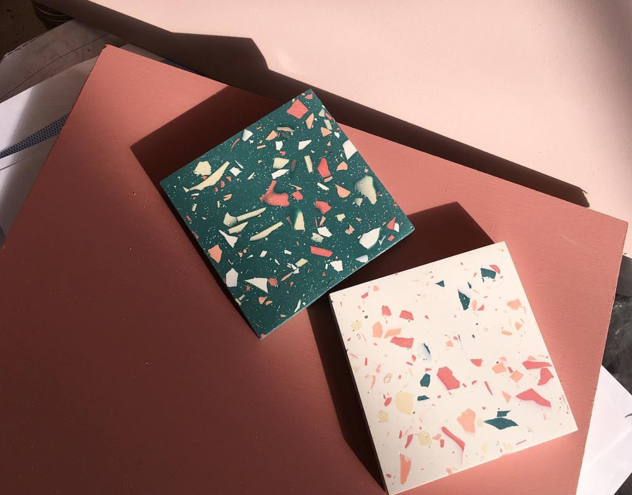
The design system I developed translates this spiritual, practical solution into a modern, respectful, and personal experience. Inspired by the terrazzo aesthetic – a material rooted in Israeli architecture – I created a series of modular, recycled-stone graves, each customizable in color, texture, density, and form.
The graves are arranged in vertical structures, up to four stories high, forming an urban geometric landscape that is both solemn and poetic. A narrow slit between graves serves as a tray for small personal objects like flowers or stones. Viewed from above, the arrangement creates a powerful mosaic of remembrance.
The system includes:
-A catalog explaining the religious, practical, and emotional layers of the burial process
-Modular grave designs with variations in shape, size, and material
-A visual selection system for clients and families, enabling them to personalize the grave in alignment with Jewish law
-A filing and registration system, including digital scan keys and physical models (1:23 and 1:1 scale) to preview the result
Every material is sustainably sourced, easy to produce, and designed to last — because even in death, we can choose meaning, care, and connection to the land we came from.
This project proposes a new vision of burial: one that honors tradition while embracing innovation, and offers comfort in form, material, and message — where stone becomes memory, and memory becomes peace.