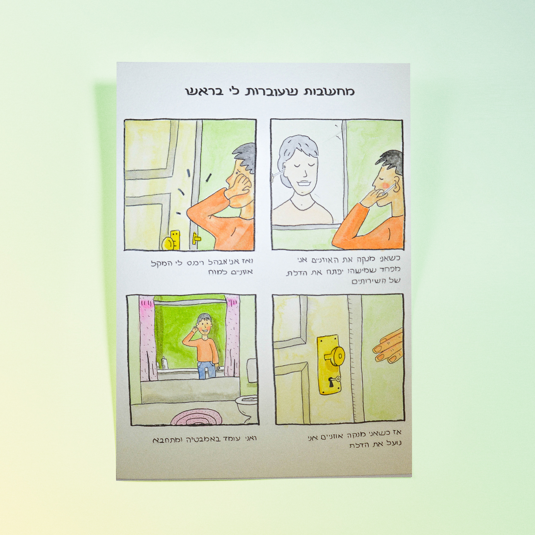
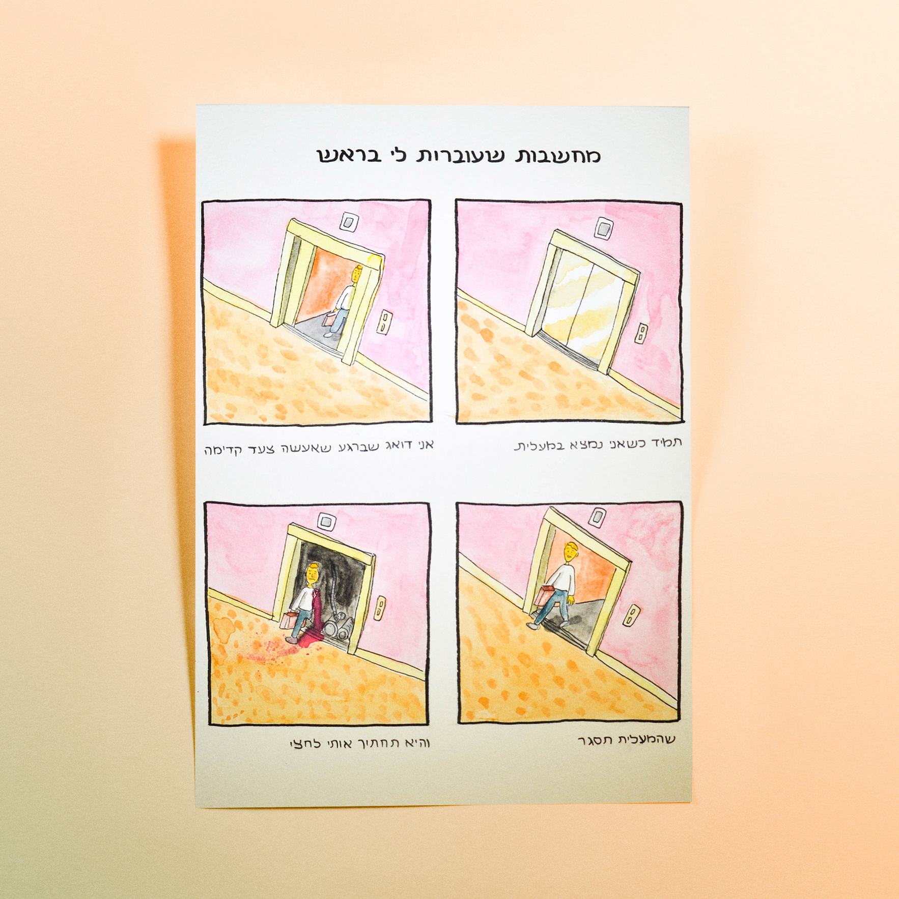
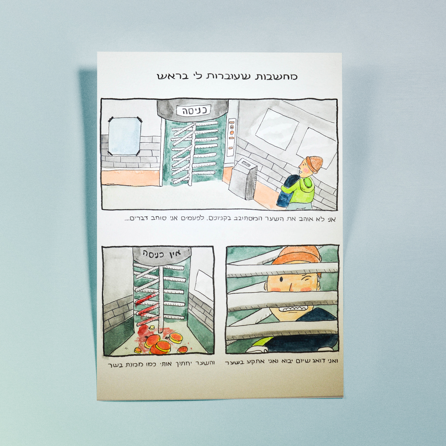
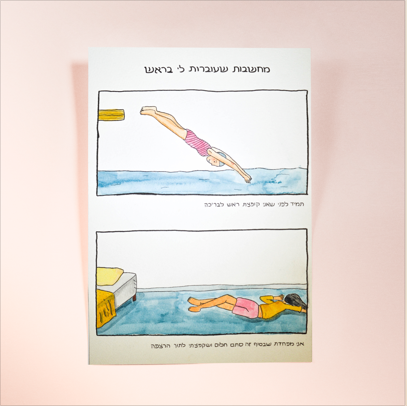
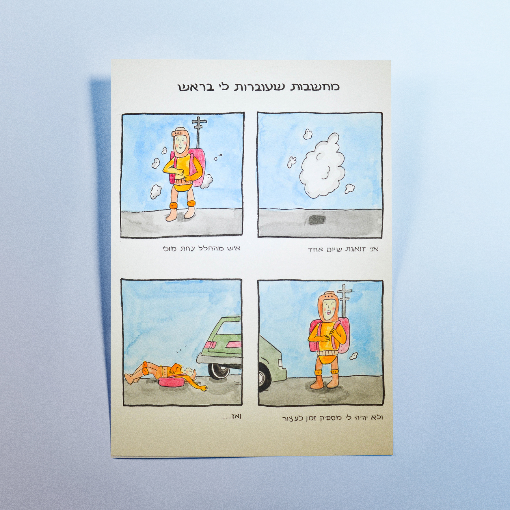
More

Logos
Some of the logos that I made
Meriash Logotype
Logotype for fashion designer MERIASH is an intimate and small young brand that engraves on its banner creative, enchanted and mysterious worlds through which unique clothing items with a distinct design language are created. There is a range of complexity in the same breath - from the most commercial items to the highly invested items. The quantities are not significant.
Spotip
SPOTIP is a platform designed for photographers seeking the perfect spot – near or far – to capture their next shot. The app helps users discover beautiful, photogenic locations, tailored to their interests through a smart search engine with category filters. Each location includes detailed info: recommended gear, time of day, and tips from other photographers who have already been there – along with sample photos for inspiration. Once users explore a location, they’re invited to contribute: share new places, upload their photos, and become part of a global photography community. A premium tier unlocks exclusive features: access to remote or restricted spots, offline saving, photography lectures, and advanced gear recommendations – all designed to help photographers capture the perfect moment, every time.
clippy
Clippy is a platform a social network that 's based on video realms and creates clips that personally coordinate word connections to videos.
Cartel Font
A Hebrew font course which includes all the symbols and numbers. I inspired by a biblical old logo I saw, And from there the font developed.
Molcho
A logo for a high-end suite hotel, offering boutique hospitality in the atmosphere of old Tel Aviv, located in Neve Tzedek. A place with history from old Tel Aviv, luxurious yet understated, in a special location on a street of artists and boutiques.
Avney Derech
A New Model for Burial Rooted in Ancient Jewish Tradition Avnei Derech is a conceptual burial system based on the ancient Jewish practice of “gathering of bones” – a two-stage burial technique mentioned in biblical and historical sources, and widely practiced in communities such as Morocco. This project responds to a pressing issue: the increasing shortage of burial space in Israel. Existing solutions, like multi-level cemeteries, are expensive and spatially inefficient. In contrast, this method allows for up to 65 times more burial plots per dunam (1,000 sqm) without compromising religious law. The process includes: *Stage 1: Temporary burial (“subsidiary burial”) *Stage 2: After one year, the bones are respectfully transferred to a permanent stone or clay grave The design system I developed translates this spiritual, practical solution into a modern, respectful, and personal experience. Inspired by the terrazzo aesthetic – a material rooted in Israeli architecture – I created a series of modular, recycled-stone graves, each customizable in color, texture, density, and form. The graves are arranged in vertical structures, up to four stories high, forming an urban geometric landscape that is both solemn and poetic. A narrow slit between graves serves as a tray for small personal objects like flowers or stones. Viewed from above, the arrangement creates a powerful mosaic of remembrance. The system includes: -A catalog explaining the religious, practical, and emotional layers of the burial process -Modular grave designs with variations in shape, size, and material -A visual selection system for clients and families, enabling them to personalize the grave in alignment with Jewish law -A filing and registration system, including digital scan keys and physical models (1:23 and 1:1 scale) to preview the result Every material is sustainably sourced, easy to produce, and designed to last — because even in death, we can choose meaning, care, and connection to the land we came from. This project proposes a new vision of burial: one that honors tradition while embracing innovation, and offers comfort in form, material, and message — where stone becomes memory, and memory becomes peace.
Diamonds chocolate
The journey of chocolate, from seed to finished product, reminded me of the way rocks are formed over time. Both begin as raw materials from nature and transform into something refined, rich, and full of character. Inspired by this parallel, I designed a chocolate package that draws on geological textures and a desert-inspired color palette. The use of organic, abstract shapes reflects the wildness and unpredictability of natural formation processes. To give the packaging a postcard-like feel, I incorporated rock textures and added information about various global mines on the back – creating a sensory and narrative-rich unboxing experience that connects the product to the earth it came from.
Drawing
poster story that i draw to a project.
Spicy middle east
While working at a startup, I fell in love with sticky notes – their bold colors, versatility, and the creative energy they bring. Inspired by that spirit, I designed a spice packaging system that channels the startup vibe through color, shape, and tone. The packaging mimics the square, lean format of sticky notes – compact and practical. A transparent window lets the natural colors of the spices shine through, acting as both a functional element and a vibrant design feature. I explored Middle Eastern patterns, matching each spice with a mood and motif: the hotter the spice, the bolder the pattern. Materials are compostable and eco-friendly, with a neutral brown base that emphasizes the natural beauty of the contents. Just like sticky notes, these packages are made to stick anywhere in your kitchen – turning it into a colorful, expressive space inspired by the land they came from.
Back to Top