Unselected options:
N.1
N.2
N.3

More

Poster Festival
Four versions of a poster promoting a cinematic event: ״To infinity and beyond״ black & white.
Witchfest
Welcome to Witchfest – a whimsical festival where witches unite to share magical trends, swap secrets, and enjoy eerie-sweet treats. The responsive website invites visitors to explore event details in true ghastly style: from a celestial map guiding the way, to instructions on how to summon an Uber Broom, and even a way to send magical invitations to friends. Witchy, witty, and web-ready.
Gazoz israeli museum
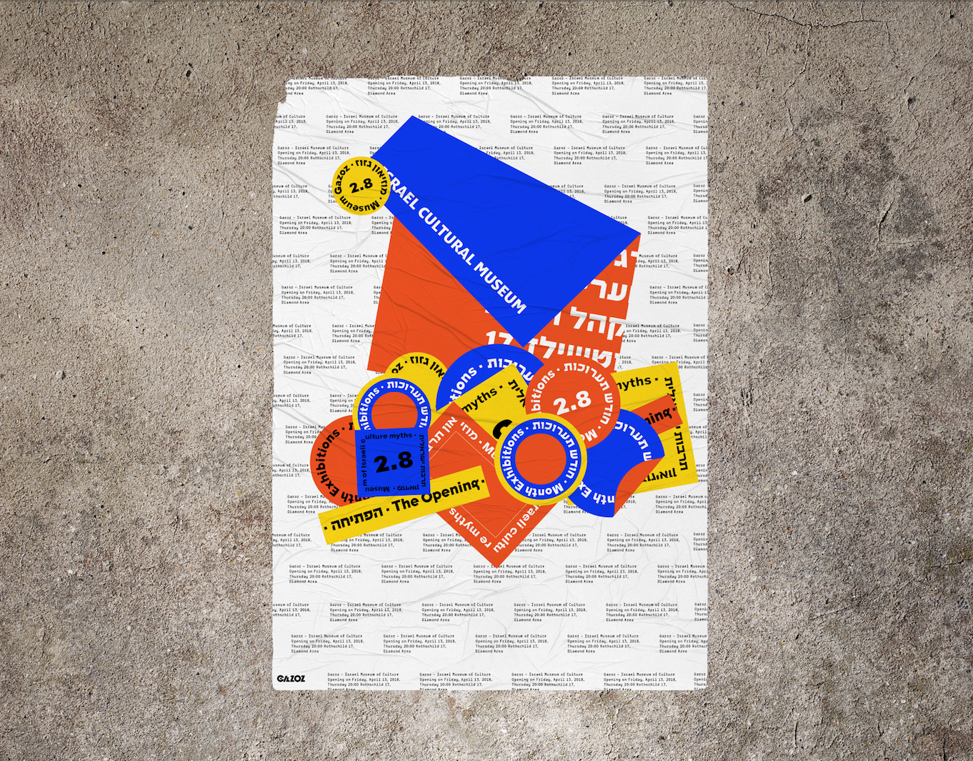
Branding of "Gazoz Museum of Israeli culture" The colors used are of the Mediterranean sands, sea, and sun. I was inspired by the amount of stickers that vary, represent and express, the multitude of cultural connections in Israel. My design is based on the informative, somewhat boring and mundane side of the Museum in contrast of the sassy, unpretentious Israeli side that's glued on layers and layers of different views and expressive ideas. I chose a naked cement wall that in my view symbolizes true and hard israeliness.
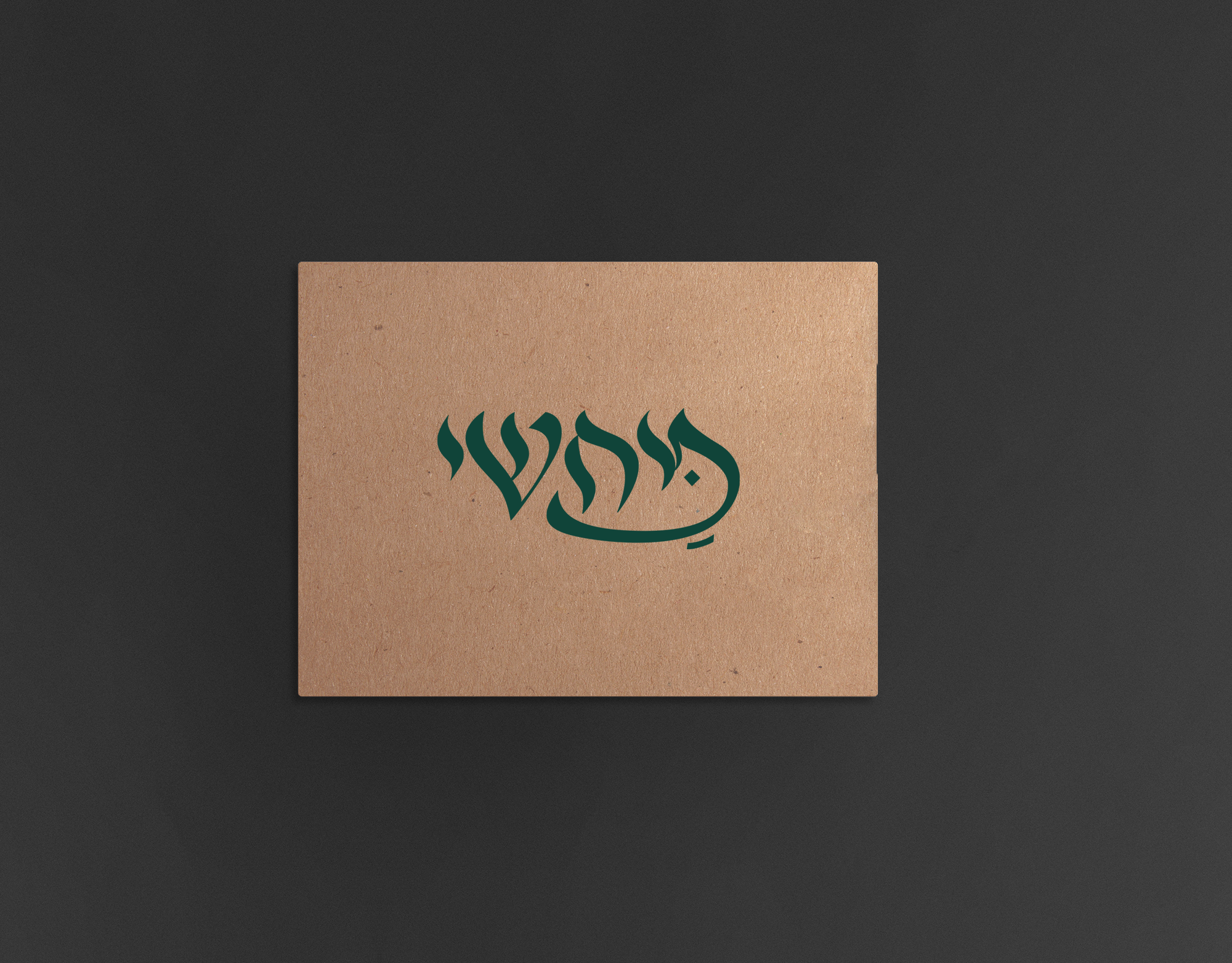
Mahshi
Logo and branding to restaurant tunisian food
Baking packaging
Baking Products being a very basic substance. I compared it to Art. Any being can make art, as any being can create something as basic from baking products. I chose the Bauhaus era. A time that was identified with basic colors and shapes, including the font that was identified and used at that time. Various products have added printed informative knowledge at this time. Vertical and Horizontal graphic art was common use during those years. The topography was all designed and based on these shapes. Each color represents a product with a different flavor and Each shape represents a family group. The shape changes its form as the product becomes more complex. My starting point was the Wheat, flour group. I branched out from that starting point creating a language.
3D Hand
Prosthetic Hand Redesign – Function Meets Fashion As part of this project, we were asked to redesign the prosthetic hand and rethink how it could be improved both functionally and emotionally. We identified an aesthetic gap in existing solutions – especially for an older audience seeking to express individuality and even celebration, rather than hiding or neutralizing the prosthesis.Our goal was to create a product that’s not only functional and ergonomic, but also fashionable – a personal accessory that reflects the user’s style.The concept also places emphasis on the user experience throughout the process: from design customization to production and, finally, to delivery – making the user feel like a co-creator of their own prosthetic.
Spicy middle east
While working at a startup, I fell in love with sticky notes – their bold colors, versatility, and the creative energy they bring. Inspired by that spirit, I designed a spice packaging system that channels the startup vibe through color, shape, and tone. The packaging mimics the square, lean format of sticky notes – compact and practical. A transparent window lets the natural colors of the spices shine through, acting as both a functional element and a vibrant design feature. I explored Middle Eastern patterns, matching each spice with a mood and motif: the hotter the spice, the bolder the pattern. Materials are compostable and eco-friendly, with a neutral brown base that emphasizes the natural beauty of the contents. Just like sticky notes, these packages are made to stick anywhere in your kitchen – turning it into a colorful, expressive space inspired by the land they came from.
Sophie calle
The book contains Orna Kazin' s articles that entail articles about wanderers. I also chose to add the artist Sophie Calle that deals with the borderlines of documentation and time. The book is set up in a modern format of a researcher, that combines both time and mystery. The Digital format focuses on Sophie Calle's work called "The Hotel" .Sophie Calle follows photographs and documents the hotel guests whilst working as a chambermaid on her spare time.
Logos
Some of the logos that I made
Capsule
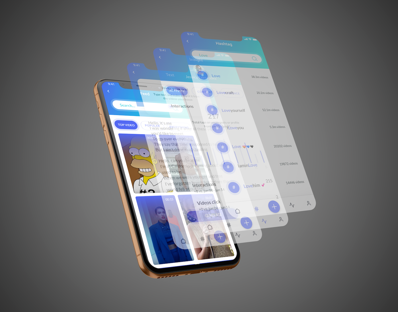
The brief was to make a particular site to a native application and refine it. we chose the Capsule site - new kind of pharmacy, prescription delivery service, which is located in the United States, we create a simple system that summarizes all the medical events and advances that have taken place for you or your family this week, have added various features that are relevant in the world of innovative medicine. The app will recognize your health status up to the smallest details, take care of the relevant medications and also as a social community that helps you find more and more people with the same health issues and share between them treatments and medicine reviews.
Back to Top