Arctic monkeys
A responsive website concept for the Arctic Monkeys, featuring a band timeline, full discography, and integrated online store – all designed to reflect the band’s unique tone and aesthetic.
Interactive course, Shenkar college, second year / 2017.
guidance: Ofir liberman
More
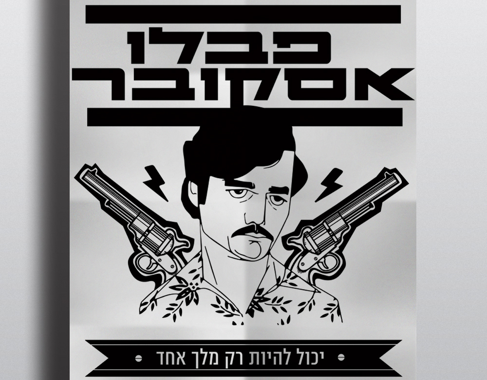
Pablo escobar
Poster, postcard and cigar as an icon called ׳Pablo Escobar׳.
The design plays with the colors of black and white, In all aspects and represents both sides of Escobar. On one hand, the evil personality, and on the other hand the one who supports the poor people.
The guns are like the wings of angels.
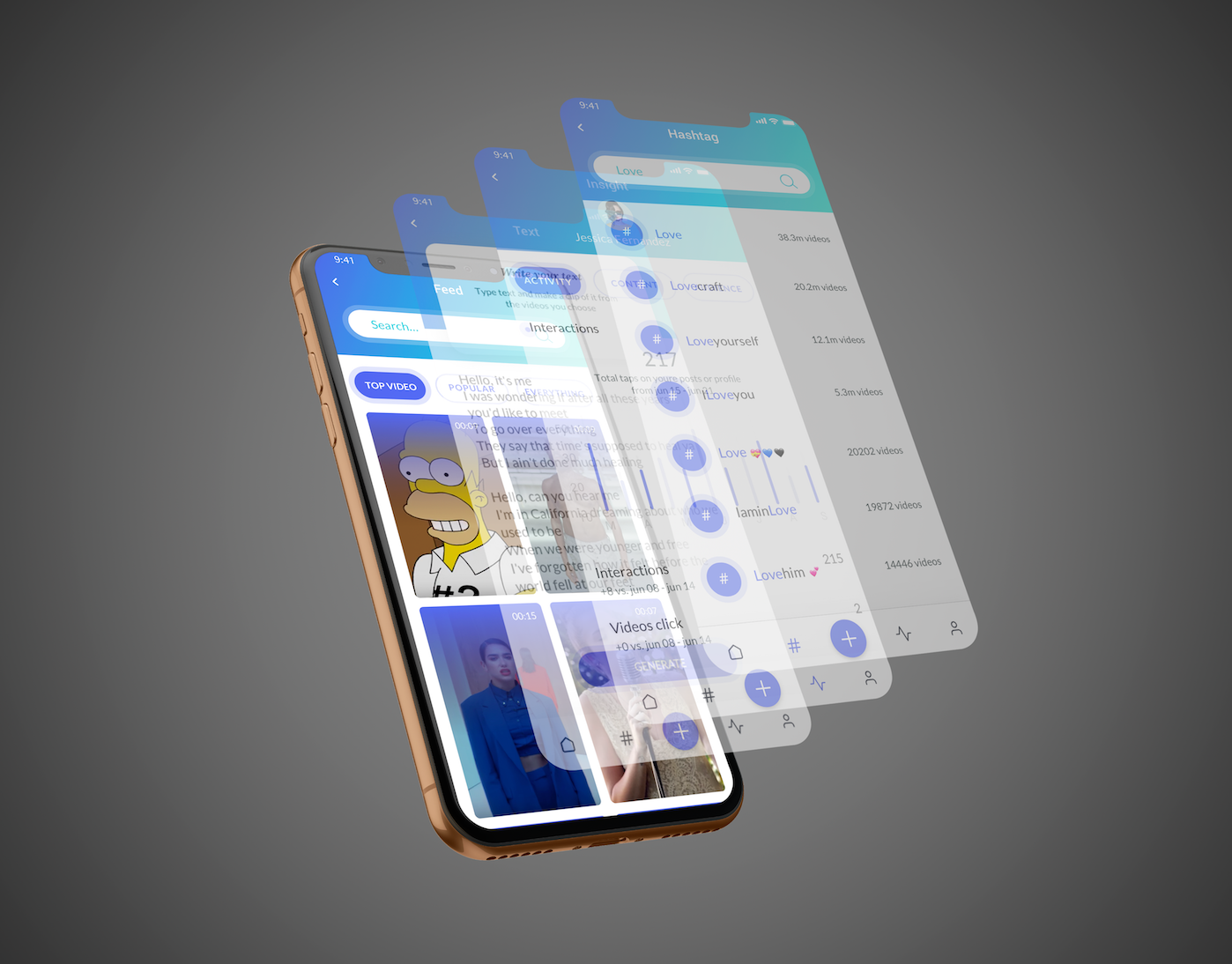
clippy
Clippy is a platform a social network that 's based on video realms and creates
clips that personally coordinate word connections to videos.
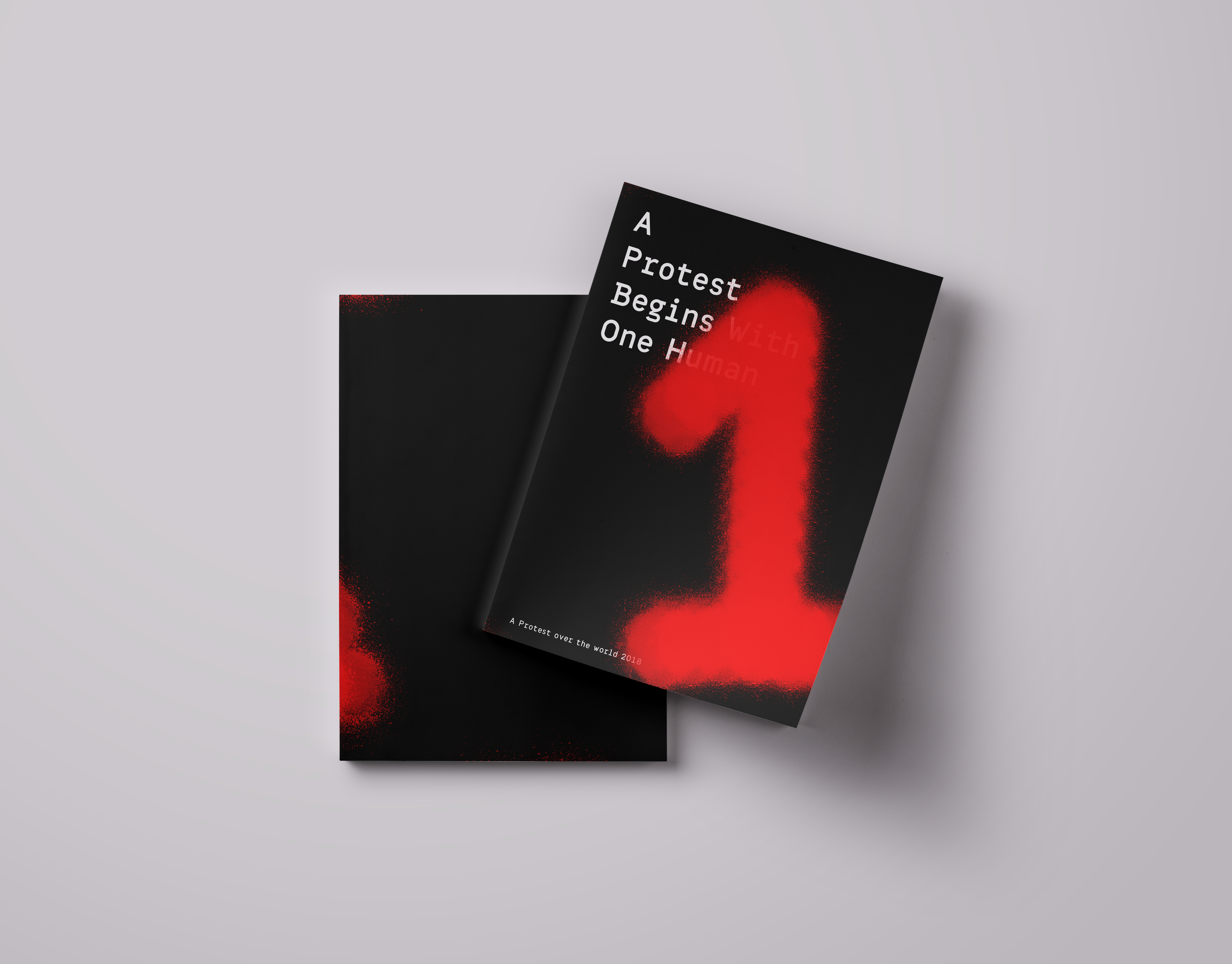
Protest catalog
A protest Begin with one human
this is a catalog dealing with protests.
the catalog is an introduction to the term "protest". The many different shades and layers this term contains.
The catalog engages in a trial to see the many shades and layers of the word from the visual point of view.
The colors that are bound together on the different billboards exposed in protests.
The end focuses on the contrast between the individual as to the masses in a composition.
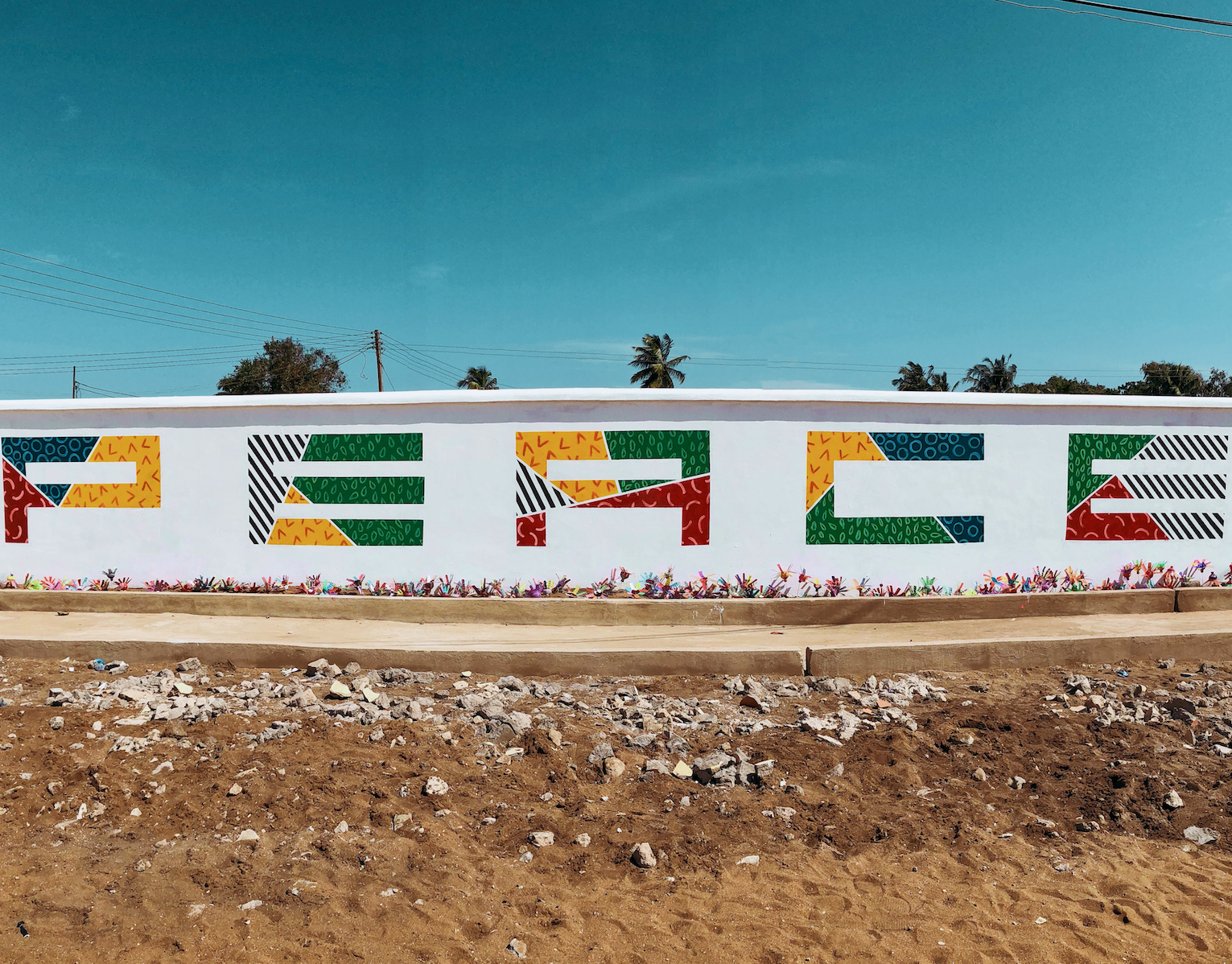
Africa
During a humanitarian expedition to Ghana, I took part in renovating a local school and orphanage.
As part of the project, I created a 30x3 meter mural on the school’s wall, reflecting the school’s core value: PEACE.
The artwork was developed in collaboration with the local community and aims to bring hope, color, and meaning to the everyday environment of the children.
Avney Derech
A New Model for Burial Rooted in Ancient Jewish Tradition
Avnei Derech is a conceptual burial system based on the ancient Jewish practice of “gathering of bones” – a two-stage burial technique mentioned in biblical and historical sources, and widely practiced in communities such as Morocco.
This project responds to a pressing issue: the increasing shortage of burial space in Israel. Existing solutions, like multi-level cemeteries, are expensive and spatially inefficient.
In contrast, this method allows for up to 65 times more burial plots per dunam (1,000 sqm) without compromising religious law.
The process includes:
*Stage 1: Temporary burial (“subsidiary burial”)
*Stage 2: After one year, the bones are respectfully transferred to a permanent stone or clay grave
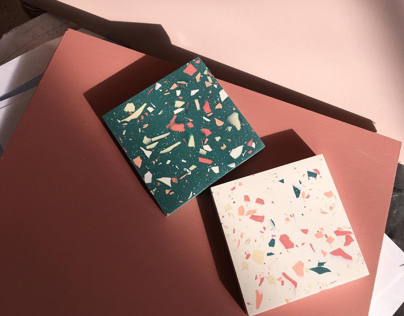
The design system I developed translates this spiritual, practical solution into a modern, respectful, and personal experience. Inspired by the terrazzo aesthetic – a material rooted in Israeli architecture – I created a series of modular, recycled-stone graves, each customizable in color, texture, density, and form.
The graves are arranged in vertical structures, up to four stories high, forming an urban geometric landscape that is both solemn and poetic. A narrow slit between graves serves as a tray for small personal objects like flowers or stones. Viewed from above, the arrangement creates a powerful mosaic of remembrance.
The system includes:
-A catalog explaining the religious, practical, and emotional layers of the burial process
-Modular grave designs with variations in shape, size, and material
-A visual selection system for clients and families, enabling them to personalize the grave in alignment with Jewish law
-A filing and registration system, including digital scan keys and physical models (1:23 and 1:1 scale) to preview the result
Every material is sustainably sourced, easy to produce, and designed to last — because even in death, we can choose meaning, care, and connection to the land we came from.
This project proposes a new vision of burial: one that honors tradition while embracing innovation, and offers comfort in form, material, and message — where stone becomes memory, and memory becomes peace.
Molcho
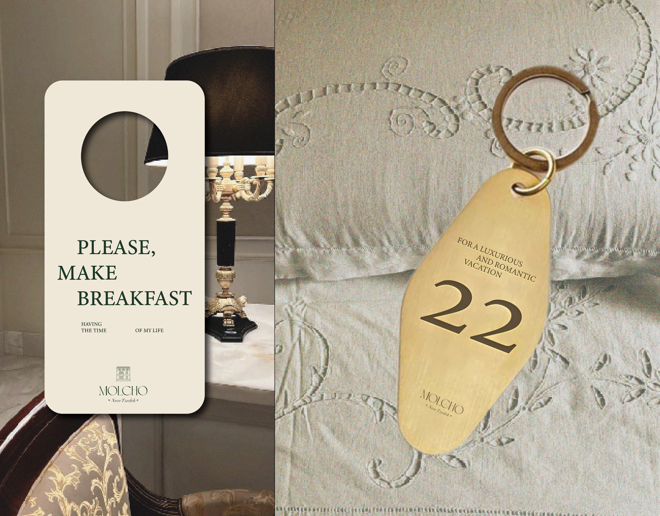
A logo for a high-end suite hotel, offering boutique hospitality in the atmosphere of old Tel Aviv, located in Neve Tzedek. A place with history from old Tel Aviv, luxurious yet understated, in a special location on a street of artists and boutiques.
Mahshi
Logo and branding to restaurant tunisian food
Einav Nasiri
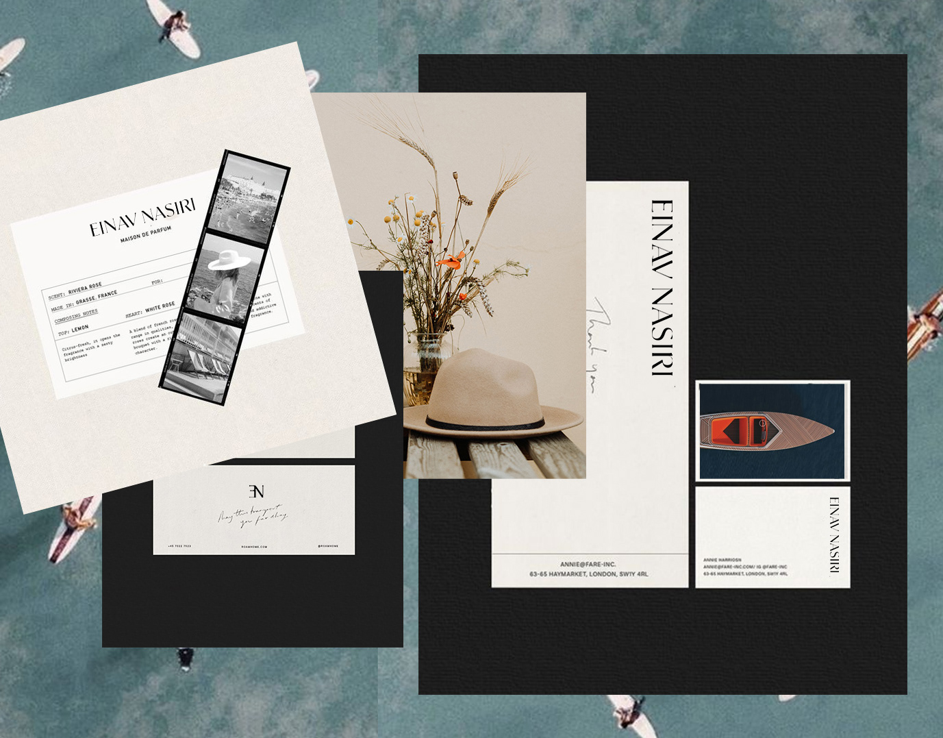
Einav Nashiri is a women's clothing brand. Those who wear Einav feel free, sexy femininity with lots of confidence. She is independent and strong. The clothes are leisure, resort clothes designed with a lot of thought. The brand's message is to be a woman and be in constant freedom.
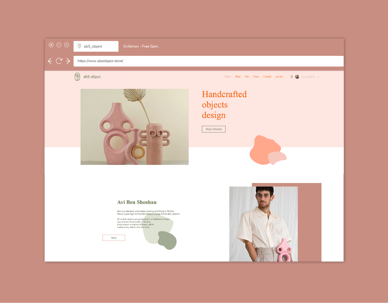
abS object
I made this site for abS object as part of an exercise at the company "wix".
Avi is a designer and maker, working and living in Tel Aviv. About a year ago he founded objects design brand abS_objects.
All of abS objects are produced in a traditional artisan way and are hand made in Tel Aviv. Every object is slightly different, which makes every object one of a kind.
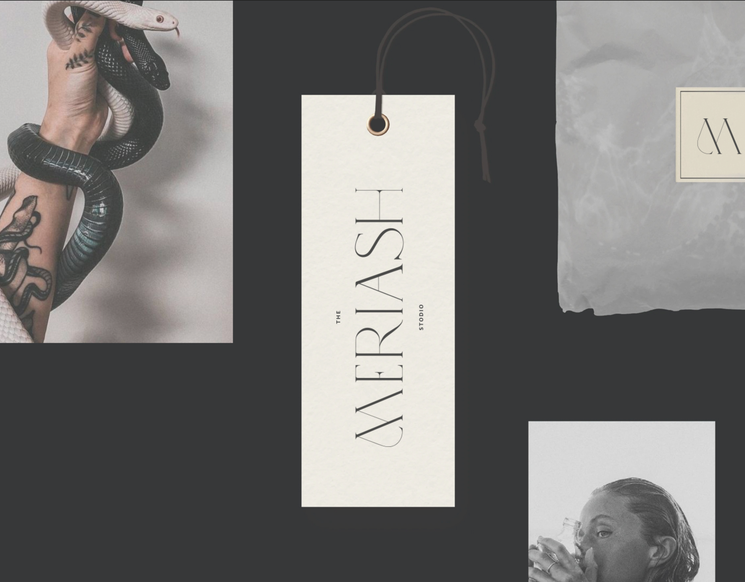
Meriash Logotype
Logotype for fashion designer
MERIASH is an intimate and small young brand that engraves on its banner creative, enchanted and mysterious worlds through which unique clothing items with a distinct design language are created. There is a range of complexity in the same breath - from the most commercial items to the highly invested items. The quantities are not significant.