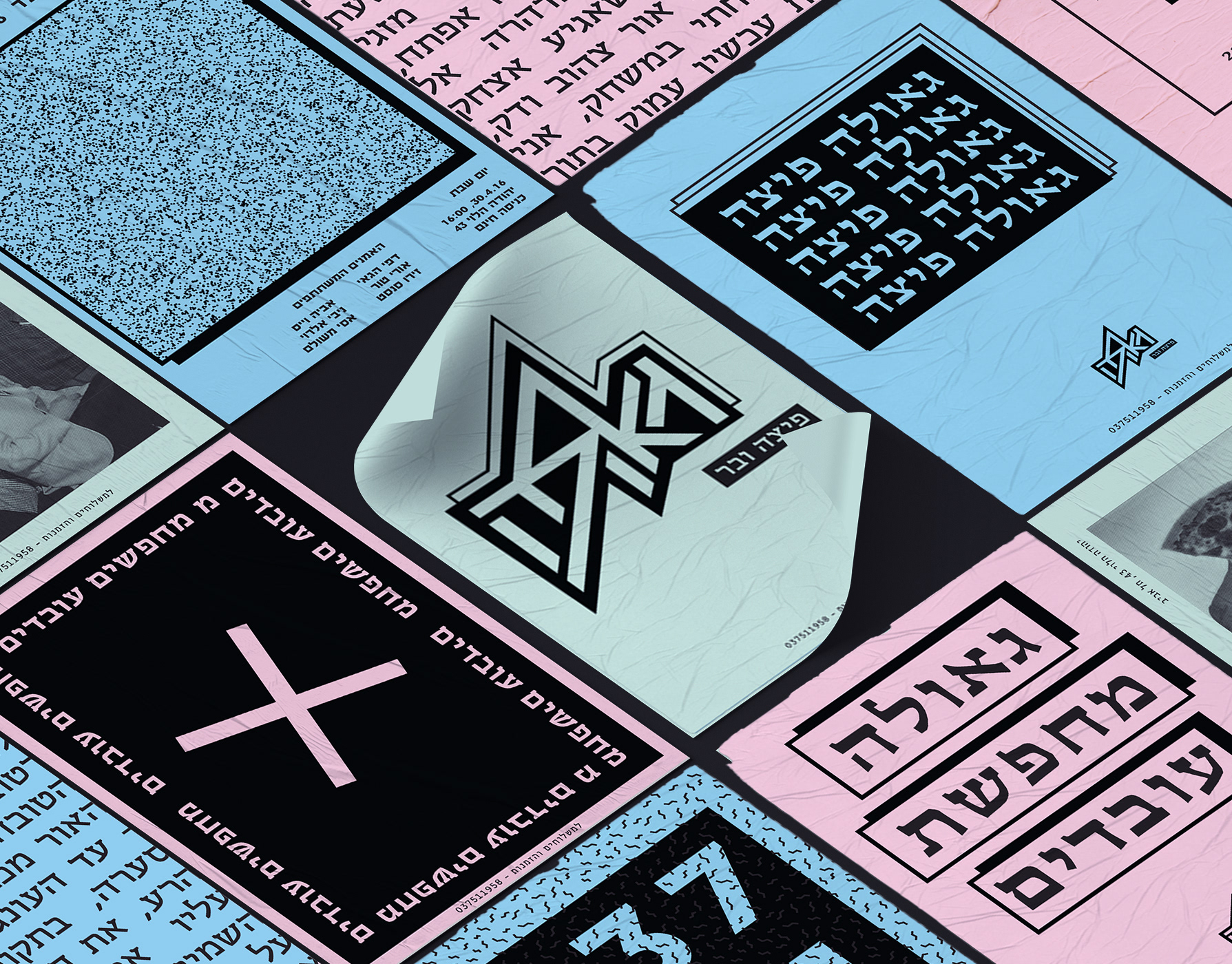
More

Diamonds chocolate
The journey of chocolate, from seed to finished product, reminded me of the way rocks are formed over time. Both begin as raw materials from nature and transform into something refined, rich, and full of character. Inspired by this parallel, I designed a chocolate package that draws on geological textures and a desert-inspired color palette. The use of organic, abstract shapes reflects the wildness and unpredictability of natural formation processes. To give the packaging a postcard-like feel, I incorporated rock textures and added information about various global mines on the back – creating a sensory and narrative-rich unboxing experience that connects the product to the earth it came from.
La grande dame
soap bracelets that inspired by The Moroccan desert.
Spicy middle east
While working at a startup, I fell in love with sticky notes – their bold colors, versatility, and the creative energy they bring. Inspired by that spirit, I designed a spice packaging system that channels the startup vibe through color, shape, and tone. The packaging mimics the square, lean format of sticky notes – compact and practical. A transparent window lets the natural colors of the spices shine through, acting as both a functional element and a vibrant design feature. I explored Middle Eastern patterns, matching each spice with a mood and motif: the hotter the spice, the bolder the pattern. Materials are compostable and eco-friendly, with a neutral brown base that emphasizes the natural beauty of the contents. Just like sticky notes, these packages are made to stick anywhere in your kitchen – turning it into a colorful, expressive space inspired by the land they came from.
Logos
Some of the logos that I made
Arctic monkeys
A responsive website concept for the Arctic Monkeys, featuring a band timeline, full discography, and integrated online store – all designed to reflect the band’s unique tone and aesthetic.
Silk print
Silk screen printing.
Baking packaging
Baking Products being a very basic substance. I compared it to Art. Any being can make art, as any being can create something as basic from baking products. I chose the Bauhaus era. A time that was identified with basic colors and shapes, including the font that was identified and used at that time. Various products have added printed informative knowledge at this time. Vertical and Horizontal graphic art was common use during those years. The topography was all designed and based on these shapes. Each color represents a product with a different flavor and Each shape represents a family group. The shape changes its form as the product becomes more complex. My starting point was the Wheat, flour group. I branched out from that starting point creating a language.
Anxieties Illustrations
As someone who lives with anxiety, illustration is my clearest form of expression. This series of short comic strips brings inner fears and intrusive thoughts to life — with honesty, dark humor, and a visual language that speaks when words fall short.
Einav Nasiri
Einav Nashiri is a women's clothing brand. Those who wear Einav feel free, sexy femininity with lots of confidence. She is independent and strong. The clothes are leisure, resort clothes designed with a lot of thought. The brand's message is to be a woman and be in constant freedom.
Capsule
The brief was to make a particular site to a native application and refine it. we chose the Capsule site - new kind of pharmacy, prescription delivery service, which is located in the United States, we create a simple system that summarizes all the medical events and advances that have taken place for you or your family this week, have added various features that are relevant in the world of innovative medicine. The app will recognize your health status up to the smallest details, take care of the relevant medications and also as a social community that helps you find more and more people with the same health issues and share between them treatments and medicine reviews.
Back to Top